

PACKAGE
Texture and Negative Space: Modern Wagashi Packaging
Texture and Negative Space: Modern Wagashi Packaging. A Japanese package design case study with notes on typography, color, materials, and shelf presence.
SELECTED WORK / ALL PROJECTS
Explore Japanese logo and packaging design case studies created by designers in Japan, with practical notes on typography, symbolism, color, materials, and use.
HOW TO VIEW THE WORK
Each case study explains how a visual direction was built: what a Japanese word or symbol communicates, why a particular type style was chosen, how color changes the emotional tone, and how the design behaves when applied to packaging, signage, or other brand materials.
The archive includes both logo and packaging concept studies. They are intended to help overseas teams evaluate Japanese design with more context than a thumbnail alone can provide. When a visual is conceptual rather than a commissioned client project, the article states this clearly.
12 PROJECTS / PAGE 01
Texture and Negative Space: Modern Wagashi Packaging. A Japanese package design case study with notes on typography, color, materials, and shelf presence.

A conceptual unagi-restaurant logo unifying a circular eel motif, calligraphic Japanese name, and clear romanized lettering.
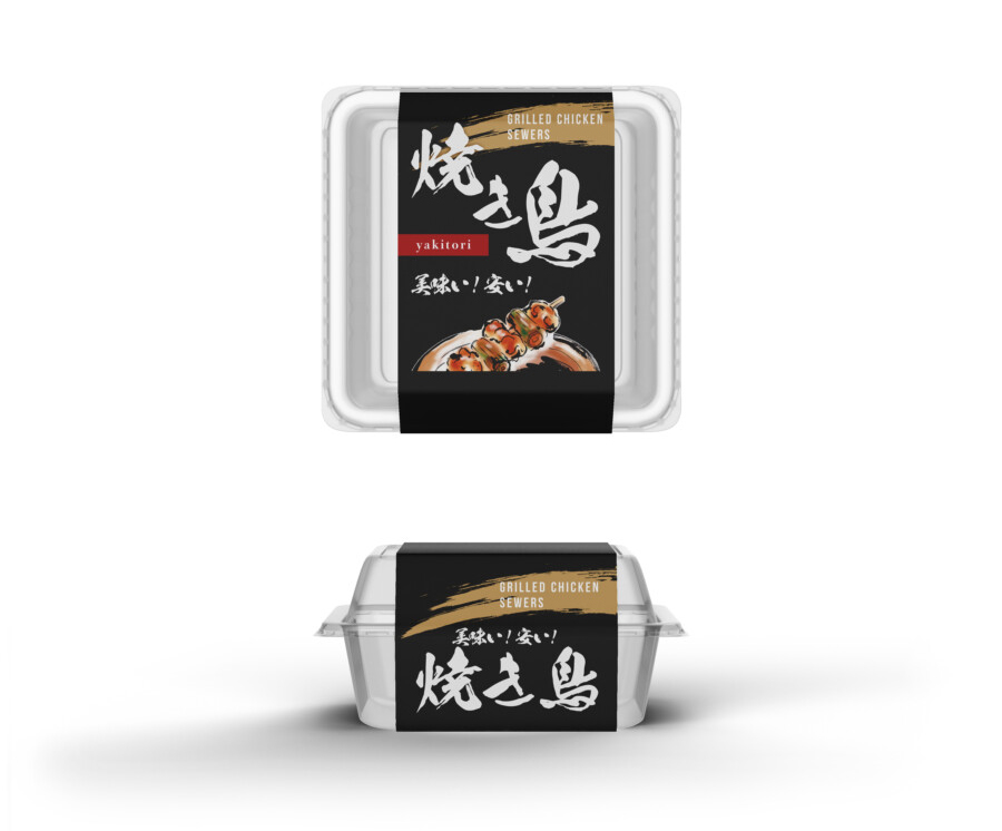
A conceptual takeaway yakitori package combining a clear container, black band label, calligraphy, food illustration, and bilingual wording.

A conceptual relaxation-spa identity combining a simplified lotus, composed Japanese typography, spacious Latin lettering, and dimensional signage.
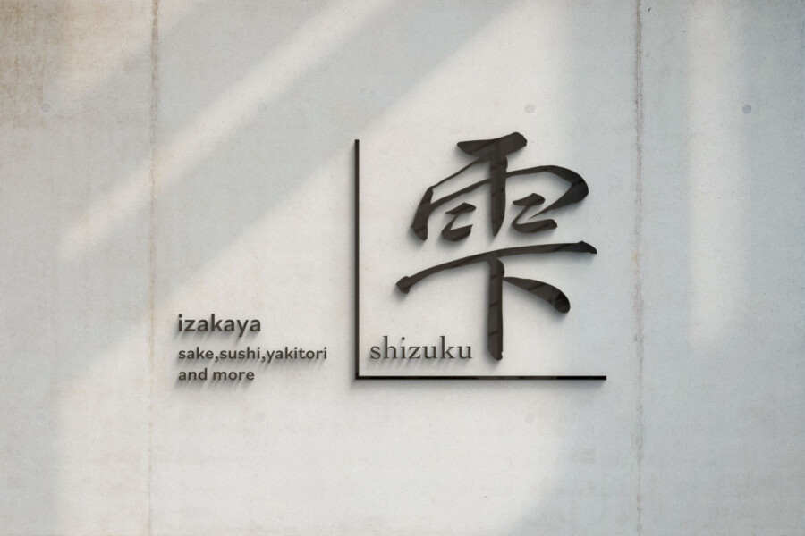
A conceptual modern-izakaya logo balancing Shizuku calligraphy, bilingual information, a red accent, and an architectural L-shaped frame.
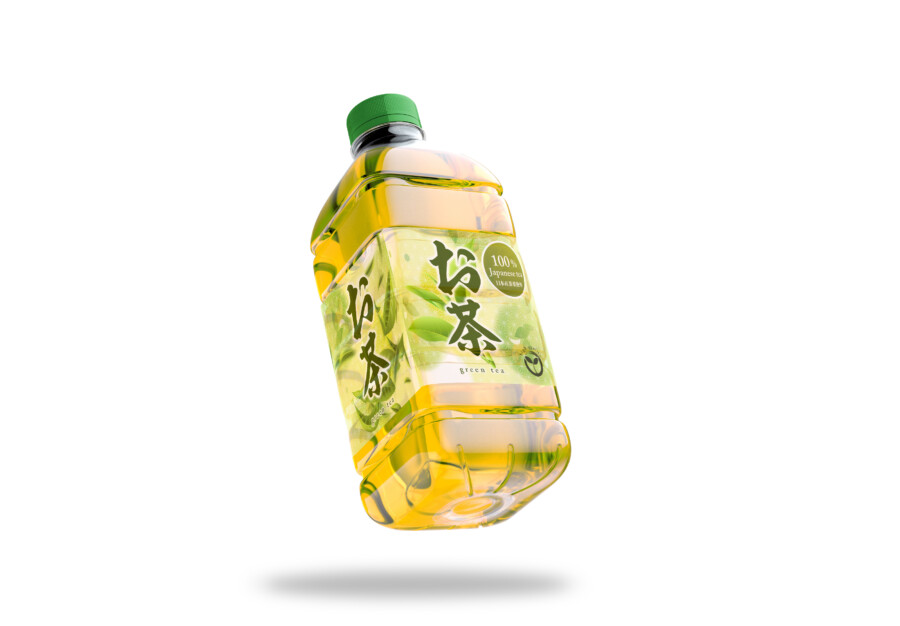
A conceptual green-tea bottle design using translucent labels, Japanese calligraphy, leaf illustration, and the beverage’s own color.
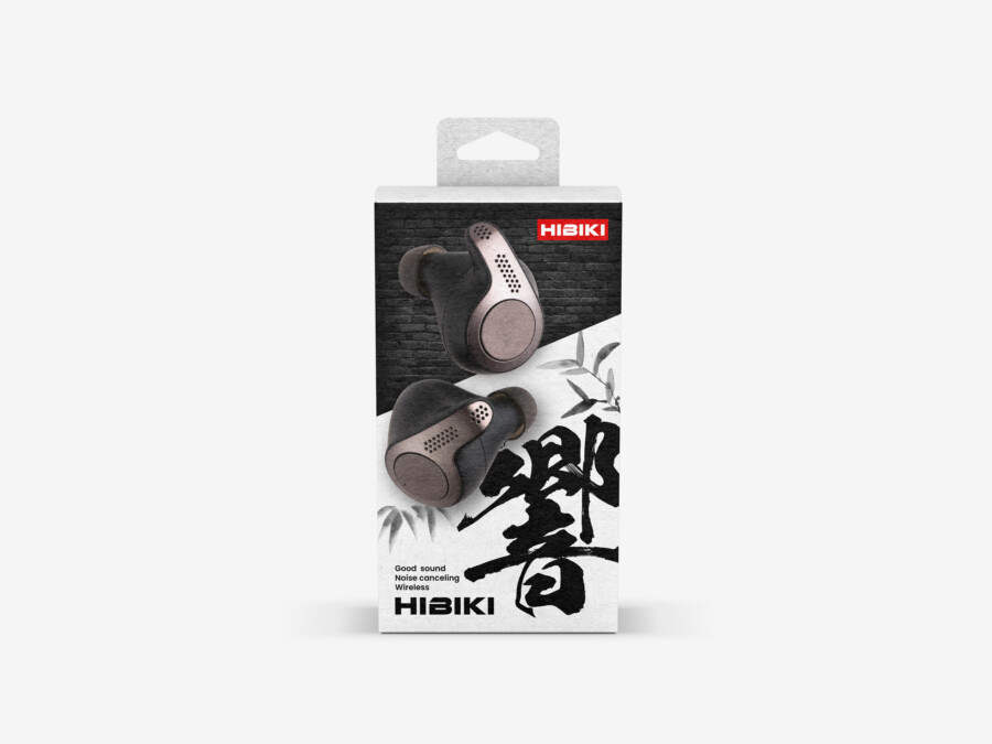
A conceptual wireless-earphone package combining urban texture, Japanese calligraphy, product detail, and a noise-to-silence visual metaphor.
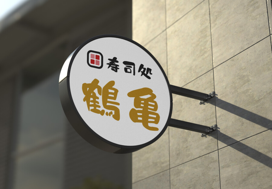
A conceptual sushi-restaurant identity combining a muted-gold Japanese name, rounded category text, and a compact geometric emblem.
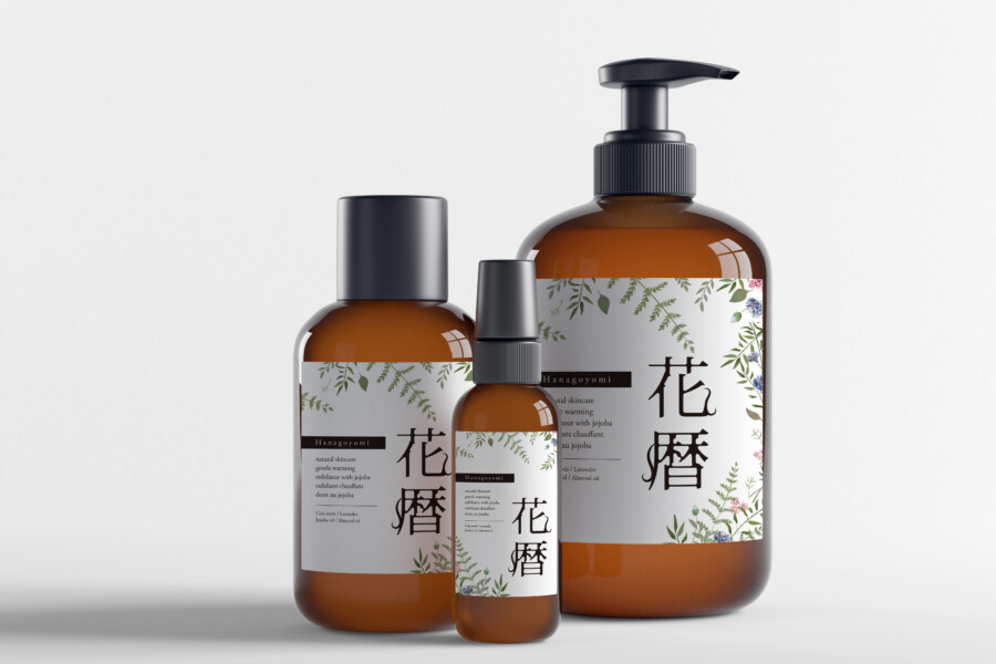
A conceptual Japanese botanical skincare system with amber bottles, open white labels, delicate illustration, and vertical typography.
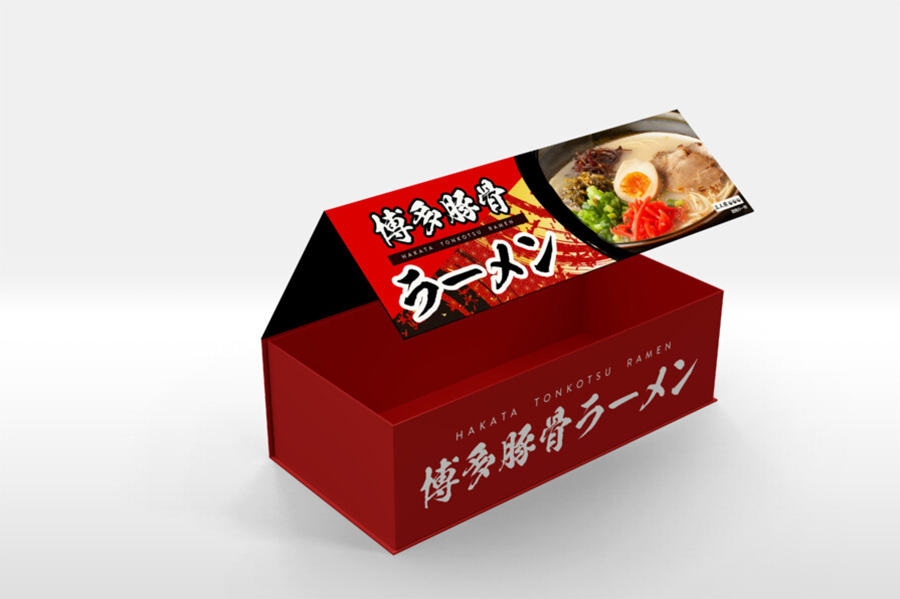
A conceptual Hakata ramen souvenir box using red, black, food photography, calligraphy, and bilingual retail information.
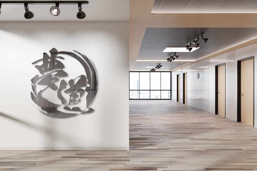
A conceptual logistics-company logo combining the kanji for dream and path with a circular brushstroke and adaptable corporate applications.
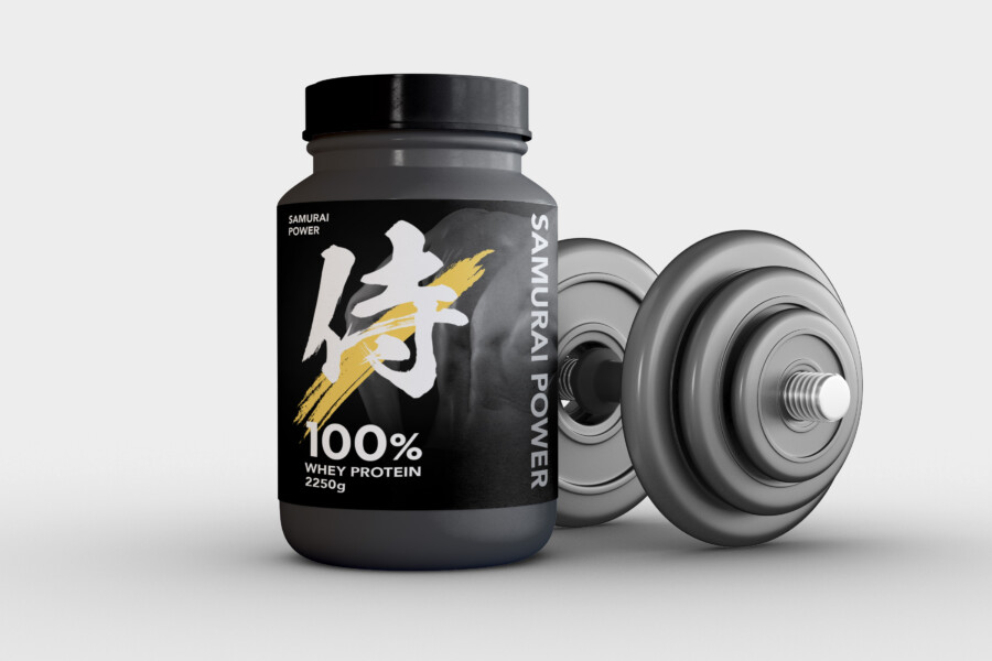
A conceptual protein package using a focused samurai metaphor, matte black, white typography, and a restrained gold brush accent.
CONTINUE EXPLORING
Compare our core services or read the guide closest to the type of project you are planning.