

LOGO
Tradition with Energy: A Dynamic Logo for an Eel Restaurant
A conceptual unagi-restaurant logo unifying a circular eel motif, calligraphic Japanese name, and clear romanized lettering.
SELECTED WORK / LOGO
Explore Japanese logo design case studies created by designers in Japan, with notes on typography, symbolism, color, and real-world applications.
HOW TO VIEW THE WORK
A Japanese logo cannot be judged by appearance alone. Kanji meaning, script choice, pronunciation, stroke structure, and cultural associations all affect whether the mark feels credible to a Japanese audience.
These case studies examine those decisions alongside practical concerns such as small-size legibility, monochrome use, signage, packaging, and the balance between Japanese character and international accessibility.
11 PROJECTS / PAGE 01
A conceptual unagi-restaurant logo unifying a circular eel motif, calligraphic Japanese name, and clear romanized lettering.
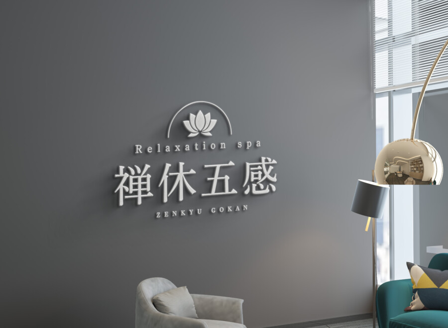
A conceptual relaxation-spa identity combining a simplified lotus, composed Japanese typography, spacious Latin lettering, and dimensional signage.
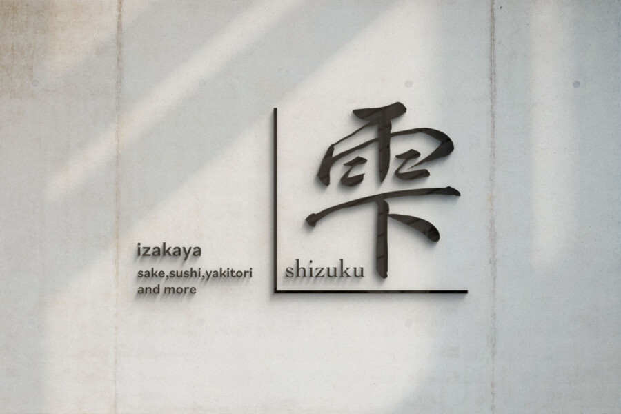
A conceptual modern-izakaya logo balancing Shizuku calligraphy, bilingual information, a red accent, and an architectural L-shaped frame.
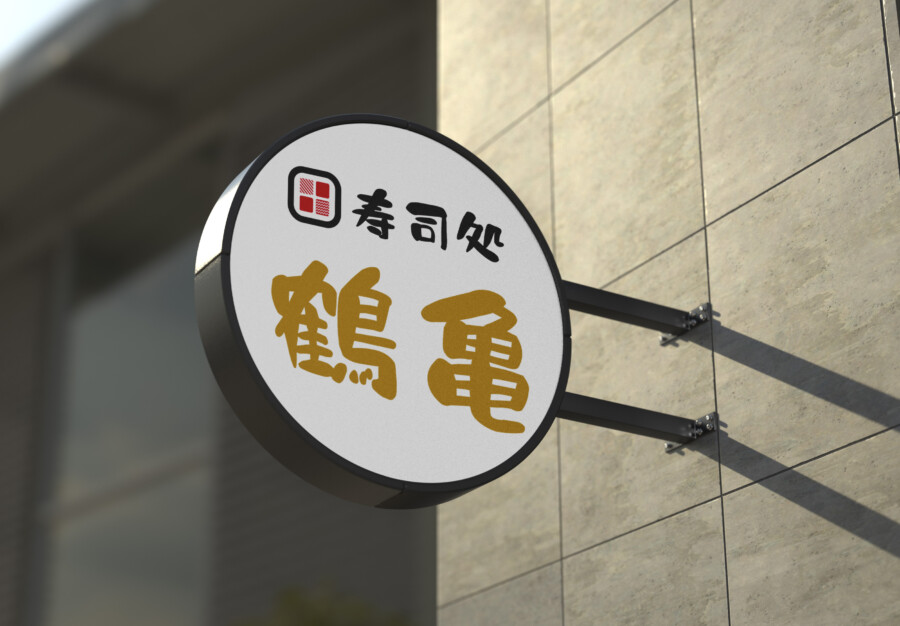
A conceptual sushi-restaurant identity combining a muted-gold Japanese name, rounded category text, and a compact geometric emblem.
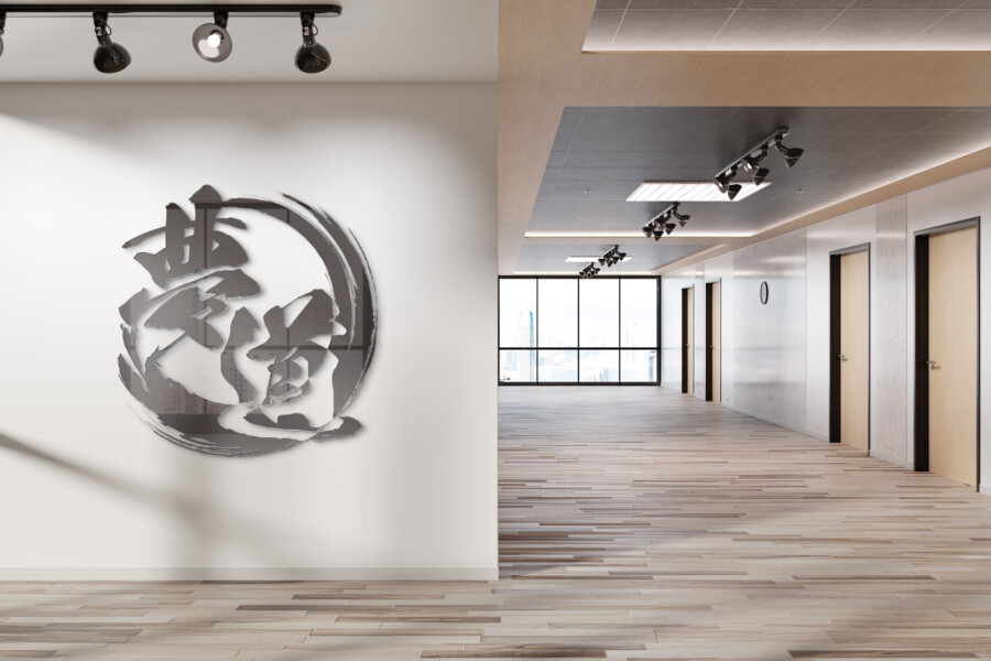
A conceptual logistics-company logo combining the kanji for dream and path with a circular brushstroke and adaptable corporate applications.
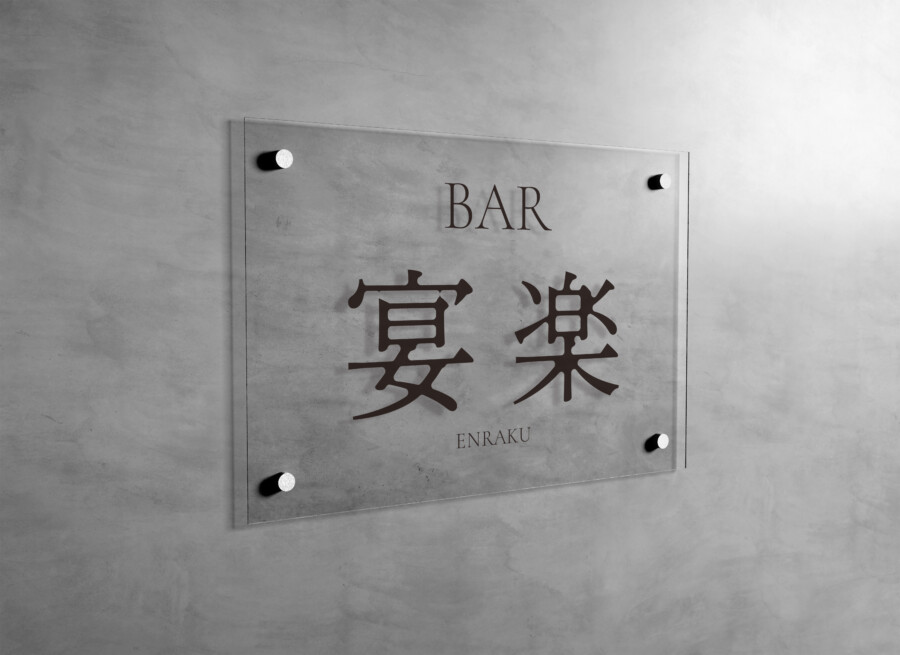
A conceptual identity for ENRAKU, combining custom Japanese lettering, a slender Latin serif, negative space, and modern bar applications.
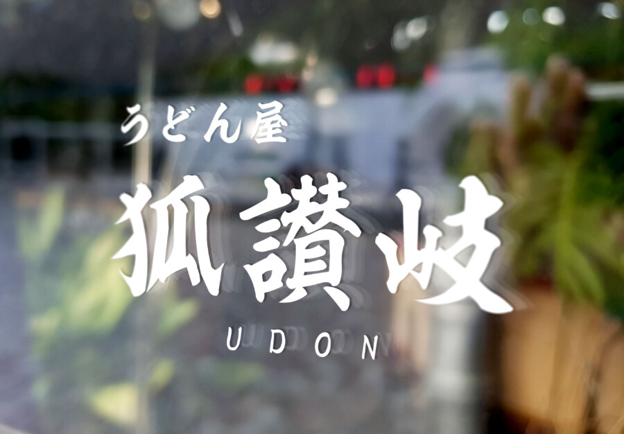
A conceptual udon restaurant identity combining custom Japanese calligraphy, clear category text, monochrome strength, and a noodle motif.
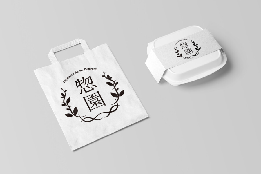
A conceptual bento-delivery logo balancing a botanical wreath, formal Japanese lettering, natural materials, and a flexible brand system.
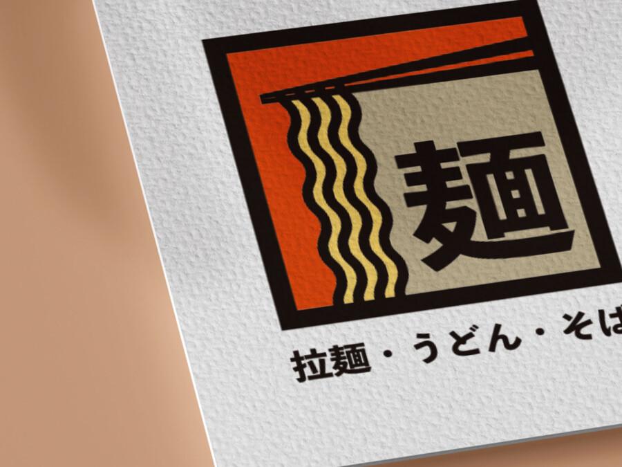
A conceptual noodle-shop logo reducing noodles, steam, chopsticks, and the kanji for noodles into a memorable square symbol.
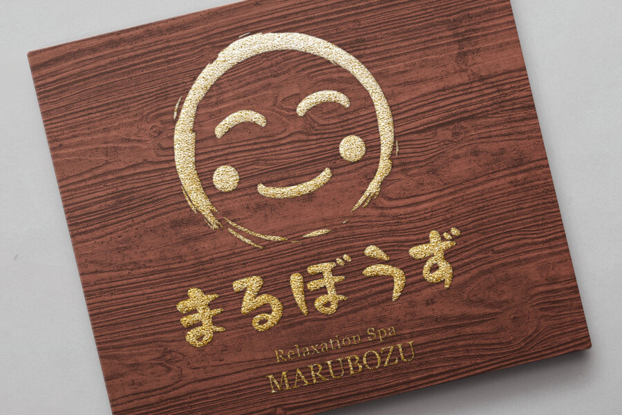
A conceptual relaxation-spa logo using a smiling brush circle, pale pink accent, rounded hiragana, and clear Latin lettering.
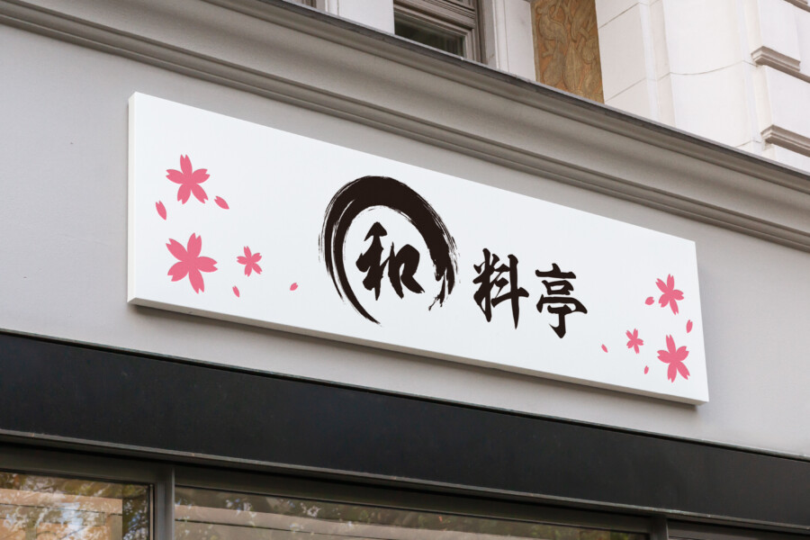
A conceptual Japanese restaurant identity combining calligraphy, an ensō-inspired circle, negative space, and a restrained sakura-pink accent.
CONTINUE EXPLORING
Understand the service, prepare your brief with the guide, or contact us when you are ready to discuss scope and timing.