![]()
Crafting Atmosphere: A Bar Logo with Dignified Presence
This is a brand logo designed for a bar dedicated to quiet, adult moments. The centerpiece is the two-kanji name. This is not an existing typeface but a custom-designed font. While it has a traditional structure, the “stops” and “sweeps” of the brushstrokes end with a knife-like sharpness. This tension seems to express the unique, crisp air of the bar itself and the “commitment” to every drink served. It has a quiet strength and a sense of dignity that heightens anticipation for the experience to come.
A Premium Contrast: The Harmony of Japanese and Western Typefaces
This logo design is characterized by its combination of Japanese and European typefaces. While the main kanji evoke “stillness” and “tradition,” the supporting text—the “BAR” descriptor and the romanized name—are set in a slender, classic European serif font. This traditional Western typeface blends with the Japanese characters to create a sophisticated, modern Japanese worldview that avoids leaning too heavily into any single “Japanese style.” We feel this exquisite contrast is what gives the entire design its premium depth.
An Aura of Calmness: Redefining the Meaning of Joy
The kanji characters used in the name, which relate to “banquet” and “pleasure,” inherently carry a “dynamic” and “lively” meaning. However, this logo design deliberately avoids expressing that meaning literally. The typeface is restrained and decidedly static. This seems to suggest that the “pleasure” offered here is not loud or boisterous, but a mature, “quiet joy”—an experience of self-reflection or calm conversation. This intellectual gap between the word’s meaning and its visual expression may be what best symbolizes the bar’s unique identity.
![]()
![]()
A Design That Blends In to Elevate the Space
A logo’s true value is revealed when it resonates with the space it occupies. This design is particularly conscious of its harmony with its physical environment.
How Inorganic Materials Accentuate the Logo’s Subtle Warmth
In the application mockups, the logo is shown printed on a transparent acrylic (or glass) plaque, mounted on a concrete wall. This combination—the cold, inorganic texture of concrete, a transparent material, and the minimal, ink-black logo—evokes a very urban, minimalist space. By deliberately avoiding “warm” materials like wood, the design paradoxically accentuates the subtle “human warmth” and “trace of the hand” present in the logo’s characters. This effect seems to lend a perfect measure of tension and quality to the entire room.
The Richness of Negative Space
Looking at the foundational design, we see that generous yohaku (negative space) has been left above and below the kanji, as well as around the entire composition. The design philosophy is not to crowd the space with information, but to intentionally preserve a vast “empty” area. This layout choice itself seems to reflect the bar’s ethos: a place to escape the busy rush of daily life and embrace a slower, more deliberate flow of time. The logo’s use of negative space eloquently speaks to this “spiritual richness” and “generosity of space.”
This logo design is a sample.
For logo design requests, please contact us using the contact form.
A Deeper Look at the Logo Design: The “ENRAKU” Typography as a Cultural Translator
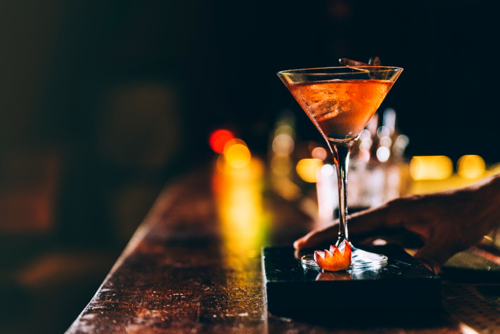
*Conceptual image
While the previous analysis explored the logo’s typeface, harmony, and spatial application, let’s now shift our perspective. We will examine how this logo communicates with an audience from a different cultural background, particularly English speakers.
The Strategic Role of the “ENRAKU” Romanization
The Romanized “ENRAKU” text, placed beneath the kanji, plays a strategic role that goes beyond being a simple pronunciation guide.
For many English speakers, kanji are perceived as beautiful and iconic symbols, but it is difficult to grasp their meaning or sound instantaneously. This is where the Romanized “ENRAKU” functions as a “cultural bridge.”
The audience first recognizes and remembers the brand by its “sound” (the proper name “ENRAKU”), set in a sophisticated serif font. Only after that do they engage with the traditional and refined visual beauty of the kanji characters 「宴楽」, which act as the visual symbol.
This creates a two-step communication design: first, the “recognizability” (readability) of the Western typeface, followed by the “symbolism of the worldview” (visual identity) of the Japanese characters. This structure is intentionally designed to accurately convey the brand’s identity, even within a global context.
Redefining the Cultural Context of “Joy”
As mentioned in the previous analysis, this logo deliberately suppresses the “lively” or “boisterous” connotations inherent in the kanji characters for “banquet” (宴) and “pleasure” (楽), instead expressing a “static joy.”
This can be seen as an expression that cleverly navigates the contextual differences in “enjoyment” between Western and Japanese cultures.
For example, in Western culture, a “Bar” and the concept of “pleasure” are often strongly associated with “dynamic” elements such as socializing, music, and lively conversation. However, the “quiet joy” presented by this logo seems to reflect a traditional Japanese aesthetic—a value system that finds “spiritual richness within tranquility,” such as the time spent focusing on a single bowl of tea in a tea ceremony, or quietly contemplating a piece of calligraphy.
While operating within the Western framework of a “BAR,” the logo’s restrained tone eloquently communicates that the essence of the experience offered is profoundly Japanese: an “introspective, high-quality, and calm passage of time.”
In this way, a single logo design can embody a deep philosophy that goes beyond simply communicating a name, serving to “translate” and “connect” the values of different cultures.