
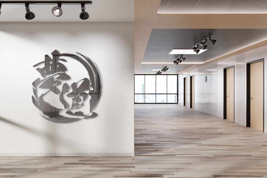
A calligraphic corporate mark built around movement
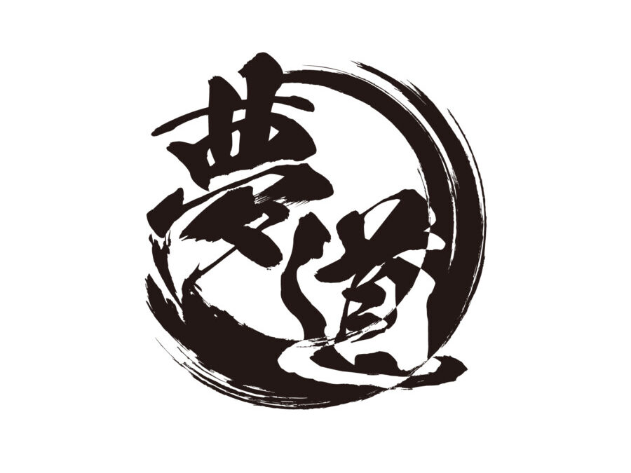
This conceptual logo was created for a logistics company. The kanji 夢道—dream and path—sit inside a broad circular stroke, connecting the company’s vision with the routes and continuous movement of its work.
The design uses calligraphy as a source of energy, but the final mark is organized for consistent reproduction. It is intended to feel personal and ambitious without losing the clarity required of a corporate identity.
The outer stroke suggests circulation and connection
The incomplete circle can be read as a route moving around the name, a cycle of collection and delivery, or a link between places. Its open brush edge keeps the symbol dynamic instead of turning it into a static border.
The two kanji connect vision with action
夢 supplies the aspirational idea, while 道 refers to a path or way. Their vertical arrangement creates a strong central axis and gives the surrounding movement a clear destination.
A flexible mark for operational and premium applications
Logistics identities appear on vehicles, boxes, uniforms, forms, warehouses, and screens. The black version therefore establishes the essential structure before any specialty color or finish is introduced.
Monochrome preserves recognition across practical uses
The circular silhouette and central characters remain distinct without gradients or fine color separation. This supports vinyl cutting, stamps, one-color packaging, and high-contrast safety environments.
Gold changes the tone without changing the mark
Foil or metallic application can give formal stationery and presentation materials a more considered finish. It is an optional expression of the identity, not a claim about service quality.
Open space prevents the brushwork from overwhelming the layout
Because the symbol is energetic, surrounding applications need disciplined margins. Clear space allows the mark to remain confident beside addresses, tracking information, or other operational text.
This is a conceptual logo design sample. The final company name, philosophy, colors, and reproduction standards would be confirmed for an actual project.
Turning a one-time brush gesture into a repeatable identity
Concept visualization
Expressive texture must survive simplification
Dry-brush gaps and ink splashes give the artwork character, but a logo also needs consistent edges and reliable small-size reproduction. The final vector drawing would preserve the essential rhythm while removing details that become noise.
Organic form introduces a human dimension
Transport systems are often represented through arrows, grids, or vehicles. The hand-derived circle offers a different emphasis: human intention and continuity behind the operational network.
Before release, the mark would be tested on truck sides, corrugated board, shipping labels, embroidery, web interfaces, and favicon-sized uses. Alternate horizontal and symbol-only arrangements would support these formats without redrawing the identity for each application. Corporate colors, safety zones, minimum line weights, and background controls would be documented so external vehicle, warehouse, and packaging suppliers can reproduce the mark consistently. The operating company name could then sit beside the expressive symbol in a neutral type system. Motion graphics could reuse the circular route without altering the static master mark, its proportions, or its established recognition across future applications.