Guide: Japanese Taste in Package Design
Lede
The “Japanese taste” that animates our culture and traditions is drawing more attention than ever. In package design especially, its quiet beauty and depth win people over at a glance—and keep them engaged through touch and story. This guide distills the essentials and shows practical ways to weave Japanese aesthetics into packaging that elevates product value.
TL;DR
- Simple yet rich: nature, harmony, and tranquility as core principles
- Colors & materials matter: indigo, vermilion, matcha × washi, bamboo, wood
- Craft collaborations and storytelling boost perceived quality and trust
- Balance minimalism with fine detail; keep brand-wide consistency
- Sustainable choices and digital techniques expand global appeal
What Is “Japanese Taste”?—Its Characteristics and Appeal
Basic elements
Japanese taste favors restraint over excess. It builds beauty from nature, harmony, and tranquility, reflecting the seasons and everyday rituals. Motifs drawn from landscapes, flora, and fauna—and a palette of nuanced, subtle hues—deliver calm and clarity. When these cues come together, the package carries an unmistakable Japanese essence.
Collaboration with traditional crafts
Partnering with craftspeople (e.g., lacquerware, ceramics, washi) adds one-of-a-kind texture and presence. Hand-finished techniques lend individuality to each item, raising perceived value and gifting suitability while reinforcing brand credibility and luxury.
Color & material choices
Color and material define first impressions. Traditional hues such as indigo blue, vermilion, and matcha green instantly set a Japanese mood. Natural materials—washi, bamboo, wood, natural fabrics—extend that feeling through touch. They also align with environmental responsibility, which increasingly guides consumer choice.
Specific Examples of Japanese Package Design
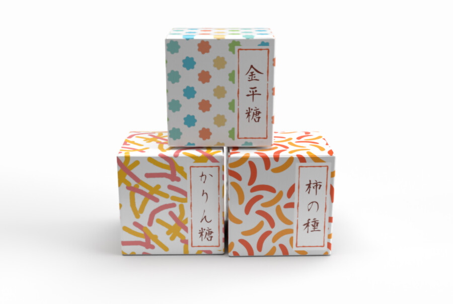
Traditional confectionery (wagashi)
Wagashi packaging often mirrors the season—cherry blossoms, plum blossoms, autumn leaves—and favors washi wraps or wooden boxes for a refined gift feel. Delicate patterns and thoughtful wrapping methods echo the care inside.
Sake and tea
For sake, bottle form, label typography, and natural boxes signal heritage and premium quality. Brush calligraphy, family crests, and textured papers are common. For tea, canisters, bamboo tubes, and layered wraps protect aroma while celebrating ritual.
Modern hybrids
Contemporary designers combine minimal layouts with traditional colors and motifs to create fresh expressions. You’ll see clean typography, generous negative space, and even digital touches—from precision printing to AR—that speak to younger audiences and global markets.
Elements That Captivate—From Shelf to Hand
Visual presence
Aim for balance and restraint. Use motifs of landscapes, family crests, flowers, or animals as purposeful accents—not decoration for decoration’s sake. Fine detail placed with intention becomes a signature.
Texture & usability
Touch completes the story. Choose materials with satisfying hand-feel—soft-fiber washi, fabric wraps, bamboo surfaces—and shape structures for easy holding, opening, and resealing. Good usability amplifies perceived quality the moment the package is picked up.
Storytelling
Let the package carry the product’s backstory—origin, makers, regional traditions, craft techniques. Short, well-placed copy (and scannable icons or stamps) turns provenance into pride and deepens attachment.
Tips for Incorporating Japanese Taste
Research regions and crafts
Every region has distinct techniques—Kyoto’s Yuzen dyeing, Kanazawa’s gold leaf, Okinawa’s Bingata, and more. Reference them respectfully to add specificity and depth.
Maintain brand-wide consistency
Define a palette, type system, and material set that repeat across SKUs. Consistency builds recognition and trust while allowing thoughtful seasonal variations.
Balance simplicity and delicacy
Keep forms and layouts simple, then introduce one or two finely crafted details—a debossed crest, a hand-tied cord, a foil accent—so the whole remains calm yet memorable.
Future Prospects
Sustainability as standard
Adopt renewable materials, low-ink systems, modular or reusable formats. Environmentally gentle choices signal responsibility and long-term brand value.
Growing appeal overseas
Japanese aesthetics—minimalism, ritual, craft—resonate strongly in global markets. Packaging becomes a cultural messenger, increasing brand awareness and opening new channels.
Digital × tradition
Use advanced printing, variable graphics, or AR to layer interactive stories onto traditional foundations. Thoughtful tech enriches—not replaces—the human touch.
Conclusion
Packaging that embodies Japanese taste blends nature, craft, color, material, and story into a quiet, persuasive whole. When executed with restraint and care, it heightens product value, delights in the hand, and travels gracefully across cultures and generations.
Please note: We provide packaging graphic design only; structural design and manufacturing are not included.