![]()
Condensing Fun and Flavor into a Symbol for a Noodle Specialist
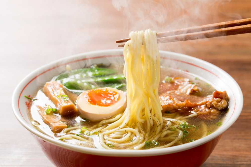
That instant: lifting noodles with chopsticks. We’ve captured this universally recognized, “sizzle”-filled moment and distilled it into a single, graphical “picture.” This logo is for a specialty shop handling various types of noodles, including ramen, udon, and soba. A key feature is the deliberate avoidance of realism in favor of bold, symbolic lines. We feel this approach gives the mark a strong, memorable impression, reminiscent of a Japanese kamon (family crest) or hanko (personal seal)—at once nostalgic and new. The square frame tightens the entire design, as if presenting it as a finished piece of art, which enhances its strength as the “face” of the brand.
Expressing Steam and Noodles
The wavy lines occupying the left side of the logo are arguably its core element. They simultaneously represent the “noodles” being lifted and the “steam” rising from a hot bowl or after being strained. By rhythmically alternating yellow and beige, it skillfully creates a sense of three-dimensionality in the noodles and that mouth-watering “sizzle” factor. The chopsticks are also rendered in simple, straight lines, contrasting with the orange background while fitting perfectly into the overall geometric composition. This bold stylization and simplification are what define the logo’s modern impression.
A Custom-Designed Character for “Noodles”
Proudly placed on the right is the kanji character for “Men” (Noodles). This is not an existing font; it was designed exclusively for this logo. While the wavy lines represent “motion,” this character is extremely thick, linear, and stable, giving it an image of “stillness.” This contrast between motion and stillness strikes a superb balance within the small square. Designed almost like a seal, this character wordlessly conveys a sense of “trust,” “dedication,” and “high quality” associated with the shop.
![]()
![]()
A Calculated Color Palette Balancing Nostalgia and Modernity
The unique atmosphere of this logo design also lies in its color scheme. The eye-catching orange, the yellow representing the noodles, and the calm beige background are all tied together by the solid black frame.
Creating a “New Retro” Atmosphere
This color combination is somewhat reminiscent of retro Japanese diner signboards or old-fashioned packaging, giving the viewer a sense of “nostalgia” and “comfort.” However, its application is decidedly modern, using flat, solid blocks of color. It’s this exquisite balance—a “New Retro” feel where nostalgia and newness coexist—that builds a brand image distinct from any other shop. It can be seen as a calculated color choice that achieves both approachability and sophistication.
The Functional Role of the Subtext
Below the main logo mark, the specific types of noodles offered (Ramen, Udon, Soba) are listed. This text, in sharp contrast to the main graphic, uses a simple, unadorned sans-serif typeface. If the main mark’s role is to convey “emotion” and “image,” this text’s role is to convey “information” accurately. It supports the logo’s strong personality without interfering with it, clearly communicating the necessary details. This typographic choice is the crucial foundation that supports the entire logo’s legibility and functionality.
![]()
This logo design is a sample.
For logo design requests, please contact us using the contact form.
The Power of a “Symbol,” Inspired by Japanese Crests and Seals
*Conceptual image
When you first see this logo, you might feel it resembles a Japanese “Kamon” (family crest) or a square “Hanko” (personal seal).
That’s a very accurate observation. This logo isn’t just “a picture of noodles”; it’s intentionally designed as a “shirushi” (a mark or symbol). This time, let’s explore the specific, professional role that this “symbol” format plays.
1. How Simplification Creates Memory
The first thing to notice is that this is not a realistic photo, but a “graphic design” composed of extremely simple lines and shapes.
- Noodles and steam become rhythmic “wavy lines.”
- Chopsticks become clean “straight lines.”
- The kanji character for “Men” (Noodles) becomes a solid “block.”
This process of simplifying elements down to their essence (a concept known as “zu-anka” or graphic simplification) has a major advantage: it’s easy to remember.
A realistic photograph of ramen, for example, contains too much visual information and fails to leave a distinct impression. A simple graphic design, however, functions as a powerful “symbol” that is instantly recognizable as “that shop’s mark.”
2. How the “Symbol” Format Conveys Trust
So, why adopt a form that resembles a “Kamon” or “Hanko”?
In Japan, crests and seals have been used for centuries as “marks” to certify a family’s identity or an individual’s authority, and to guarantee quality. Because of this history, Japanese people subconsciously associate these “symbol-like” shapes with feelings of “trust,” “authenticity,” and “tradition.”
This logo borrows the inherent power of that traditional format.
The design, which neatly contains the noodles and kanji within a tight square frame, acts like a “hanko” being stamped. It’s as if the shop is making a formal declaration: “This is who we are.” This form wordlessly expresses the shop’s “resolve” and “dedication” (kodawari) to being a noodle specialist.
By using this simplified, symbolic “mark,” the shop can intuitively convey its “status as a specialist” and a “sense of reliability” to its customers, setting it apart from any other restaurant.