
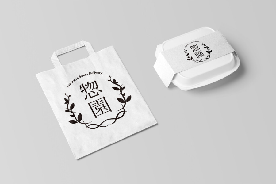
A welcoming identity for a bento delivery service
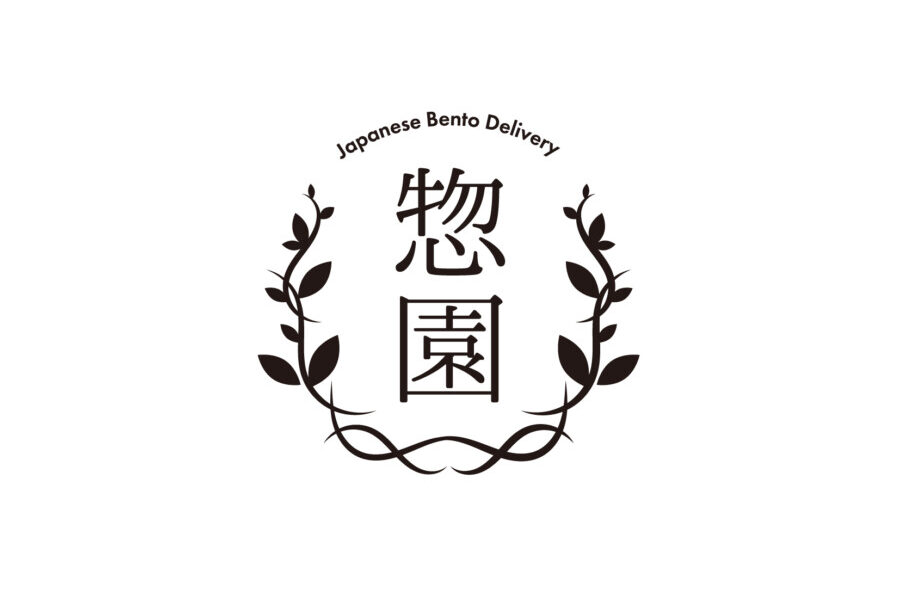
This conceptual logo places the Japanese name 悠園 inside a loosely drawn botanical wreath. The composition is intended to communicate care and hospitality without relying on a literal bento-box illustration.
Soft foliage surrounds a more formal central name, creating a balance between the warmth of a prepared meal and the reliability expected from a delivery service.
The wreath gives the mark an open, generous shape
Leafy branches form a near-circle around the name. Wreaths can suggest welcome, celebration, and continuity, while the plant forms relate naturally to food and ingredients. The opening at the top prevents the symbol from feeling sealed or rigid.
Asymmetry keeps the botanical element alive
The leaves vary in size, direction, and spacing. This controlled irregularity makes the wreath feel drawn and organic rather than generated from a repeated geometric unit. The intertwined lower branches give the mark a stable base.
Typography adds dignity to the organic symbol
The kanji name uses a Mincho-based treatment with enough structure to remain calm inside the irregular wreath. Subtle differences in stroke character keep the two kanji from appearing mechanically identical.
The central name provides a formal counterpoint
A fully handwritten name might make the identity feel too casual. The more disciplined letterforms communicate an established service while allowing the wreath to carry the softer expression.
Arched supporting text completes the silhouette
The English service descriptor follows the upper curve in a thin sans serif. It identifies the category without competing with the Japanese name and helps the open wreath read as one complete mark.
Natural materials reinforce the concept
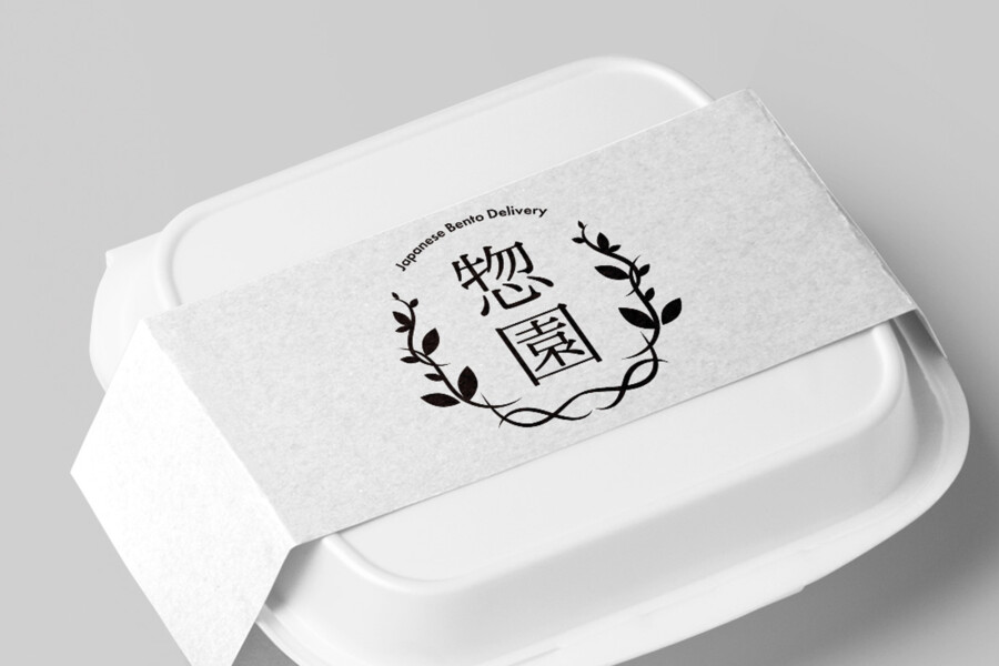
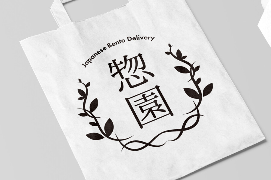
Uncoated paper, kraft stock, and lightly textured packaging complement the botanical linework. Glossy surfaces could still be used, but they would give the same logo a cleaner and less handmade tone.
This is a conceptual logo design sample. The final service name, business description, colors, and reproduction rules would be confirmed for an actual project.
How warmth and reliability coexist in the mark

Concept visualization
The wreath carries the emotional message
Customers do not need to identify a specific plant to understand the soft, attentive tone of the surrounding foliage. Its role is to frame the service as welcoming, not to make a factual claim about organic or healthy ingredients.
The name carries recognition and continuity
The central Japanese lettering remains stable as materials and formats change. This allows the identity to extend from meal bands and paper bags to delivery vehicles, ordering screens, and printed invoices without losing its center.
Before launch, fine leaves and small English text would be tested at reduced sizes. A simplified wreath or name-only version would be prepared for stamps, embroidery, social icons, and thermal printing, where the complete linework may not reproduce reliably. Color and paper guidance would keep the identity coherent when individual meal ranges or seasonal menus require their own accents. Delivery vehicles and ordering screens would use the clearest high-contrast version for rapid recognition at a distance and in motion.