
An eel restaurant identity drawn as one calligraphic gesture
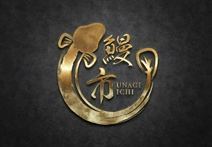
This conceptual logo was designed for an unagi restaurant named 鰻一, Unagi Ichi. An eel curves around the central name to form a broad circle, giving the ingredient and the lettering one shared visual language.
The design aims for energy without becoming a mascot. Brush texture, changing stroke weight, and a compact silhouette create a mark suited to a specialist restaurant.
The eel motif forms the outer structure
The curved body encloses the name and directs the eye around the composition. Its circular movement can suggest continuity and connection, but the primary function is clear recognition of the restaurant’s specialty.
Image and name use related brushwork
The eel and the kanji share rough edges and variations in ink density. Because they feel drawn by the same hand, the mark reads as one identity rather than an illustration placed beside separate text.
Romanized lettering adds contemporary clarity
UNAGI ICHI appears in a clean sans serif beside the expressive symbol. It gives international guests a readable name and prevents the identity from relying entirely on cultural recognition of the kanji.
One-color strength supports a wide restaurant system
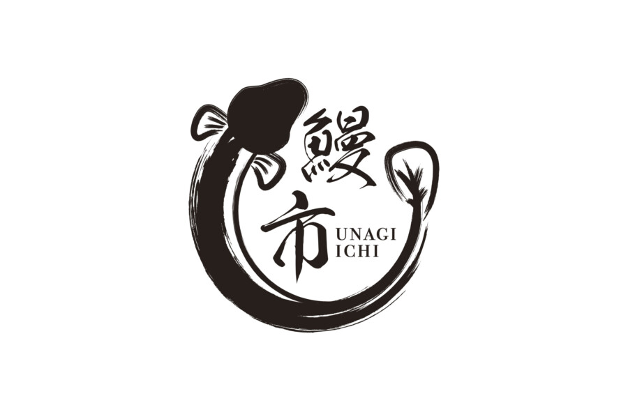
The black version reveals the essential form and preserves the character of the brush. It can extend across noren curtains, tableware, menus, wrapping paper, takeaway packaging, stamps, and digital interfaces.
Monochrome keeps the mark functional
A strong single-color identity is easier to reproduce across fabric, ceramics, paper, and screens. Dry-brush detail adds energy, but the circular outline and central name remain the main recognition features.
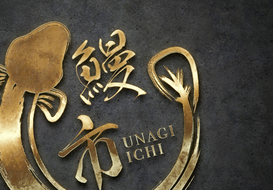
Gold can mark formal or celebratory applications
Rendered in raised gold against a dark material, the same logo takes on a more ceremonial tone. This treatment may suit gift boxes or premium signage, while everyday uses can remain direct and monochrome.
Motion and centered structure remain in balance
The eel introduces movement, while the central kanji and circular silhouette provide stability. The neutral Latin lettering then supplies an informational layer outside the brush composition.
This is a conceptual logo design sample. The final restaurant name, calligraphy, symbol, colors, and application standards would be confirmed for an actual project.
How the ingredient becomes a memorable brand icon
Concept visualization
Stylized action is more distinctive than a realistic drawing
The mark does not describe every detail of an eel. Its speed, curve, and brush rhythm communicate movement and vitality, allowing the image to remain clear at the scale of a sign or small icon.
A shared style unifies ingredient and name
Using one brush language prevents the eel from becoming a detachable mascot. The ingredient is presented as the core of the restaurant identity and remains visually tied to 鰻一.
Modern type keeps the identity accessible
The romanized name supports pronunciation, search, maps, and bilingual menus. It provides information without asking the expressive calligraphy to become more literal or less distinctive.
Production testing would cover fabric, ceramics, foil, illuminated signs, menu printing, delivery packaging, and social icons. A simplified small-size version would preserve the circular eel and central name while reducing brush texture that cannot reproduce consistently.