![]()
Uniting Tradition and Grace: A Logo Design for a Japanese Restaurant
This logo design serves as the “face” of a Japanese fine-dining restaurant. At its heart is a powerful brushstroke, dynamically rendered to form a circle. Enclosed within this ring is a single character representing “Wa,” or harmony—the core spirit of the establishment. This circular motif is inspired by the Ensō, a symbol in Zen calligraphy often representing the universe or a perfect, unending form. In this design, it seems to express the connection (en) with guests and the harmonious world created by the cuisine and the atmosphere. While rooted in traditional calligraphy, the execution feels crisp and modern, establishing a dignified air. We feel it creates a strong identity that instantly communicates a refined Japanese space.
Dynamic and Static: A Dignified Calligraphic Balance
The logotype is composed of two distinct calligraphic styles. The Ensō and the central character have a “dynamic” feel, capturing a sense of movement and even the energetic splash of ink. In contrast, the characters for the restaurant’s name (the part corresponding to “Fine Dining”) are rendered in a more orderly, “static,” and formal style. This contrast between motion and stillness creates depth and rhythm in the overall design. It’s almost as if it symbolizes the passionate, precise work of a chef within a serene, traditional setting. This combination aims to express a business that honors tradition while simultaneously embracing innovation.
The Aesthetics of “Ma”: Using Negative Space to Create Atmosphere
This design also places great importance on the use of yohaku, or negative space. Careful attention was paid to the Ma—the Japanese concept of interval or pause—in the layout. The Ensō motif, the calligraphic name, and the scattered blossoms are all positioned to maintain a comfortable tension without crowding one another. When used on a sign, as seen in the image, the white background itself becomes this essential negative space, allowing each element to breathe and stand out. Rather than filling the canvas, this design luxuriates in this emptiness. This “aesthetic of subtraction,” which is central to Japanese design, reinforces the image of a refined restaurant space where one can experience a relaxed, unhurried flow of time.
![]()
![]()
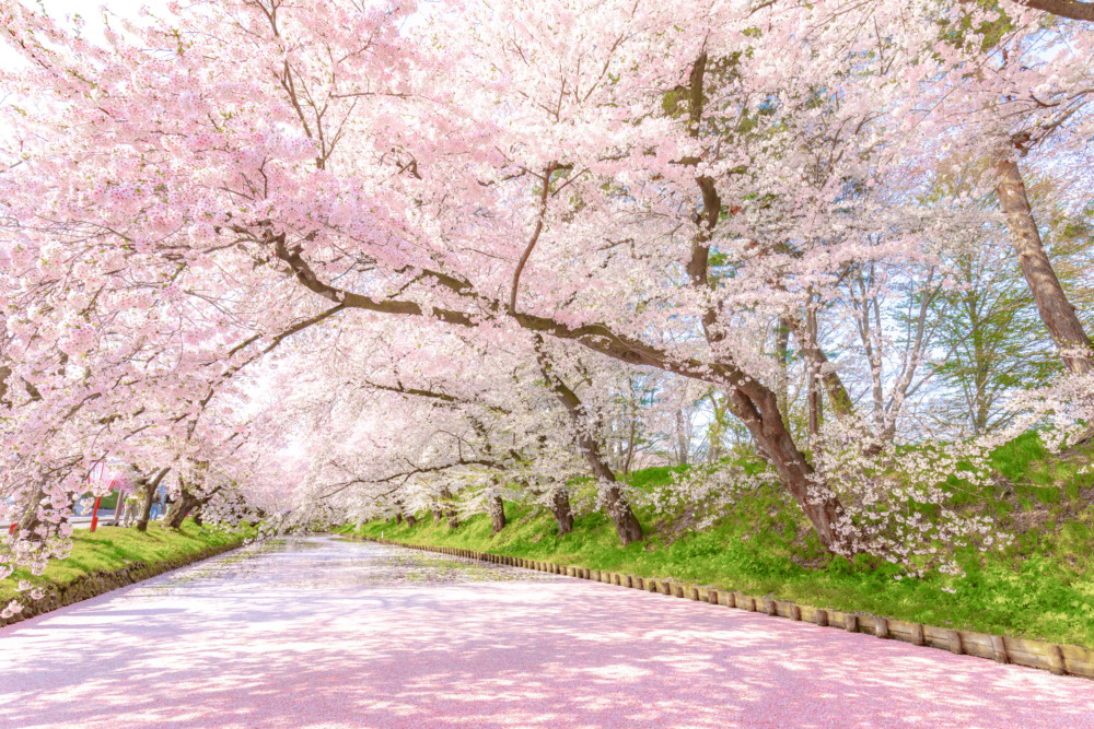
A Touch of ‘Hana’: Adding Grace and Japanese Sentiment
Powerful, monochrome calligraphy alone can sometimes feel austere or even intimidating, perhaps making a restaurant seem unapproachable. To balance this, the design incorporates the motif of sakura (cherry blossoms), which symbolize the Japanese seasons and the spirit of omotenashi (wholehearted hospitality).
Softening the Impression: The Role of a Single Accent Color
The key to this design’s balance is the accent of light pink. While the black ink conveys “formality” and “authenticity,” the gentle pink of the blossoms introduces “warmth” and “elegance.” This addition helps create a more approachable and welcoming atmosphere, inviting customers to visit. The color is a direct reference to sakura-iro, or traditional cherry blossom pink, adding a tasteful, not gaudy, touch of splendor. By intentionally limiting the color palette and using this single accent color effectively, the design maintains a sophisticated impression while gaining emotional depth.
A Modern Reinterpretation of a Traditional Motif
Although the cherry blossom is a highly traditional motif, its depiction here is not realistic. Instead, it’s rendered as a simple, graphic silhouette. This choice allows it to harmonize with the logo’s overall modern atmosphere. Furthermore, the blossoms are not arranged uniformly; they are scattered as if dancing in a gentle breeze. This “calculated randomness” introduces a sense of natural movement into the design, appealing to the viewer’s emotions. This logo was designed to function as a new standard of “Wa,” reconstructing traditional elements—calligraphy, the Ensō, and sakura—within a contemporary design framework.
This logo design is a sample.
For logo design requests, please contact us using the contact form.
Why This Black and Pink Work Together
*Conceptual image
When you see this logo used as a storefront sign, the combination of “black brushwork” and “light pink sakura” is particularly striking. I’d like to dive a bit deeper into the professional role these specific colors and motif choices play in the design.
1. The “Dignity” of Black and the Need for Balance
In restaurant logos, especially those valuing “Wa” (Japanese harmony) and a sense of luxury, black is a very common color. As the color of sumi (traditional ink), black has a strong ability to convey “tradition,” “authenticity,” and “formality,” which builds trust in the establishment.
However, as you see in the image of the sign, using black alone can sometimes feel too heavy or make the restaurant seem a bit too exclusive or intimidating. To make customers feel welcome, the balance between this “dignity” and “approachability” is the key.
2. The Role of “Sakura Pink” as a Balancing Accent
This is where the accent of “sakura pink” becomes so effective. This pink isn’t just there to make the design look pretty.
It gently softens the “heaviness” of the black, visually communicating the restaurant’s “warmth” and “spirit of hospitality” (omotenashi).
Furthermore, sakura (cherry blossoms) are a powerful symbol of Japan’s seasons. The presence of this motif subconsciously builds anticipation for the “seasonal ingredients” and “dishes full of seasonal feeling” that the restaurant offers.
3. Expressing Modern “Wa” with Silhouettes
Another point to notice is the way the sakura are depicted.
Imagine for a moment if they were drawn as highly realistic illustrations. The impression might become too old-fashioned, clashing with the logo’s overall modern atmosphere and the contemporary building facade shown in the image.
Instead, the design intentionally uses simple, graphic silhouettes. This choice allows the logo to use the traditional sakura motif without feeling dated. It successfully reinforces the restaurant’s identity as a refined, yet modern, “Wa” (Japanese) space.
As you can see, logo design is a process of controlling the exact “atmosphere” an establishment wants to project. This is achieved by precisely tuning not only the forms (like logotypes) but also the use of color and the stylistic expression of its motifs.