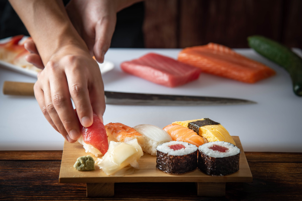
![]()
A sushi bar logo that blends traditional strength with modern playfulness.
This is a brand logo design for a sushi restaurant. The most eye-catching elements are the two kanji characters of the restaurant’s name, rendered in a bold, dignified typeface, and the small, modern mon (crest-like symbol) placed to the upper left. The name, which is the logo’s protagonist, powerfully expresses the “prestige” and “reliability” of a traditional sushi establishment. At the same time, the symbol and the secondary typeface (used for the business category) are intentionally softer, adding a touch of “playfulness.” It strikes a precise balance—not overly formal, yet certainly not cheap—that seems to capture the restaurant’s unique personality.
A Bold, Golden Logotype That Commands Attention
The restaurant’s name is not set in an existing font; it’s a custom-designed logotype with significant volume. Its thick, stable letterforms have a strong presence, especially when used on a sign. The color chosen is a “mustard yellow” or “old gold,” which is intentionally muted. It has a different, calmer feel than a shiny, reflective “gold.” We feel this color choice expresses the unwavering “inner strength” of the restaurant—the artisan’s “commitment” and “confidence.”
A Softer Typeface to Create an Approachable Atmosphere
In sharp contrast to the powerful name, the text above it identifying the business as a “Sushi-dokoro” (sushi place) uses a softer, rounded typeface. This has a functional role in “conveying information,” but just as importantly, it communicates the shop’s “atmosphere.” If this text had been a rigid serif (Mincho) or calligraphic font, the entire establishment might have felt too formal and intimidating. This softer font introduces a “friendliness” to the design, suggesting a wide, welcoming entrance for all customers.
![]()
![]()
A Modern Crest: The Brand’s Signature Emblem
The small symbol in the upper left plays a role just as important as the restaurant’s name in this logo design.
A Contemporary Reinterpretation of a Traditional Crest
This square mark is a modern reinterpretation of a Japanese kamon (family crest) or hanko (personal seal). A “seal” like this functions as a symbol that guarantees the shop’s “quality” or “heritage.” By deliberately avoiding literal pictures of sushi and instead using geometric patterns, it functions as a sophisticated “emblem” that doesn’t feel old-fashioned. It possesses enough visual strength to be recognizable as the shop’s icon, even when used apart from the name.
A Four-Part Design with a Red Accent
Looking closely at the symbol, you can see a square divided into four quadrants, each with a different pattern (like waves or parallel lines). This may be an abstract representation of sushi-related motifs, such as the sea (waves) or the cut-edge of a fish fillet (parallel lines). The “red” used in only one of the quadrants is a highly effective “accent color” for the entire logo, which is otherwise black and gold. This single drop of “red” adds “vibrancy” and a sense of iki—a kind of sophisticated, traditional “pop” aesthetic associated with Edo-style sushi—and pulls the whole design together.
The Modern Feel of a Round Sign
This logo is shown on a round, projecting sign. This “circular” format is also a key element in defining the shop’s impression. A traditional Japanese restaurant might more often choose a rectangular wooden sign or a fabric curtain (noren). By intentionally adopting a modern “round” sign, it projects a “contemporary” feel that isn’t bound by tradition, as well as a “casualness” that makes it easy for anyone to enter. The logo’s dual nature of “strength” and “softness” feels perfectly encapsulated within this circular format.
This logo design is a sample.
For logo design requests, please contact us using the contact form.
Icon, Information, and Identity: The Three Languages of a Sushi Logo
*Conceptual image
The previous analysis noted this logo’s clever blend of “traditional strength” and “modern approachability.” Now, let’s explore a different aspect: how this logo masterfully uses three distinct visual languages to communicate its identity and status, even to an audience unfamiliar with the cultural context.
The Universal Icon (The Crest)
First is the square mon (crest) in the top left. This plays a role most similar to a Western “icon” or “emblem.” As the original analysis noted, it functions as a “seal” guaranteeing quality, but it also works as a symbol that transcends cultural barriers.
The key element here is the use of “red.” This red not only alludes to sushi neta (like tuna) but, more importantly, a “red square on a white background” acts as a powerful visual hook, unconsciously signaling “Japan” to an international viewer.
Even if the text is unreadable, this small emblem instantly communicates “something of high quality from Japan.”
The Functional Text (The ‘Sushi-dokoro’)
Next is the black text reading 「寿司処」 (Sushi-dokoro). This is a “functional language,” directly informing those who read Japanese that “this is a sushi place.”
However, its true role, as mentioned in the previous analysis, lies in its soft, rounded typeface. It skillfully neutralizes the “intimidation factor” or “high barrier to entry” that can be associated with traditional, high-end sushi.
This is communication through tone: it sends a message of welcome, effectively saying, “We are not stuffy or unapproachable.”
The Symbolic Text (The ‘Tsurukame’ Name)
Finally, we have the main protagonist: the golden name 「鶴亀」 (Tsurukame). This is a “symbolic language.” Even for a Japanese speaker, its deepest meaning (“Crane and Turtle” = longevity and good fortune) requires specific cultural knowledge.
For an English-speaking viewer, this element is not “read”—it is “felt.”
They will not perceive it as letters, but as a single, powerful, artistic graphic. Its commanding volume and muted “old gold” texture bypass logic to symbolize the core values of the sushi experience: “tradition,” “authenticity,” and “craftsmanship.”