
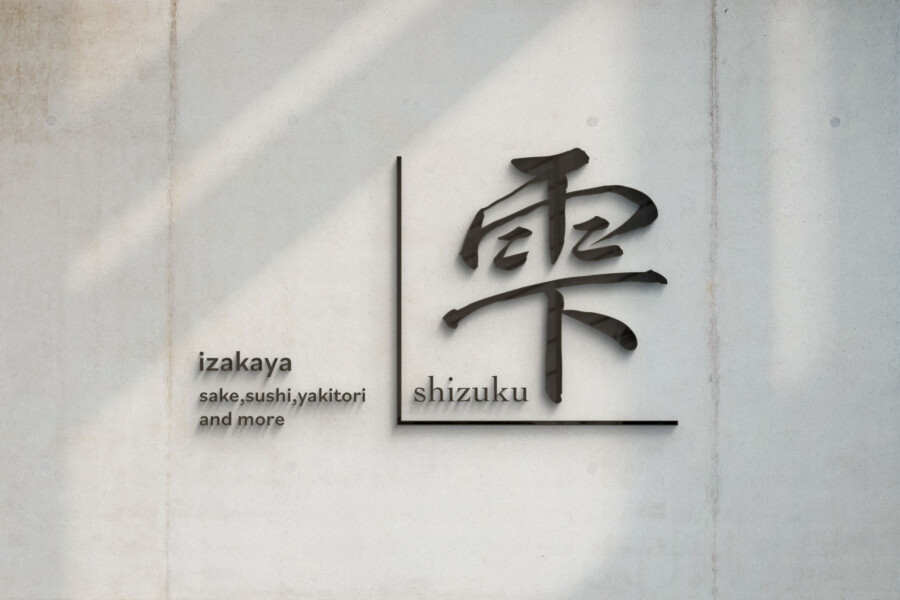
A modern izakaya identity where information meets expression
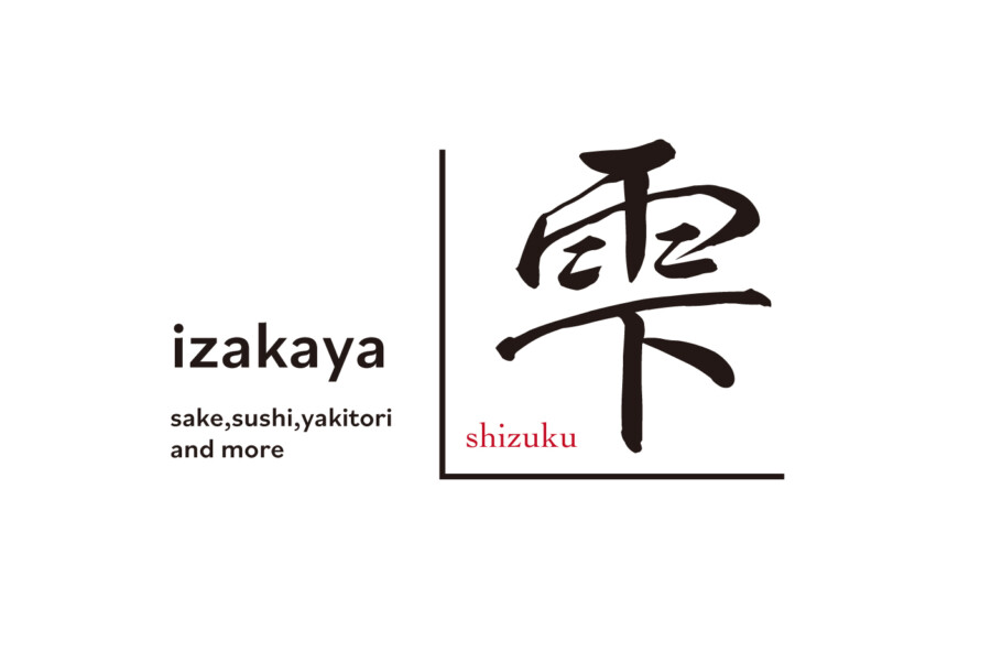
This conceptual logo was designed for an izakaya named 雫, Shizuku, meaning droplet. A large calligraphic character carries the emotional side of the identity, while clean Latin lettering communicates the category, pronunciation, and menu focus.
An L-shaped line separates the two areas without disconnecting them. The result is asymmetrical but controlled, combining the atmosphere of Japanese brushwork with the clarity of a contemporary hospitality brand.
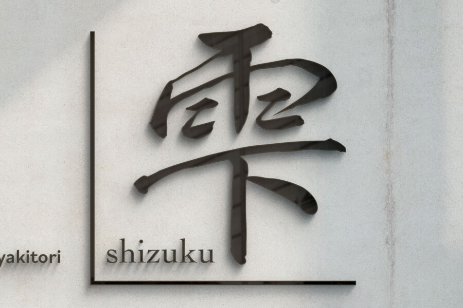
The character 雫 suggests motion and stillness
The changing ink density can recall a falling droplet and the quieter ripple that follows it. This interpretation connects the name to sake and water without requiring a literal drop icon.
The L-shaped frame gives the calligraphy a modern boundary
A rigid line runs along the side and base of the character. It can loosely recall the geometry of a square masu sake cup, while also functioning as a practical divider between the expressive and informational elements.
A small red romanized name provides focus
Most of the identity is monochrome. The red SHIZUKU line therefore becomes easy to locate and connects the Japanese character with a readable pronunciation for international guests.
The layout gives emotion and information separate space
The left side identifies the business as an izakaya and lists sake, sushi, and yakitori in a modern sans serif. The right side gives the calligraphic name room to function as the primary image.
Clean type acts as a guide
Guests unfamiliar with Japanese dining terms can scan the Latin lettering without having to interpret the calligraphy. The typography is intentionally neutral so it does not imitate a Japanese style.
Calligraphy carries the distinctive atmosphere
For readers of Japanese, 雫 remains the restaurant name. For other viewers, its proportion and brush rhythm still provide a memorable visual symbol. Both functions can coexist without reducing the character to ornament.
Transparent and concrete materials extend the contrast
Acrylic and concrete give the application an architectural precision. The slight shadow behind raised lettering introduces depth, while the calligraphy preserves a visible trace of hand movement.
This is a conceptual logo design sample. The final restaurant name, menu wording, colors, and environmental applications would be confirmed for an actual project.
Why the boundary improves bilingual communication
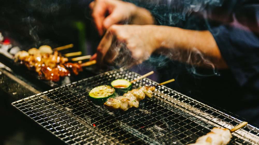
Concept visualization
Separation prevents either writing system from becoming artificial
The Latin lettering can remain highly readable, and the Japanese character can retain its expressive form. Forcing both into one style would weaken either the information or the visual character.
The frame creates a relationship without requiring symmetry
The two sections differ in scale and density, but the L-shape aligns their bases and gives the full lockup a clear outer silhouette. This makes the asymmetry feel intentional rather than unresolved.
Final testing would cover exterior signs, menus, glassware, coasters, reservation listings, and social icons. A character-only mark and a compact bilingual version would support small formats, while clear-space rules would preserve the tension between the two areas. The red accent would be standardized across illuminated, printed, and digital applications.