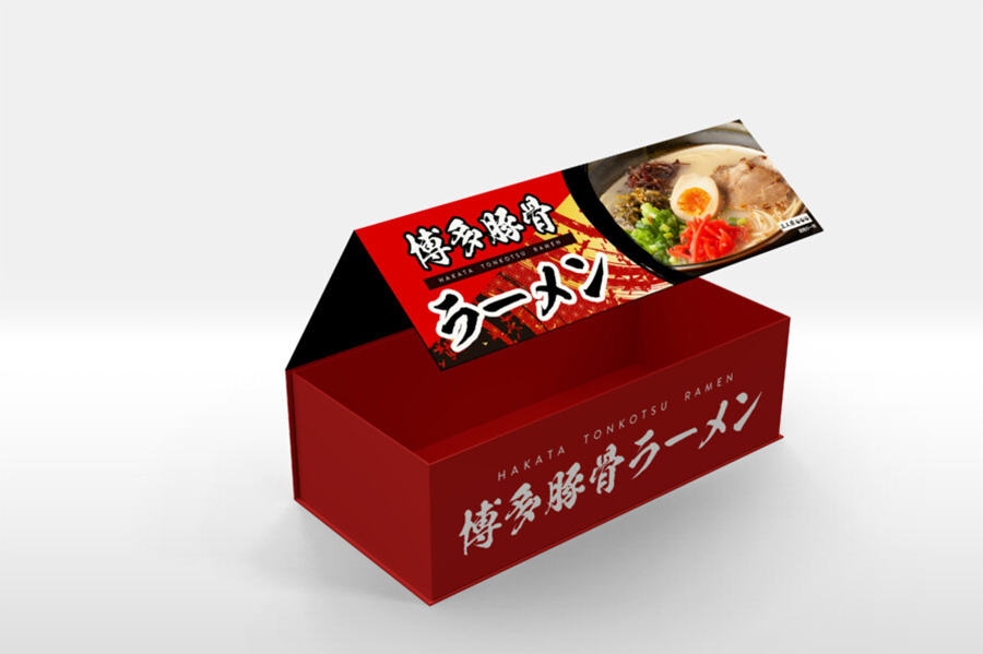
A Souvenir Package That Builds Anticipation for Authentic Flavor with Passionate Colors and an Evocative Photo
We were responsible for the gift box design for a local souvenir ramen. The role of a souvenir package is to allow customers to bring home a “culinary experience” along with their travel memories. In creating the design, our first priority was how to elevate the “anticipation for authentic flavor.” To achieve this, we selected a passionate, deep “red” as the key color. We feel this color strongly stimulates the appetite, as it can evoke the energy of tonkotsu (pork bone) ramen, the “richness” of the soup, or even the red pickled ginger topping. The sturdy, box-like shape is not only functional for protecting the contents but is also intended to provide a sense of “dignity” as a gift for a valued person.
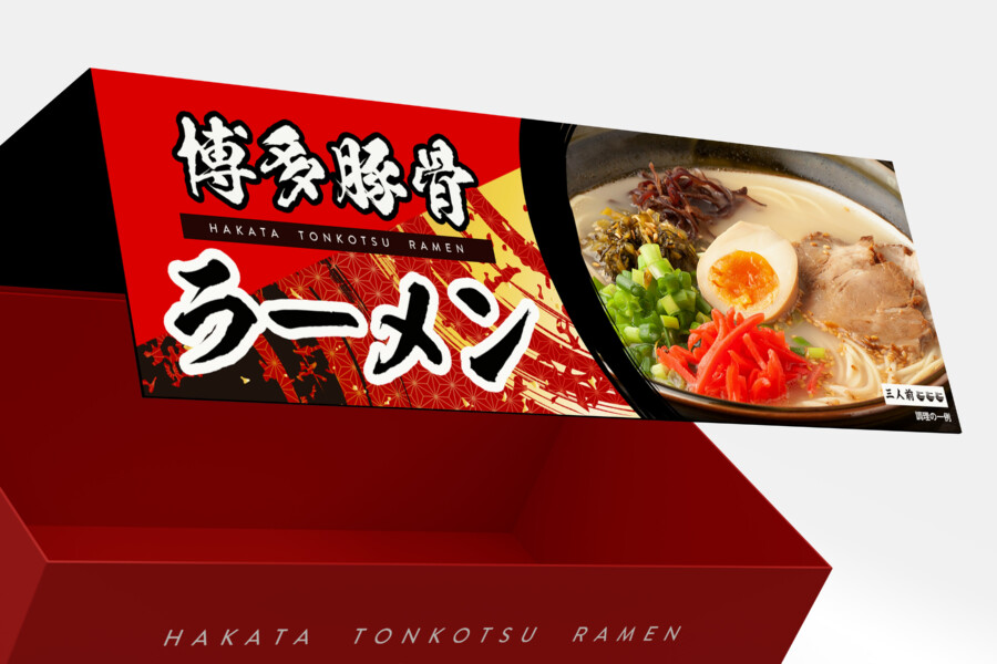
The Lid Design: A Direct Appeal to the Appetite
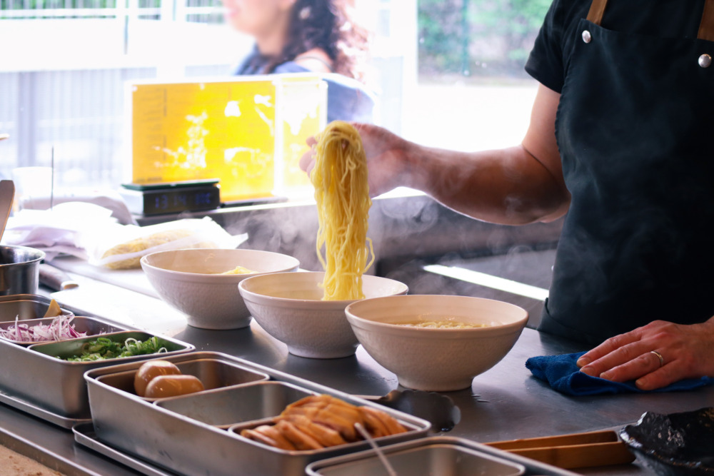
The top of the lid, which the consumer sees first, is truly the “face” of the package. Here, we used a crisp “black” background to make the evocative photo of the ramen, placed in the center, stand out vividly. The photo, which realistically conveys the steam and details of the chashu pork, seasoned egg, and green onions, intuitively communicates the product’s “deliciousness” without need for explanation. This “black” also feels symbolic of a specialty shop’s “noren” (curtain) or a “secret sauce” cultivated over many years, suggesting the artisan’s “dedication” and “depth.” The strong contrast with the “red” of the main box enhances its visibility at the point of sale.
A Logotype That Conveys Tradition and Power
In the center of the package, we placed the product name logo, which defines its identity. As this is a product representing the food culture of its region, we adopted a vigorous calligraphic script to convey its “history” and “seriousness.” This typeface expresses the ramen chef’s passion and the “power” of the soup. In particular, the parts indicating its regional origin, such as “Hakata Tonkotsu,” are designed in white against a red background to make a an especially strong appeal for its identity. It is not just textual information but is memorable as the “face” of the brand. We feel this powerful logotype serves to anchor the entire design.
Balancing “Dignity” as a Souvenir with “Clarity”
Souvenirs are often chosen in the excitement of travel and are also intended to be given as gifts. Therefore, the design must balance “instant appeal” with the “quality feel of a gift.” We pursued this balance by organizing the color scheme and layout. We designed this package with the hope that it would become a “bridge” connecting fond travel memories with authentic flavor. We’ve incorporated subtle details to ensure the feeling of excitement continues right up to the moment the recipient opens the box.
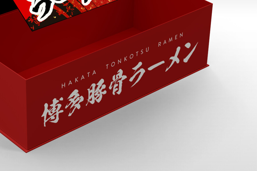
The Side Panels: Conveying Identity Even When Stacked
In contrast to the black lid, the sides of the box are composed entirely of the key color, “red.” This was a consideration for how the product would “appear” when stacked flat or lined up on a shelf in a store. From any angle, and even from a distance, it functions as a “brand color” that makes the product instantly recognizable. We placed the same logo in white on the side as on the front to ensure visibility. By avoiding excessive decoration and expressing the brand cleanly with just color and logo, we intended for the product’s unique “character” to stand out, even on crowded souvenir shelves.
The “Black” Interior: Staging a “Thrill” for the Moment of Opening
In this package, the experience of opening the lid is also considered part of the design. In a complete switch from the passionate “red” exterior, the inside is unified in “black.” This vivid color change from outside to inside perhaps functions like a switch, shifting one’s mindset from the everyday to a “special culinary experience.” Furthermore, making the interior black naturally draws the eye to the products (bags of noodles and soup) packed inside, with the expected effect of making the contents stand out even more. It is a subtle staging to make the very act of opening the souvenir an enjoyable part of the experience.
Incorporating a Global Perspective in the Text
Alongside the traditional calligraphic logo, we’ve included an English notation in a modern, highly readable sans-serif font. This is a consideration not only for domestic travelers but also for the increasing number of international tourists, helping them to intuitively understand that this is “Ramen from Hakata, Japan.” Japan’s local food culture is now loved globally. We hope that by combining the “emotion” of the traditional script with the “functionality” of the Western font, we can help convey the product’s appeal to an even wider audience.
This package design is a sample.
For logo design requests, please contact us using the contact form.
A Design Perspective: How This Package Delivers a “Travel Memory”
*Conceptual image
A souvenir package is more than just a box. It’s a crucial device for carrying home the “experience” and “energy” of a trip. This Hakata Tonkotsu Ramen box is full of thoughtful design choices intended to do just that.
The Red & Black Contrast: Evoking the Yatai Atmosphere
The design’s “Red” and “Black” foundation does more than just stimulate the appetite. This color scheme evokes the energetic atmosphere of Hakata’s food culture, particularly its famous late-night yatai (food stall) scene.
“Black” can represent the night sky or the iconic, well-worn noren (shop curtains).
“Red” captures the warm glow of chochin (paper lanterns), the “vibrancy” of the crowds, and the “passion” of the ramen itself.
This powerful contrast visually expresses the energetic “heat” of the city, intuitively telling the customer, “This is that authentic flavor you’re looking for.”
The “Sizzle Photo”: The “Goal” of the Culinary Trip
A souvenir is often bought with one desire: “I want to enjoy that amazing flavor from my trip one more time at home.”
The appetizing “sizzle photo” (realistically showing steam and glistening toppings) placed boldly on the lid is the direct “answer” to that desire. It’s not just explaining the contents. It’s a powerful promise: “The ‘goal’ of your culinary journey is right here in this box.” When a consumer is choosing from countless items in a shop, this clear “destination of deliciousness” becomes the final, persuasive deciding factor.
The Side Panel as the Star: A Strategy for Discovery
Picture a souvenir shop at an airport or station. Products are packed tightly onto shelves, meaning the top of the box often isn’t visible. More often than not, all you can see is a long row of “side panels.”
This design anticipates that exact scenario. While the lid is black and detailed, the side of the box is a simple, powerful composition: “solid red + logo.” This ensures that even from a distance, or when stacked high, the product is instantly recognizable. The intentionally minimal side panel is a crucial “design for discovery,” helping it stand out and be found among its many competitors.