
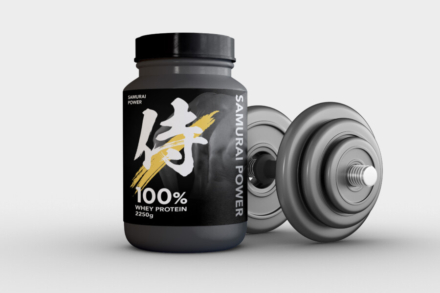
A supplement package built around discipline and focus
This conceptual fitness-supplement package uses the samurai as a brand metaphor for discipline, concentration, and sustained effort. Rather than filling the surface with technical graphics, the design gives one bold symbol a central role.
Matte black establishes the overall tone. White keeps the symbol and essential information clear, while a restrained gold accent introduces movement and distinction.
A calligraphic symbol creates immediate recognition
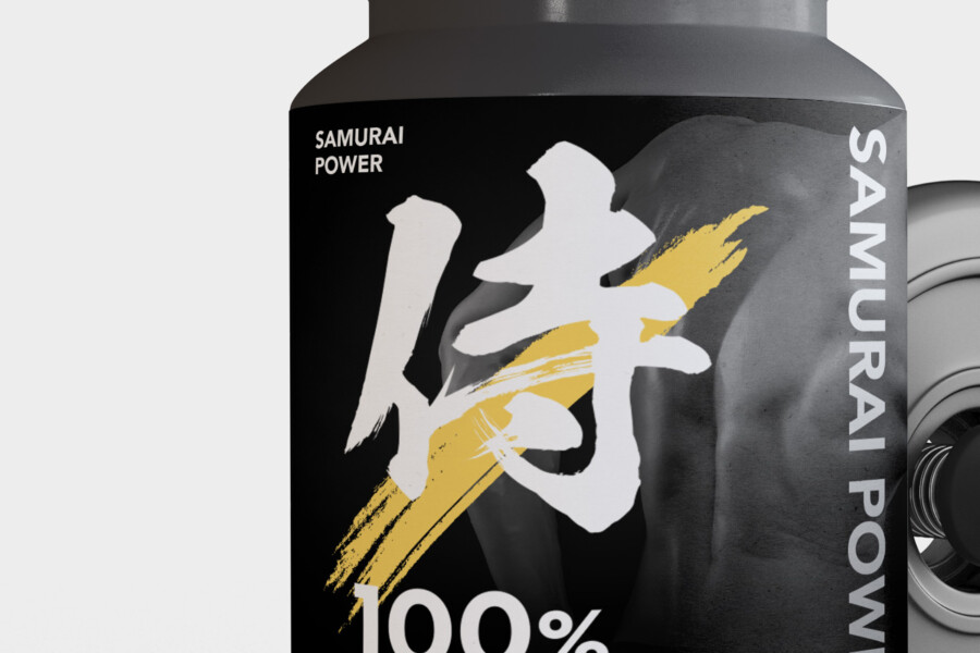
The large central mark is designed to remain recognizable at shelf distance and in small online thumbnails. Its rough brush edges give it energy, while the simple placement keeps the front panel controlled.
Modern typography keeps product information functional
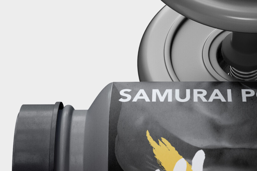
A strong sans-serif typeface identifies the brand and product category. The vertically arranged Latin lettering echoes the direction of the central symbol without imitating Japanese calligraphy. Core information such as 100% Whey Protein remains easy to find.
Packaging designed to support a training mindset
The container is intended to feel like part of the user’s routine. Its restrained palette and durable appearance suit a gym bag or training space without relying on exaggerated performance claims.
Black, white, and gold each have a clear role
Black creates continuity across the container, white provides maximum legibility, and gold acts as a focused accent. Keeping gold limited to the brush-like splash prevents the package from becoming decorative or ceremonial.
Stillness and movement create visual tension
The matte surface feels controlled and stable, while the gold stroke appears to cut across it with speed. That contrast reflects the relationship between consistent training and moments of exertion without stating a literal product outcome.
A distinct direction within the supplement category
Many fitness products use bright gradients, metallic effects, or scientific diagrams. This concept takes a different route, using a culturally specific metaphor and a compact information hierarchy to create recognition.
This is a conceptual package design sample. Product claims, required labeling, container specifications, and production methods would be supplied and approved for an actual project.
Three details that hold the concept together

Concept visualization
The samurai reference centers on discipline
The concept is not intended as a general statement about Japanese culture. It uses a focused association—disciplined practice—to connect the brand with the daily commitment required by training.
The gold accent interrupts the matte surface
A single energetic stroke is more effective here than several competing effects. It gives the mark emphasis and helps the package retain impact in photography and online listings.
The vertical axis reinforces stability
The symbol and side lettering share a strong vertical direction. This creates a consistent spine through the layout and makes the different type styles feel related.
Before production, the design would need to be tested on the actual container and viewed from several distances. The amount of essential supplement information, mandatory claims, flavor identification, and barcode placement could affect the balance of the front and back panels. The concept therefore provides a visual system, not a substitute for the approved regulatory copy or final production testing.