
A botanical skincare system with a quiet Japanese character
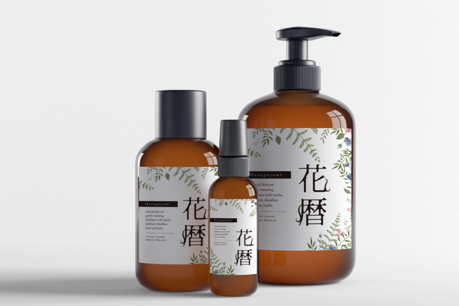
This conceptual skincare line includes pump, spray, and standard bottles. The design needed to remain consistent across different formats while creating a gentle, composed presence in a washroom or on a vanity.
Amber containers provide a warm foundation, white labels create a clean information field, and delicate botanical illustration frames a vertical Japanese name. The result combines natural references with a modern product system.
Botanical illustration introduces softness and variation
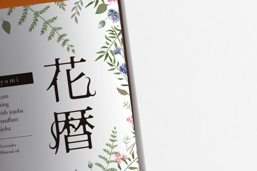
Fine green leaves and small blue and pink flowers sit near the upper and lower edges of the labels. Their watercolor-like treatment suggests plant ingredients without turning the front panel into a dense botanical pattern.
A vertical Japanese logotype forms the central axis
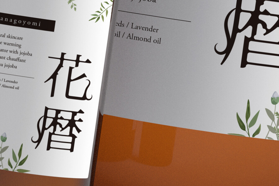
The product name 花暦, Hanagoyomi, is set vertically in an elegant Mincho-style treatment. Its slender proportions give the label structure and create a clear contrast with the spreading forms of the illustration.
Designed to live comfortably in an everyday space
Skincare packaging is viewed repeatedly and often remains visible between uses. Rather than maximizing contrast in every detail, this design aims for long-term visual comfort and easy recognition across the product family.
White space separates the key messages
Open areas keep the illustrations, Japanese name, and supporting information from competing. The white label also provides consistent contrast against the varying shapes and shadows of the amber containers.
Latin lettering supports functional information
Product type and ingredient names use a restrained sans-serif typeface. This text is kept distinct from the Japanese logotype so customers can scan practical information without weakening the brand’s central visual feature.
One design rule adapts to several containers
The position of the illustration, name, and supporting copy adjusts to each bottle while the underlying hierarchy remains consistent. This flexibility allows future products to join the range without losing recognition.
This is a conceptual package design sample. Ingredient claims, required labeling, container specifications, and production details would be supplied and approved for an actual project.
Details that give the line a cohesive presence

Concept visualization
Amber glass brings visual history, not a product guarantee
Amber bottles are familiar from apothecary and cosmetic packaging and can suggest care, preservation, and formulation. Those visual associations support the concept, although actual protective performance depends on the specified container and product.
The vertical name creates a distinct silhouette
Horizontal Latin lettering is common in contemporary cosmetics. A single vertical Japanese axis therefore gives the labels a recognizable rhythm while remaining restrained.
The product family shares one recognizable face
When different bottle types appear together, the repeated label structure makes them feel intentional rather than accumulated. This matters both on retail shelves and in the customer’s own space.
At production stage, the label system should be tested against the actual curvature, cap, pump, and spray components. Small type, transparent areas, label seams, moisture resistance, and color consistency across substrates can all affect the finished result. Those checks help preserve the calm visual direction when the design moves from mockup to manufactured packaging.