
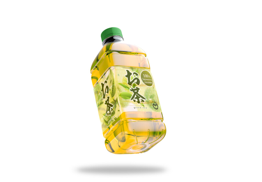
A green-tea package that lets the drink provide the color
This conceptual beverage label uses the clear bottle and yellow-green tea as active parts of the design. Instead of covering the container with an opaque sleeve, the label frames the liquid and coordinates with its natural color.
Japanese calligraphy identifies the product, while tea-leaf illustration and pale green washes connect the printed surface with the contents. The approach makes freshness visible without adding unnecessary information.
A strong name remains readable against the liquid
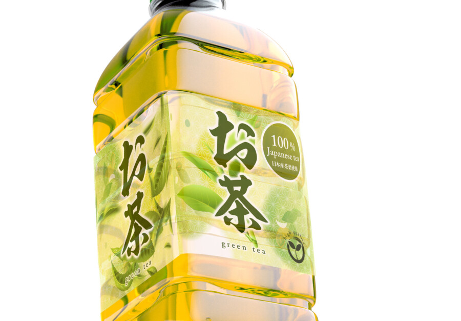
The main お茶 logotype sits on a lighter, more opaque field so its brush forms do not disappear into the changing color behind it. This practical contrast also establishes the clearest point in the hierarchy.
Botanical elements extend beyond the solid label area
Tea leaves appear on translucent film around the name. Because the liquid remains visible beneath them, the illustration feels integrated with the bottle rather than printed on a separate white panel.
Designing refreshment through transparency and movement
The label aims to evoke a cool, freshly poured drink through color and openness. In a refrigerated display, the liquid, transparent film, and layered greens work together as one visual field.
Translucent and opaque areas perform different tasks
Opaque areas protect the legibility of the name and required information. Translucent areas allow the color of the tea to remain visible. Dividing these roles creates both functional clarity and a lighter visual impression.
An asymmetrical layout avoids a static appearance
The name sits slightly off center and the leaves move around it with varied spacing. This controlled asymmetry adds rhythm and keeps the bottle from feeling overly rigid.
Several greens create depth without introducing extra colors
Pale washes, brighter leaf tones, and the drink itself form a layered palette. The variations distinguish information levels while preserving a clear product-category signal.
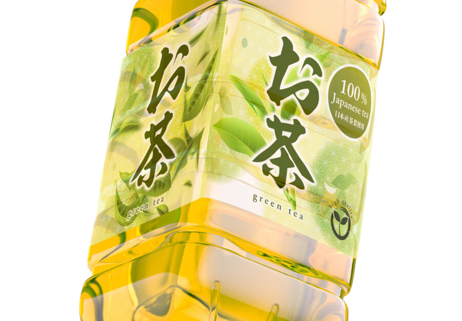
This is a conceptual package design sample. Product origin, ingredient claims, required labeling, bottle specifications, and production details would be supplied and approved for an actual project.
Three details that support purchase decisions

Concept visualization
Reading and feeling are handled separately
The solid field provides reliable text contrast, while the clear film lets the customer experience the beverage color directly. The label therefore does not force one surface to solve every communication task.
Movement suggests freshness
Scattered leaves and a slightly off-center name introduce the visual movement of leaves unfolding in water. The effect remains subtle enough for everyday beverage packaging.
A circular mark organizes an approved product claim
The small quality mark turns supporting information into a recognizable unit near the main name. In an actual project, its wording would use only verified claims supplied and approved by the client.
The final label would be reviewed on a filled bottle because the tea color, condensation, refrigerator lighting, and film transparency all alter contrast. Nutrition information, ingredients, recycling marks, barcode, and best-before details would then be organized on the appropriate panel without weakening the main product name or obscuring the beverage color that defines the concept.