
A Wagashi Gift Box That Conveys Quality Through Traditional “Texture” and “Color”
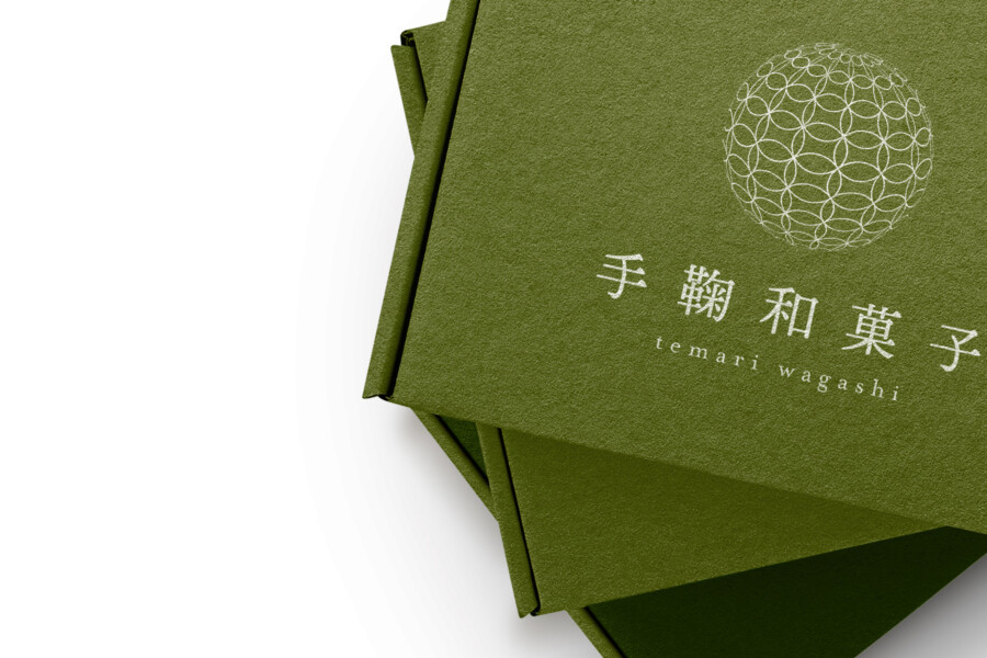
We handled the package design for a wagashi (traditional Japanese sweet) that evokes the “Temari,” a beautiful, round craft ball. The theme was how to express the dignity of a gift item and the product’s delicate worldview through the “vessel” of a box. We chose an approach that speaks directly through “material texture” and “color,” eliminating all excessive decoration. For the key color, we adopted a deep, calm “matcha green,” symbolizing Japanese tea and nature. By combining this color with a coarse texture reminiscent of washi (Japanese paper), we intended to convey the “spirit of Wa” and a “sense of quality” not only visually but also through the sense of touch.
A Traditional Pattern Symbolizing the Product’s “Roundness”
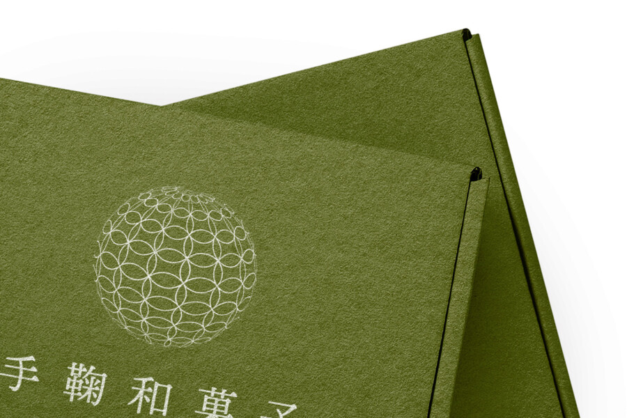
The design’s focal point is the spherical symbol mark placed on the top right of the lid. This directly expresses the “Mari” (ball) from the product’s name. The sphere is composed of the “Shippo” pattern, a traditional motif. This auspicious pattern, with its endlessly interlocking circles, signifies “good fortune” and “harmony,” making it ideal for the message embedded in a gift. By reconstructing this traditional pattern into a modern, geometric sphere and drawing it with delicate “white” lines, we feel it creates a beautiful contrast with the rustic texture of the box itself.
A Mincho-style Logotype That Creates a Refined Atmosphere
Below the symbol, we placed the product name in Japanese. Rather than a strong calligraphic script, we intentionally selected a slender, sophisticated typeface based on the “Mincho” style. The straight vertical lines and the variation in line weight of this typeface give the entire design a “dignified tension” and “grace.” Furthermore, the small Western text added below it brings a “modern” touch to the traditional atmosphere, allowing it to fit into contemporary lifestyles. It doesn’t overstate itself; it just exists quietly. We feel this modest presence resonates with the worldview of wagashi.
Eloquent “Material Feel” and the Aesthetics of Subtraction
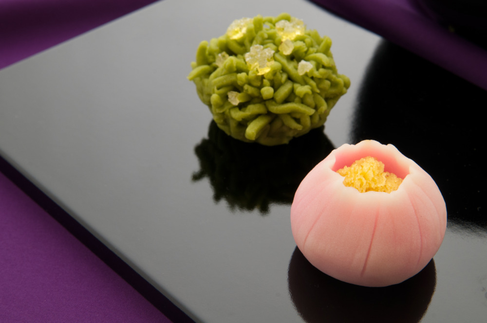
The star of this package is not just the graphics, but the “material feel” of the box itself. The “fibrous feel of the paper” that you sense when you pick it up—we believe this is the most eloquent element for conveying the “warmth of handiwork” and “sincerity” behind the product. In an age overflowing with information, we believe that by adhering to an “aesthetics of subtraction”—paring elements down to their absolute minimum—we can, in fact, create a stronger presence and a memorable “sense of specialty.” This box plays the role of an important “prologue” before one even tastes the sweets inside.
“Negative Space” That EnhANCES the Depth of Color and Texture
A key feature of this design is that the area of “unprinted negative space” is far greater than the area where graphics are printed. This bold “negative space” is the core of the design. Because of this space, our attention is naturally drawn to the “depth of the color” and the “texture” of the paper itself. If this space were filled with more information or decoration, this beautiful matcha color and warm texture might have been lost in the background. It doesn’t tell the whole story, leaving room for imagination in the margins. We feel this modesty connects to a Japanese sense of beauty and the product’s premium quality.
A Refined Presence That Wraps the Giver’s “Heart”
We aimed to design not just a “container,” but the “gifting experience” itself. The recipient first picks up this quiet, beautiful box. Its color and texture build anticipation for the contents inside. We imagined this flow of “feeling.” Because the decoration is minimal, it leaves room for the giver to add their own “finishing touch,” such as tying a ribbon or wrapping it in a furoshiki (traditional wrapping cloth). The package, the exterior, quietly but surely speaks for the “delicate care” embodied in the sweets within. We hope you can feel that sense of presence.
This package design is a sample.
For logo design requests, please contact us using the contact form.
Two Reasons This Box Feels “Premium”
*Conceptual image
The quiet, luxurious feel of this wagashi box isn’t just due to its color or minimalist layout. It hides clever techniques that appeal to both sight and touch, making the consumer feel “this is not just a box” the moment they pick it up.
Sincere Design: Making the Paper’s “Color” the Star
The most unique feature of this package is that it’s not white paper “printed” with green ink. The box itself is crafted from “deep green paper stock.”
Unlike printing a solid color on white paper, this makes the “color” and “texture” of the paper itself the main features of the design. The logo and pattern are then printed in “white ink” on top of this coarse paper.
When held, this creates a subtle “tactile contrast” between the “paper’s natural fibrous feel” and the “slightly smoother feel of the printed ink.” This small tactile stimulus is what eloquently speaks to the “authenticity” and “quality” that a digital image can’t fully capture.
The Thread-Like Pattern: Hinting at the Delicacy Inside
As the existing text notes, the spherical pattern is based on the “Shippo” (seven treasures) motif, expressing the product’s “Temari” (traditional thread ball) theme.
What’s notable here is the method of expression. This is not a solid, filled-in sphere. It is drawn with extremely thin “white lines,” giving it a “lightness,” as if it were crafted by winding delicate “threads” over and over.
This contrast—between the “heavy, solid-colored box” and the “light, thread-like logo”—serves to “imply” the quality of the contents within. It suggests that inside this “substantial gift box” lies a “delicate and intricate wagashi.” It’s a mechanism that quietly builds the consumer’s anticipation before the box is even opened.