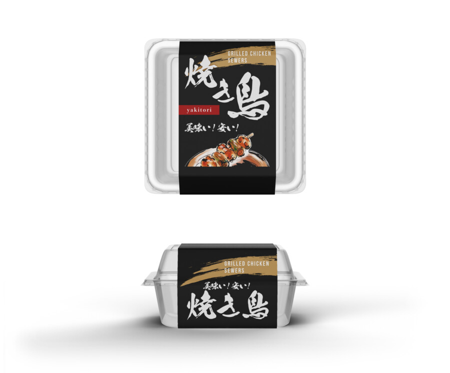
A Takeaway Package That Condenses Sizzle and Energy, Based in Black
We handled the package design for takeaway yakitori. This is a band-style label that acts as the brand’s “face,” while still leveraging the primary advantage of the clear container: “showing the contents.” The “black” base color evokes the “iki” (chic, stylish) atmosphere of a specialty yakitori shop and the “power” of charcoal grilling. This black background also creates a strong contrast with the color of the yakitori visible through the container and the “sizzle” of the photograph placed in the center of the label. Although it’s a casual takeaway product, it was designed to feel “authentic” and “serious.” We aimed for a strong, solid presence.
An Energetic, Calligraphic Product Name That Grabs the Eye
The most eye-catching element is the large product name logo, rendered in white. We adopted an energetic calligraphic style that seems to convey the “live” feeling of grilling, the rising smoke, and the appetizing aroma. While appearing to be a traditional script, it also gives a very modern impression as a design. This powerful typeface becomes the “core” of the entire design, functioning as an eyecatch that makes it recognizable from a distance as “that shop’s, that flavor.” Furthermore, the gold brushstroke accent at the top evokes the “flame” of the charcoal or the “glaze” of the sauce, adding a touch of luxury and “heat” to the design.
A Sizzle Photo and Handwritten “Voice” That Directly Hits the Appetite
Below the calligraphic logo, we placed a sizzle photo that intuitively conveys the product’s “deliciousness.” By realistically showing the shine of the sauce and the char on the green onions, it strongly stimulates the consumer’s desire to eat. An even more distinctive feature is the handwritten-style catchcopy added next to it. By intentionally incorporating straightforward “voices” like “Delicious!” and “Cheap!”—which seem to speak for the customer—we feel it expresses both approachability and “confidence” in the product’s value. We believe this “raw energy” is the true charm of this design.
A Design Balance That Achieves Both a “Specialty Shop Atmosphere” and “Casual Ease”
This design skillfully combines elements that, at first glance, seem contradictory. The black-based background and powerful calligraphic logo create the “dignity” and “authenticity” of a specialty shop. On the other hand, the handwritten-style catchcopy and the clear container that intentionally shows the contents provide a “casual ease” and “friendliness” unique to takeaway. We believe this balance of “premium” and “casual” is the reason it gives off a “special presence” among the many other products on supermarket or deli shelves. Because it’s something to be enjoyed every day, we valued that “iki” (style) in the design that elevates the mood, even just a little.
Western Text and Accent Colors That Reinforce the Worldview
Looking at the details, you can also see functional considerations. Near the product name logo, “yakitori” is added in Western text on a small, red tag-like design. This functions as a design accent, adding a pop of “red” to the “Wa” (Japanese) black worldview, while simultaneously playing a “universal design” role to tell non-Japanese customers what the product is. Above that, the more specific “GRILLED CHICKEN SKEWERS” is also placed. We believe these thoughtful details help to “widen the doorway,” contributing to communicating the product’s appeal to more people.
The Potential for Brand Expansion, Unified by the “Band”
This package adopts a “band label” style wrapped around a clear container. The advantage of this format isn’t just that it shows off the “sizzle” of the contents. For example, if the brand expands its product line in the future to include other types of yakitori like “tsukune” (chicken meatballs) or “kawa” (chicken skin), they can use the same container and simply change the band label design. This allows for easy “series expansion.” It maintains “brand unity” while efficiently adding variations. We consider this “scalability” to be one of the important functions of package design.
This package design is a sample.
For logo design requests, please contact us using the contact form.
Three Details That Create That “Delicious!” Feeling

*Conceptual image
This takeaway yakitori package has a special presence that stands out in a supermarket or deli. Let’s dig deeper into how its “sizzle” and “specialty shop atmosphere” are created.
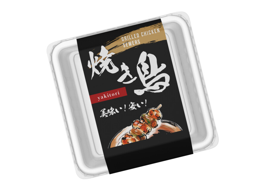
“Ideal Sizzle”: The Power of Illustration Over Photography
The appetizing yakitori in the center of the label is not a photograph; it’s a highly realistic “illustration.”
Why make this choice? A photograph can sometimes be too real. The lighting might make the sauce look too dark, the charring might look like a flaw, or it might just look slightly different from the actual product inside.
An illustration, however, allows the designer to capture the “ideal moment” of deliciousness. It can perfectly render the “gloss” of the tare sauce, the “char” on the green onion, and the “juiciness” of the meat. By condensing only the best parts, it creates a powerful “sizzle” that perfectly matches the consumer’s expectation of what “delicious” should look like.
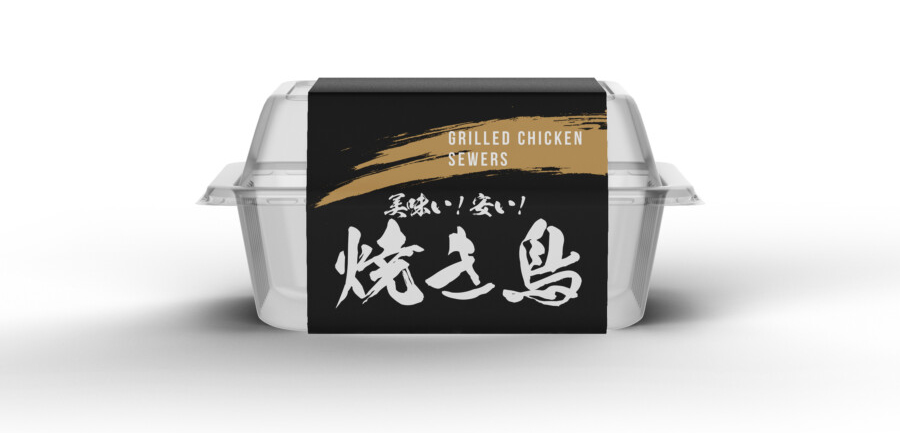
The “Band Label”: A Sign of Confidence in the Contents
This package uses a “band label” (obimaki) wrapped around a clear container, rather than a bag or box that hides the contents. This is a deliberate choice. It allows the brand’s “face” (the label) to be seen, while also saying, “Go ahead, look at the ‘real thing’ inside.”
This “no-hiding” posture is a sign of the maker’s “confidence” in their quality. It allows the consumer to compare the “idealized illustration” on the label with the “actual product” in the container, building trust. As a bonus, the black background of the label provides a strong contrast, making the colors of the yakitori visible through the clear plastic appear even more vibrant.
The “Voice POP”: Designing a Lively Shout
The handwritten-style catchcopy “美味い!安い!” (“Delicious! Cheap!”) is a key accent. This isn’t just descriptive text.
It’s a “Voice POP”—a design that visualizes the “energetic shouts” you might hear from the shopkeeper at a traditional yakitori stand. By inserting this “raw voice” into the otherwise sophisticated, black-based design, it breaks any sense of stuffiness and adds a feeling of “liveliness” and “humanity.” This “gap” is the clever trick that allows the product to convey “specialty shop quality” and “casual, everyday approachability” all at the same time.