
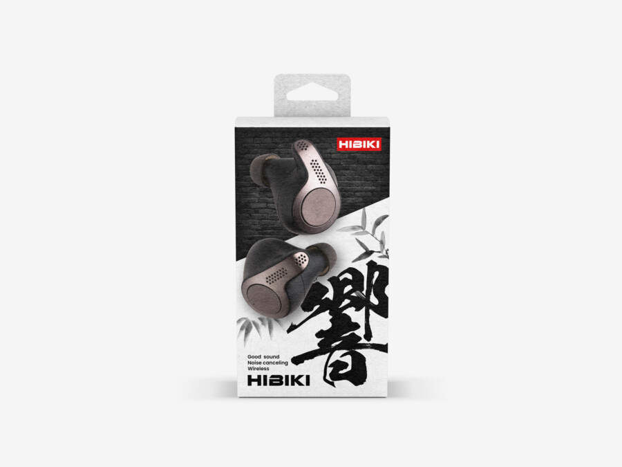
Earphone packaging between urban energy and Japanese calm
This conceptual wireless-earphone package brings together two contrasting visual environments. A black brick texture suggests the density of the city, while the open white lower section creates a quieter field for the product and information.
A large calligraphic character, realistic product rendering, and small red brand mark connect the two areas. The design uses contrast to introduce the idea of moving from outside noise toward a focused listening space.
The character 響 gives the product a memorable center
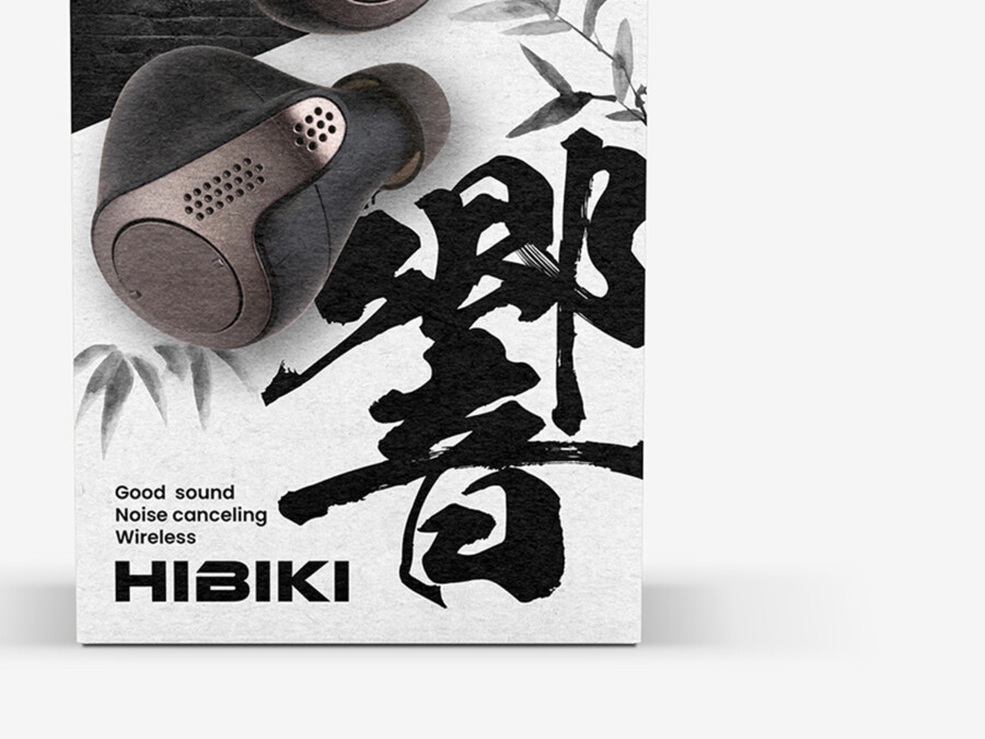
響, read as hibiki, can mean resonance or echo. Its brushwork provides movement and a distinctly Japanese graphic element, while the meaning relates directly to sound. Faint bamboo imagery softens the surrounding space without competing with the name.
Product imagery keeps the technology tangible
The earbuds are shown with enough detail to communicate form, finish, and wearing surfaces. Overlapping the product with the textural boundary prevents it from feeling detached from the package concept.
A visual identity built from deliberate contrast
The package does not attempt to make every element stylistically uniform. Its character comes from placing urban texture, Japanese calligraphy, bamboo, and precise product graphics within one controlled grid.
Brick and bamboo describe two sound environments
The hard brick texture can be read as external noise and city activity, while the white bamboo field suggests calm and separation. The product sits between them, supporting the noise-cancelling message through layout rather than an additional diagram.
Black, white, and red create a compact palette
Monochrome surfaces keep the composition focused. A single red brand mark recalls the placement of a seal and provides a precise point of recognition without turning the package into a traditional pastiche.
Functional typography remains easy to scan
Feature names and supporting copy use a modern sans-serif typeface. This neutral treatment balances the expressive calligraphy and preserves the clarity expected from an audio product.
This is a conceptual package design sample. Product features, technical claims, dimensions, and production specifications would be supplied and approved for an actual project.
How the design visualizes the listening experience

Concept visualization
The boundary becomes part of the message
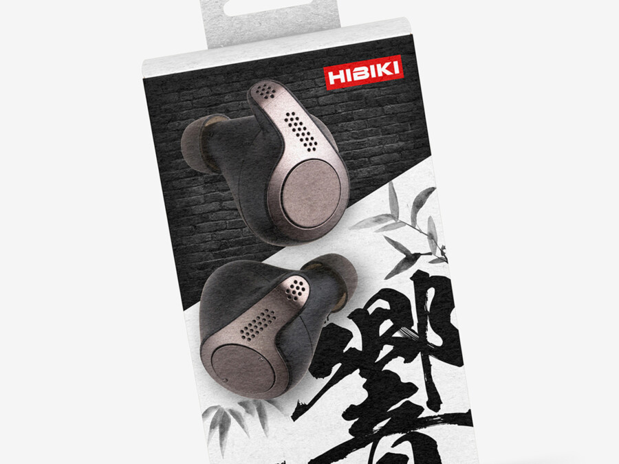
Placing the earbuds between the textured and open areas turns the page division into a functional metaphor. The composition suggests a transition without requiring customers to interpret a complex illustration.
Hibiki communicates more than the generic word for sound
The chosen name refers to resonance rather than simply audio. Changes in the calligraphic stroke weight echo the expansion and fading of a sound wave, giving the lettering a conceptual reason to be expressive.
The red mark provides a controlled signature
Because the rest of the package is almost monochrome, the small red logo becomes immediately visible. Its scale keeps it secondary to the product name while supporting consistent branding across the range.
A production-ready version would also need to coordinate the graphic system with retail requirements and the supplied technical copy. Model name, compatibility, included accessories, certifications, barcode, and multilingual specifications require a clear secondary information area so they do not dilute the front-panel concept.