Kanji or Kana? How to Choose the Right Japanese Script for Your Logo
Logos tell stories. They represent your brand’s identity at a glance, making them a critical element of any business strategy. When you decide to incorporate Japanese characters into your logo, you open up a world of possibilities—both visually and conceptually. But which script should you use? Should you go with the elegance and depth of kanji, or the simplicity and charm of kana? In this article, we will explore the characteristics of each Japanese script, along with practical advice on how to make the best choice for your brand.
Get Your Japanese Design Reviewed →
Understanding the Japanese Writing Systems
Kanji
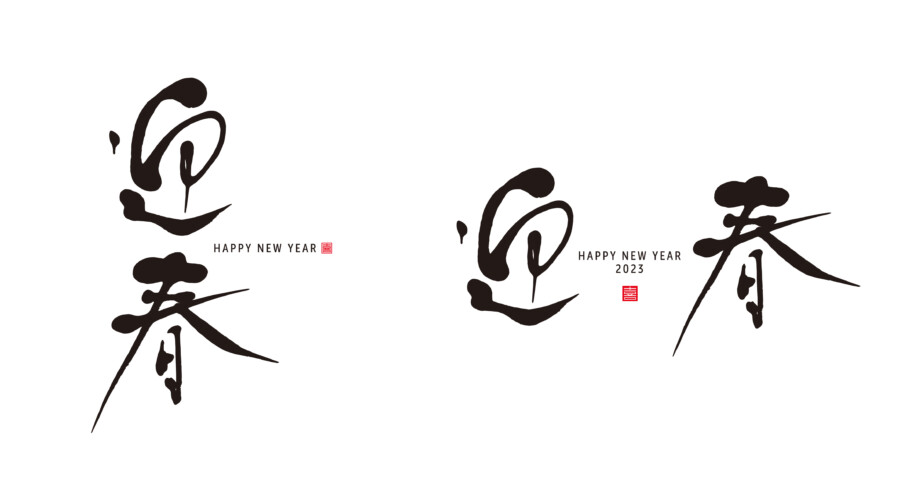
Kanji are Chinese characters that have been adopted into the Japanese writing system over many centuries. Each kanji carries a specific meaning—often multiple meanings depending on context. Because of their origin and nature, kanji characters can appear visually complex, but they hold a depth and sense of tradition that many designers find appealing. One kanji can convey multiple ideas, making it a powerful tool for storytelling and brand identity.
Hiragana
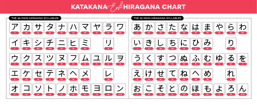
Hiragana is a phonetic script unique to Japanese. Each character (or letter) represents a specific syllable (e.g., a, i, u, e, o). Hiragana is often associated with softness, fluidity, and a more casual feel. It is frequently used in everyday writing, children’s books, and text that requires an approachable, friendly tone. If your brand aims for warmth and accessibility, hiragana might be the perfect match.
Katakana
Katakana is another phonetic script, but it’s typically used for foreign words, onomatopoeia, and emphasis. It has a more angular shape compared to hiragana, giving it a bold, modern aesthetic. Brands that want to hint at globalization or technological innovation sometimes find katakana appealing, especially if they want a contemporary, edgy look.
The Appeal of Kanji

Visual Impact and Elegance
Kanji hold a distinctive elegance. From the subtle strokes to the intricate details, a kanji-based logo can be striking at first glance. For a brand that wants to emphasize tradition, history, or sophistication, a carefully chosen kanji can make a strong visual statement.
Conceptual Depth
Each kanji has meaning beyond its phonetic reading. For instance, the character 心 (“kokoro”) carries the concept of heart, mind, and spirit all at once. Harnessing these multi-layered meanings can create a powerful symbolic connection to your brand story. If your business focuses on concepts like nature, harmony, or innovation, you can find kanji that resonate strongly with those themes.
A Sense of History
Kanji connect modern Japan to its Chinese roots, reflecting centuries of cultural exchange. When you use kanji, you tap into a long history that adds depth and credibility to your design. This can be especially appealing if your brand wants to highlight a link to tradition or craftsmanship—think artisanal products, cultural goods, or heritage experiences.
Potential Drawbacks of Kanji
However, the complexity of kanji is not without challenges. If your target audience lacks familiarity with Japanese characters, they may struggle to remember or recognize your logo. In certain cases, an overly intricate kanji might be hard to reproduce at smaller sizes—like on business cards or mobile app icons. Also, be aware that choosing a kanji purely for its aesthetic appeal without understanding its meaning can lead to misunderstandings or unintended messages.
The Charm of Kana (Hiragana and Katakana)

Simplicity and Modernity
Kana scripts (hiragana and katakana) tend to be simpler in form compared to most kanji. This simplicity can be an advantage for logo design, especially in digital contexts where crisp, clean lines tend to shine. If your brand wants a modern or minimalistic look, creating a custom kana-based logo could be the right solution.
Friendly, Approachable Tone
Many Japanese speakers associate hiragana with softness or warmth, partly due to its frequent use in children’s literature and casual writing. Meanwhile, katakana tends to feel sharper, yet it also carries a contemporary edge, particularly if your brand often incorporates foreign elements or technology. Both scripts can project an inviting, easy-to-read style, which may be useful for companies aiming to appeal to a broad international audience.
Cultural Versatility
Katakana is often the script of choice for loanwords—words borrowed from other languages, including English. If your brand name is not traditionally Japanese, using katakana can make it feel seamlessly integrated into a Japanese context. It can also highlight the global, cross-cultural spirit of your brand.
Potential Drawbacks of Kana
Although kana can be easier to read, it may not have the same visual impact or symbolic depth that a kanji might offer. A brand seeking a rich conceptual story might find kana too plain or straightforward. In addition, if you use kana incorrectly—like mixing hiragana and katakana in a way that looks unnatural—it can come across as odd to Japanese audiences.
Combining Scripts: When and How It Works
Mixing Kanji and Kana for Contrast
Some designers choose to combine kanji with hiragana or katakana to create contrast and visual variety. For instance, you might use a powerful kanji at the center of your logo to represent the core idea of your brand, then pair it with a small kana element for phonetic clarity or style. This approach can offer the best of both worlds: the deep resonance of kanji plus the simplicity of kana.
Using Multiple Scripts Thoughtfully
If you plan to combine scripts, do so with intention. The arrangement should enhance readability or reinforce your brand story, rather than confuse the audience. Consider how the characters flow together visually. When executed well, multiple scripts in one design can highlight different facets of your brand personality—a blend of tradition and modernity, formality and friendliness.
Balancing Aesthetics and Meaning
Research Before You Decide
Before falling in love with a particular character, do thorough research. What does the kanji actually mean in various contexts? How is it commonly used? Are there any negative connotations you should be aware of? For kana, check if the pronunciation aligns with your brand name in a way that’s easy to say and remember. Asking for input from native Japanese speakers or professional linguists can help you avoid awkward surprises.
Calligraphy vs. Typography
Some logos use hand-drawn calligraphy to amplify the emotional quality of the characters, giving them a sense of movement and personality. This can be beautiful, but harder to replicate in digital formats. Alternatively, using a standard typeface ensures consistency across different media, though it may feel less unique. Weigh the value of a custom approach versus a simpler, more adaptable design.
Testing and Feedback
Once you’ve narrowed down your options, gather feedback. Show your logo concepts to potential customers or professional designers—ideally, people who read Japanese fluently. A design that seems perfect in theory might come across as cluttered or ambiguous in practice. Early feedback can save you from costly redesigns down the road.
Cultural Sensitivity and Respect
Avoiding Misinterpretation
Using another culture’s script in your branding can be a double-edged sword. On one hand, it can be an exciting way to connect with different audiences. On the other, it risks misappropriation or misinterpretation if handled carelessly. For instance, using a kanji that looks visually appealing but is commonly associated with something negative in Japanese culture could alienate potential customers.
Embracing Authenticity
To avoid cultural pitfalls, authenticity is key. Seek guidance from native speakers, or even collaborate with Japanese designers. By engaging with people who understand the nuances of language and symbolism, you demonstrate respect and appreciation for the culture you’re referencing, ultimately building a stronger, more meaningful brand identity.
Practical Steps to Choose the Right Script

- Define Your Brand Values
What qualities do you want to highlight—tradition, innovation, warmth, strength? Write these down and look for possible connections to specific kanji or kana styles. - Research Script Characteristics
Study the basic look and feel of kanji, hiragana, and katakana. Compare fonts and calligraphy examples to see which resonates best with your brand personality. - Explore Multiple Concepts
Don’t settle on the first idea that comes to mind. Experiment with different characters, fonts, and layouts. Keep in mind how each element will appear in various media—websites, print materials, mobile apps, and more. - Check Meanings and Pronunciations
Confirm that any chosen kanji has the intended meaning and no unexpected connotations. If you’re leaning toward kana, make sure the phonetic spelling is clear and pleasant to read in English or other languages. - Consult Experts
Reach out to native Japanese speakers, calligraphers, or designers with a background in Japanese typography. Their insights can help you avoid mistakes and refine your design in ways you might not have considered. - Test in Context
Mock up your logo in real-life scenarios—on product packaging, websites, or signage. Ask for feedback from both English-speaking and Japanese-speaking audiences. - Refine and Finalize
Use the feedback you receive to make final adjustments. Whether you end up with a single kanji or a stylish combination of kana, ensure that the final design reflects your brand’s essence.
Conclusion
Choosing between kanji or kana is not merely an artistic decision. It’s a way of shaping how your brand is perceived—its values, its heritage, and its sense of identity. Kanji can offer depth, elegance, and historical resonance, while hiragana and katakana deliver friendliness, modernity, and clarity. Whichever path you choose, take the time to research meanings, test designs, and respect the cultural context. By blending visual appeal with authenticity, you can create a logo that resonates powerfully with audiences both in Japan and around the world.
Kanji & Cultural Accuracy Check


