The Japanese language has three characters: Kanji, Hiragana, and Katakana
Three characters are used in the Japanese language: kanji, hiragana, and katakana. In this article, we will give an overview of each of these characters and how they are used in the Japanese language.
Kanji
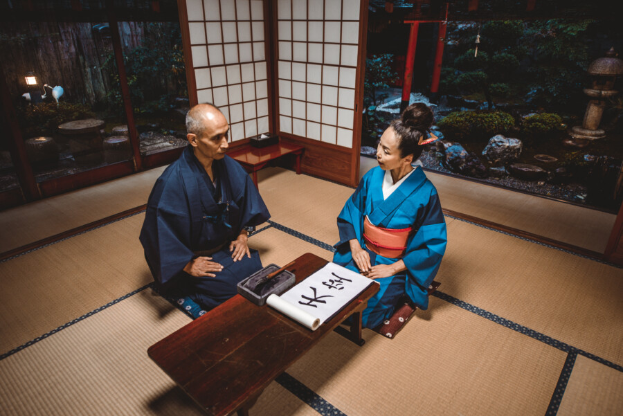
Kanji was introduced to Japan in the 5th century. There are more than 50,000 Kanji characters, but only about 2,000 of them are in common use. Kanji are mainly used to write the stems of words, and in many cases can be read in more than one way. They are also ideographs, meaning existing in each character.
Hiragana
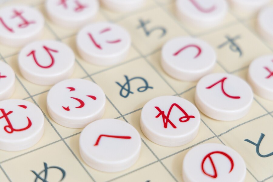
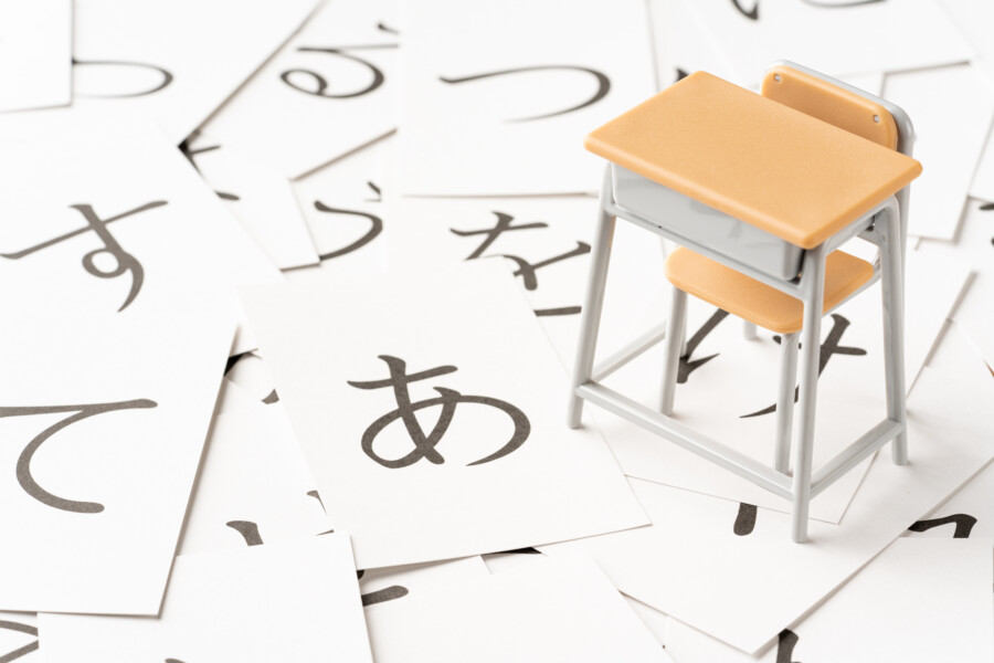
Hiragana is a phonetic script created in the 9th century. It is used to write grammatical endings and words that have no kanji equivalent. Hiragana has 46 basic characters and several variants. Its soft, curved shape gives a gentle impression when used in designs. Most Japanese sentences are composed of a combination of kanji and hiragana.
Katakana
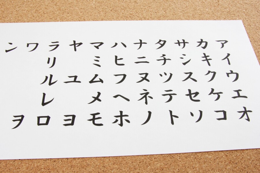
Katakana, another phonetic character, is used for foreign words and foreign personal names, and was developed in the 9th century. Katakana has 46 basic characters and several variants. It is composed of straight lines and gives a cool impression when used in designs.
In conclusion, three types of characters are used in the Japanese language: kanji, hiragana, and katakana. Kanji are ideographic characters used to write the stems of words. Hiragana is a phonetic character, used for words that do not have grammatical endings or kanji equivalents. Katakana is also a phonetic character, but is used for foreign words and foreign personal names.
How to use these characters in logo design?

When designing a logo that incorporates Japanese characters, it is important to consider the meaning and impression that each character conveys. Kanji characters can be especially powerful in conveying a message, as each character has a unique meaning and cultural significance.
Hiragana and katakana can also add a unique touch to a logo design, but they are typically used more for decorative purposes rather than conveying a specific message. For example, hiragana characters can be used to create a gentle, flowing design, while katakana characters can give a logo a bold, modern feel.
It is also important to consider the balance and spacing of the characters in the design. Too many characters or too much text can make a logo look cluttered and difficult to read. A minimalist approach with just a few characters can often be the most effective.
Incorporating Japanese characters into logo design can be a great way to add a unique touch and convey a message to your audience. By understanding the cultural significance and meaning behind each character, you can create a design that truly resonates with your target audience.
Japanese Language & Culture Supervision


