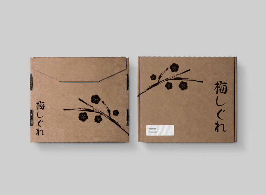
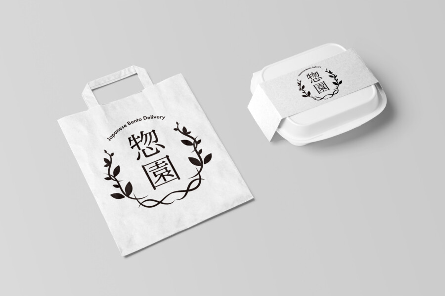
Tradition Redefined: Modern Packaging Design for Artisanal Wagashi
Weaving Tradition and Modernity: The Essence of Japanese Sweets Packaging
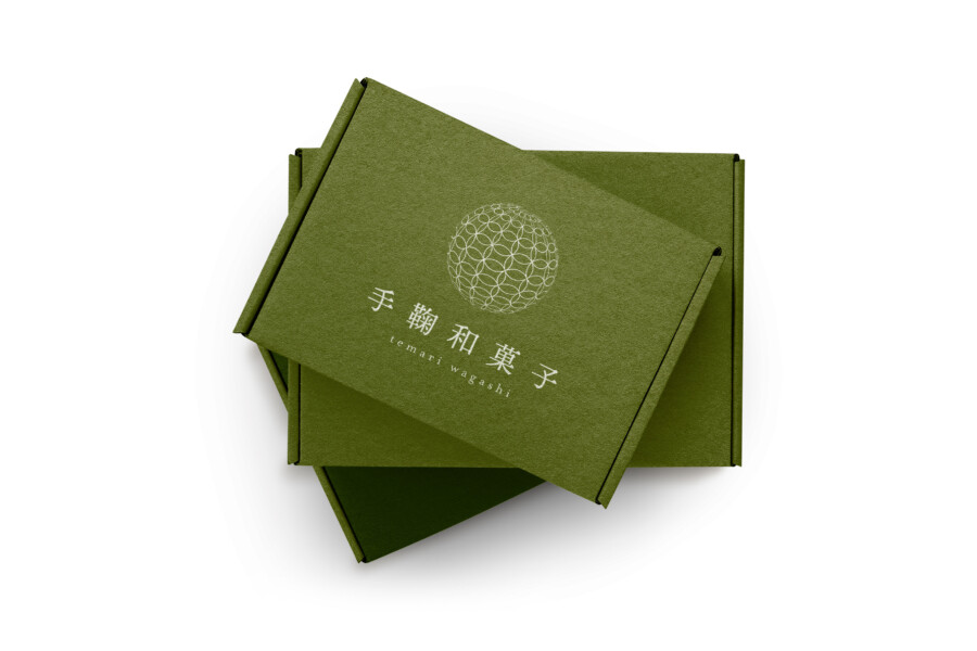
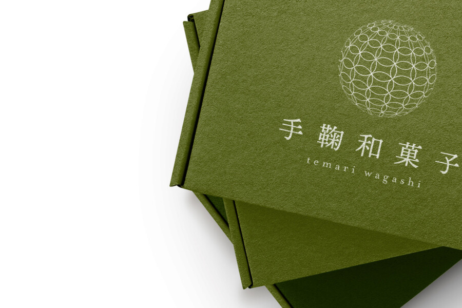
This packaging design for Japanese confectionery, known as wagashi, aims to bridge the gap between deep-rooted tradition and modern aesthetic sensibilities. The core challenge was to create a visual identity that honours the artistry and cultural significance of wagashi while appealing to a contemporary audience, potentially including those unfamiliar with these traditional sweets. The design needed to convey elegance, quality, and a sense of Japanese heritage without relying on overly complex or cliché elements. The chosen deep green colour palette provides a sense of calm and naturalness, perhaps evoking matcha tea or serene Japanese gardens, setting a sophisticated stage for the confectionery inside. This colour choice, combined with the texture of the material, feels both organic and refined, suggesting a high-quality, carefully crafted product. The overall impression is one of understated luxury, inviting the consumer to discover the delicate treat within. It seeks to respect the past while feeling relevant and appealing today.
Elegance in Simplicity
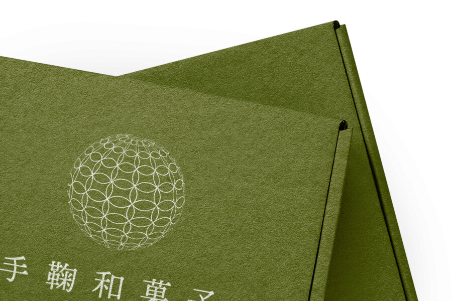
The design emphasizes minimalism and clean lines. A refined sans-serif font for the romanized product name complements the elegant Japanese characters, creating a harmonious balance between the two scripts. This typographic choice enhances readability for a wider audience while maintaining a distinctly Japanese feel. The texture of the packaging material itself plays a crucial role; it’s not just a container but part of the sensory experience. This tactile quality adds depth and suggests the use of natural, high-quality materials, hinting at the craftsmanship involved in both the packaging and the product. The layout is uncluttered, allowing the central graphic element and the product’s descriptor text to stand out. This simplicity is intentional, reflecting a common Japanese design principle where beauty is found in restraint and carefully considered details, ensuring the focus remains on the product’s inherent quality and the cultural context it represents.
The Symbolic Temari Motif
Central to the design is a delicate, circular geometric pattern. This motif is reminiscent of a Temari, a traditional Japanese embroidered ball, often given as a symbol of deep friendship, good fortune, and cherished feelings. Incorporating this pattern subtly infuses the packaging with layers of cultural meaning and artistry. It speaks to intricate craftsmanship and the care invested in creating something beautiful, mirroring the meticulous process of making wagashi. The pattern is rendered in a clean, modern style, preventing it from appearing overly traditional or old-fashioned. It serves as a visual focal point, drawing the eye and adding a touch of decorative elegance without overwhelming the design’s minimalist foundation. This symbol acts as a quiet nod to Japanese heritage, enriching the consumer’s experience and providing a deeper connection to the product’s origins.
Communicating Quality Beyond Words
Ultimately, the packaging design aims to communicate the premium nature and artistry of the wagashi before the box is even opened. The combination of the calming colour, tactile material, elegant typography, and symbolic motif works together to create an aura of sophistication and quality. It suggests that the contents are crafted with the same level of care and attention to detail. This approach moves beyond simply containing the product; it seeks to create anticipation and enhance the ritual of enjoying these traditional Japanese sweets. The understated elegance makes it feel appropriate for various occasions, particularly as a thoughtful gift. It’s believed that this design successfully conveys a sense of authenticity and refinement, appealing to those who appreciate subtle beauty and cultural depth in the products they choose.
Professional Japan-Ready Packaging
AMIX Design Studio has spent the past decade honing its craft in Japan. Through our dedicated label Japanify Works, we create designs that celebrate kanji, the Japanese language, and Japan’s rich culture—covering everything from Japan-inspired packaging to fully bespoke branding. Quotes are always free, so drop us a line any time!
This package design is a sample.
For package design requests, please contact us using the contact form.
Contact Us
Also viewed: