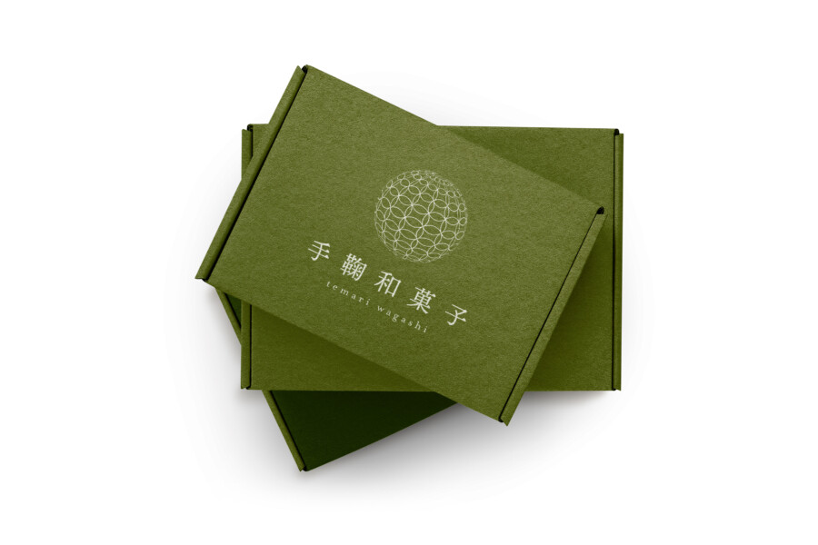
Package design for a Japanese sweets shop
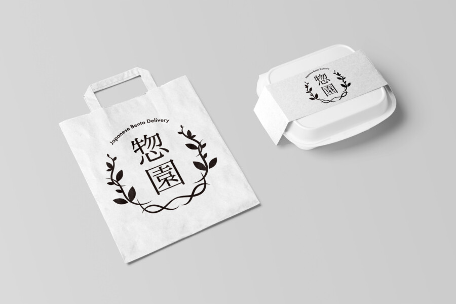
Paper Bags with “Wagara” Patterns Give a Kimono-ish Impression
Most of the Japanese sweets (wagashi) are plant-based, which attracts attention as vegan food. In countries outside Japan, Japanese confectionery packages often adopt modern and sleek designs. In this project for a Japanese confectionery brand, we have focused on a traditional feel. We worked on the brand identity and packaging.
Logo Design: Embracing Traditional Calligraphy
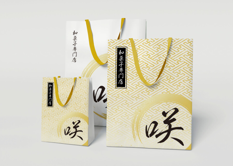
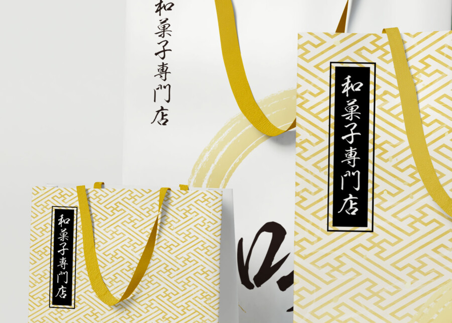
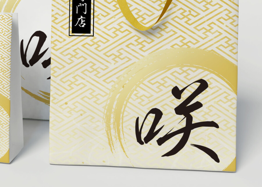
The brush calligraphy used for the logo shows elegant curves drawn with quick, skillful strokes. Circling the character with a bold brush line makes it a perfect match for traditional Japanese sweets. The word in the vertical rectangle explains that this is the Japanese sweets specialty shop.
Paper Bags as Brand Ambassadors
Paper bags play an important role in branding. The design of them conveys your messages to customers with its colors, shapes, and finish. We put one of the typical Japanese traditional patterns (Wagara) on the background. You can find such patterns on kimonos, hand towels, and many small Japanese items.
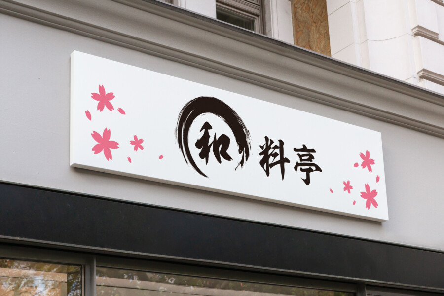
Cultural Distinction in Design: Japanify Your Brand
It can be uneasy for those unfamiliar with East Asian culture to tell Japanese style patterns and color pallets from Chinese or Korean ones. Japanify would be a help when you think of appealing to Japanese consumers.
Cohesive Brand Identity Through Traditional Elements
The combination of the elegant brush calligraphy and the Wagara pattern creates a cohesive and distinctive brand identity. The design evokes a sense of tradition and authenticity, which is essential for a Japanese confectionery brand.
Get Japan-Optimized Packaging →
AMIX Design Studio has spent the past decade honing its craft in Japan. Through our dedicated label Japanify Works, we create designs that celebrate kanji, the Japanese language, and Japan’s rich culture—covering everything from Calligraphy-style logos to fully bespoke branding. Quotes are always free, so drop us a line any time!
This package design is a sample.
For package design requests, please contact us using the contact form.
Contact Us
Also viewed: