Elegant Brushstroke Logo for a Refined Japanese Restaurant
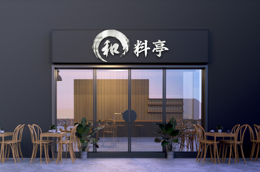
Capturing Tradition and Harmony in a Single Stroke
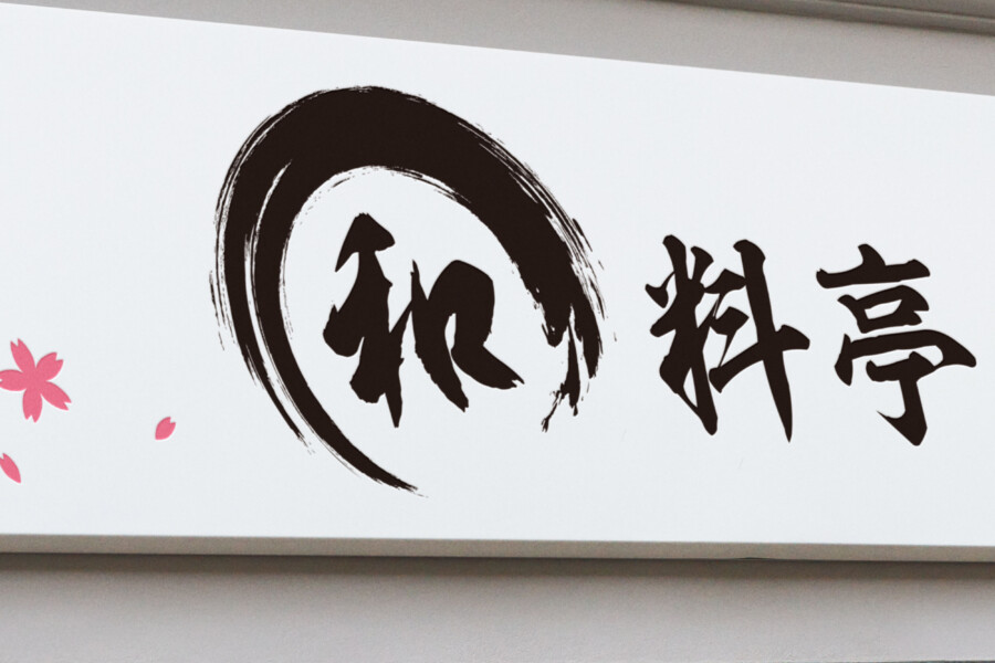
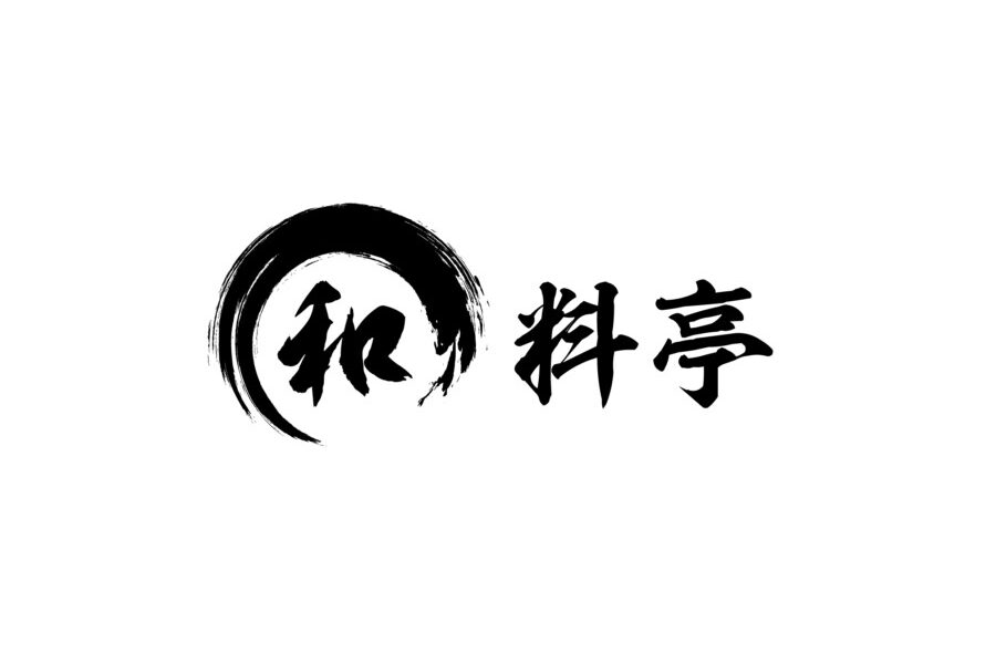
This logo design aims to embody the essence of a traditional Japanese restaurant through a modern lens. The central element is a dynamic brushstroke forming a circle, a shape deeply rooted in Japanese aesthetics, often symbolizing infinity, harmony, and enlightenment (known as ensō). The expressive, flowing lines of the brushwork evoke a sense of artistry and craftsmanship, mirroring the meticulous preparation and high quality ingredients one would expect from an upscale dining experience. The deep black color adds a layer of sophistication and timelessness, ensuring the logo feels both authentic and enduring. It’s designed to immediately convey a sense of place and quality, setting the stage for the culinary journey within. The overall impression is one of quiet confidence and refined taste, appealing to patrons seeking an authentic Japanese fine dining atmosphere.
The Power of the Brush: Expressing Authenticity
Delving deeper into the brushwork reveals intricate details. The ensō isn’t a perfect, static circle but possesses variations in ink density and speed, capturing the spontaneous yet controlled energy of calligraphy. These subtle imperfections add character and warmth, preventing the design from feeling sterile. It speaks to the human touch involved in both the creation of the logo and the cuisine served at the restaurant. The deliberate use of kasure (かすれ), the “scratchy” or fading parts of the stroke, adds texture and a sense of depth, suggesting a rich history and adherence to traditional techniques. This calligraphic approach ensures the logo feels uniquely Japanese and resonates with cultural significance, offering more than just a visual mark but a connection to heritage.
Typography that Speaks Volumes: Choosing the Right Characters
Complementing the circular mark is the logotype, featuring the restaurant’s category, “料亭” (Ryotei), which denotes a traditional, high-end Japanese restaurant. The typography chosen is a strong, somewhat stylized Mincho-based script. This style balances the fluidity of the brushstroke mark with a necessary degree of legibility and formality. The characters possess a quiet dignity, aligning with the restaurant’s positioning. The thickness and structure of the strokes in the characters were carefully considered to harmonize with the weight of the ensō mark, creating a cohesive visual identity. Neither element overpowers the other; instead, they work together to present a unified and sophisticated brand image that is easily recognizable.
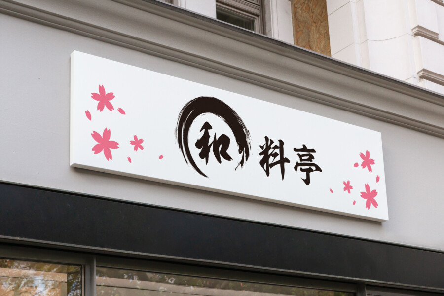
Beyond the Logo: Adapting for Signage
While the core logo consists of the black brushstroke ensō and the “料亭” characters, its application extends to various contexts, such as the signage shown. In this example, delicate pink cherry blossom motifs have been added around the core logo. It’s important to note these blossoms are decorative elements specifically for the sign, enhancing its visual appeal and seasonal connection, rather than being part of the primary logo itself. This demonstrates the logo’s versatility; the strong, simple core design allows for embellishments or adaptations depending on the application, without losing its fundamental identity. The contrast between the bold black logo and the soft pink blossoms creates an eye-catching display that is welcoming yet retains its sophisticated air.
AMIX Design Studio has spent the past decade honing its craft in Japan. Through our dedicated label Japanify Works, we create designs that celebrate kanji, the Japanese language, and Japan’s rich culture—covering everything from Japanese language supervision to fully bespoke branding. Quotes are always free, so drop us a line any time!
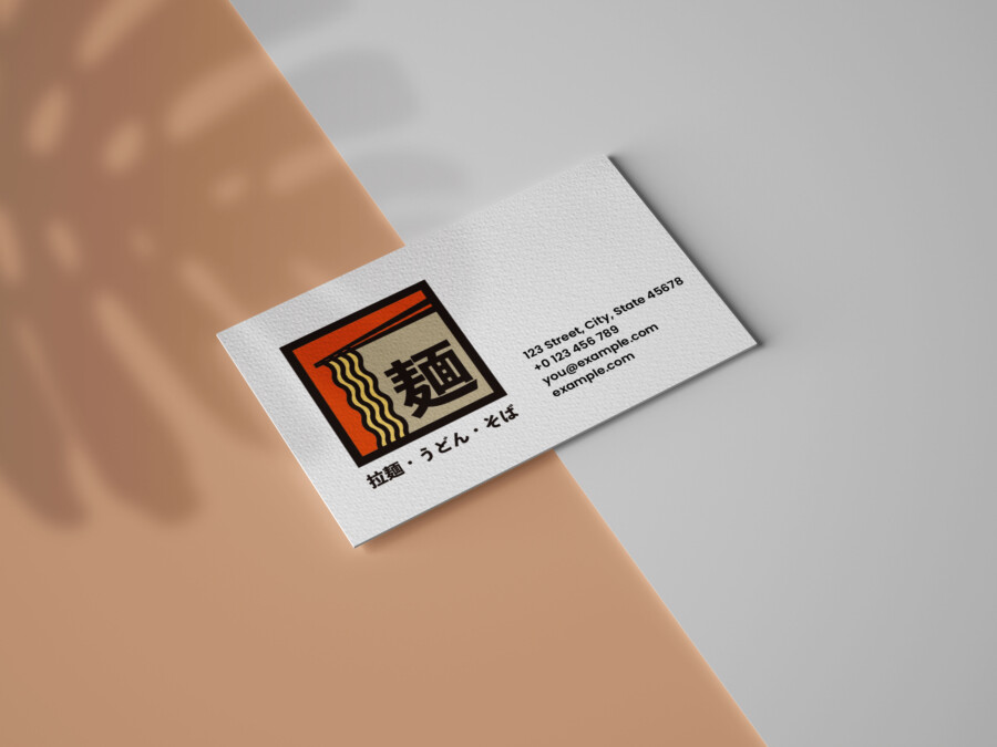
This logo design is a sample.
For logo design requests, please contact us using the contact form.
Contact Us
Also viewed: