Crafting a Visual Identity: Logo Design for a Japanese Noodle Restaurant
Capturing the Essence of Japanese Noodles in a Single Mark
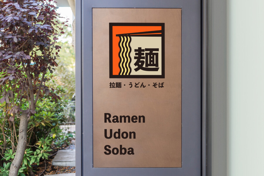
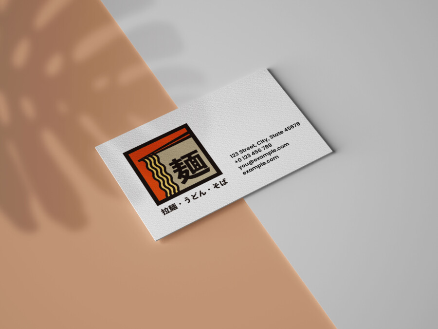
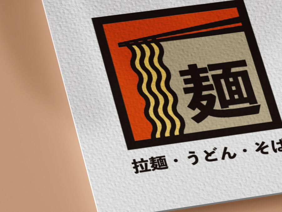
This logo serves as a visual ambassador for a restaurant specializing in various Japanese noodles, including ramen, udon, and soba. The design immediately communicates its core offering through a harmonious blend of typography and illustration. Central to the logo is the prominent Kanji character “麺” (men), meaning noodles, rendered in a bold, stable typeface that conveys tradition and reliability. This character is instantly recognizable to those familiar with Japanese cuisine. Integrated seamlessly with the Kanji are stylized representations of noodles hanging down, held by chopsticks at the top. This illustrative element adds a dynamic and appetizing quality, directly referencing the dining experience. The overall composition is contained within a clean, rectangular frame, lending structure and a sense of completeness, reminiscent of traditional Japanese shop signs or ‘noren’ curtains, further enhancing the authentic atmosphere.
The Power of Kanji: Integrating Character and Illustration
The strength of this logo lies in its clever integration of the Kanji character “麺” as both a linguistic signifier and a core graphic element. It doesn’t just say noodles; it visually embodies the concept. The thick, confident strokes of the Kanji provide a solid foundation, while the flowing lines of the illustrated noodles add a contrasting softness and sense of movement, suggesting the texture and appeal of the food. The chopsticks poised above complete the picture, creating a visual narrative of enjoyment. This balance between the abstract power of the character and the literal representation of the food makes the logo highly effective. It’s informative without being cluttered, relying on universally understood symbols (chopsticks, noodles) alongside the culturally specific Kanji to create a design that is both unique and easily interpreted, especially within the context of Japanese dining.
Strategic Color Choice: Warmth and Tradition
The color palette plays a crucial role in establishing the restaurant’s identity and mood. The design utilizes a focused combination of black, warm orange, and a neutral beige or cream tone. Black provides a strong contrast, outlining the primary shapes and grounding the design with a sense of sophistication and tradition often associated with established Japanese aesthetics. The vibrant orange injects warmth, energy, and stimulates the appetite, creating an inviting and friendly atmosphere. It often evokes feelings of comfort and satisfaction, highly relevant for a dining establishment. The lighter beige/cream background within the frame offers a calming, natural counterpoint, ensuring the central elements stand out clearly while contributing to an overall clean and balanced look. Together, these colors create a visual experience that feels authentic, welcoming, and indicative of a quality culinary offering.
Versatility and Impact: A Logo Built to Last
Beyond its aesthetic appeal, the logo is designed for practicality and versatility. Its relatively simple, bold shapes and clear structure ensure it remains legible and impactful across various applications, from large-scale signage and menu covers to smaller digital icons or merchandise. The contained, rectangular format makes it easy to place and integrate into different layouts without losing its integrity. The design avoids overly intricate details, focusing instead on strong, memorable visual cues – the Kanji, the noodles, the chopsticks. This clarity contributes to its memorability, allowing customers to easily recall and identify the brand. It successfully conveys a sense of authenticity and specialization in Japanese noodles, acting as a strong foundation for the restaurant’s visual identity and communication efforts, designed to resonate with customers seeking a genuine noodle experience.
AMIX Design Studio has spent the past decade honing its craft in Japan. Through our dedicated label Japanify Works, we create designs that celebrate kanji, the Japanese language, and Japan’s rich culture—covering everything from Japanese text review to fully bespoke branding. Quotes are always free, so drop us a line any time!
This logo design is a sample.
For logo design requests, please contact us using the contact form.
Contact Us
Also viewed: