Crafting a Memorable Identity: Casual Sushi Restaurant Logo
Balancing Tradition and Modern Appeal
Creating a logo for a neighborhood sushi spot involves capturing both its authenticity and its welcoming vibe. The challenge lies in blending the rich heritage of sushi with a feel that’s approachable for everyday dining. This design achieves that balance by pairing classic Japanese aesthetics with a clean, modern sensibility. We incorporated a traditional emblem alongside clearly legible typography for the “Sushi Place” identifier. This combination sets a foundation that respects tradition while feeling current and inviting, ensuring the logo resonates with both long-time sushi lovers and newcomers alike, promising a genuine yet relaxed experience.
The Power of Brushstrokes: Evoking Energy and Craftsmanship
The restaurant’s name, rendered in a bold, expressive brush script, forms the heart of the logo. This style was chosen deliberately to inject a sense of dynamism and artistry, reflecting the freshness of the ingredients and the skilled hands preparing the sushi. The characters themselves, symbolizing longevity and good fortune (Crane and Turtle), add a layer of positive cultural meaning. The warm, golden-ochre color enhances this effect, suggesting quality and a welcoming atmosphere. This handcrafted feel distinguishes the eatery, hinting at the care and quality that goes into every dish served.
The Significance of the Emblem
Nestled beside the standard text, a small, square emblem adds a distinct and clever visual touch. This element is a minimalist representation of a makizushi (sushi roll) cross-section. Its design directly and playfully references the restaurant’s core offering. The clean lines and simple geometric pattern within the square provide a modern feel, while the familiar shape subtly evokes the image of sushi. The classic color palette of red, white, and black used within the emblem not only offers visual clarity and contrast but also potentially hints at common sushi ingredients like tuna, rice, and seaweed. This thoughtful detail serves as a compact, sophisticated visual shorthand for the restaurant’s specialty.
Designing for Versatility
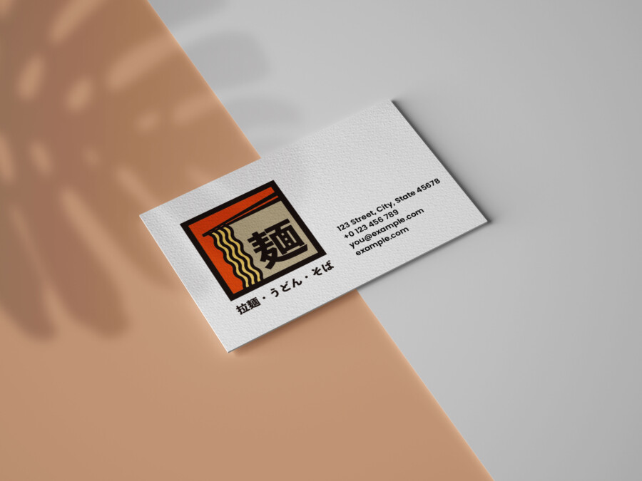
A successful logo needs to work effectively across various applications. This design was developed with versatility in mind. The distinct elements – the emblem, the standard text, and the brush script name – are designed to be visually cohesive yet adaptable. They can be used together as the primary logo or potentially utilized individually or in different configurations for specific needs like signage, menus, staff uniforms, or takeout packaging. Its balanced composition ensures it remains clear and impactful whether scaled up for a storefront or down for a business card, creating a consistent and memorable brand presence.
AMIX Design Studio has spent the past decade honing its craft in Japan. Through our dedicated label Japanify Works, we create designs that celebrate kanji, the Japanese language, and Japan’s rich culture—covering everything from Japanese label design to fully bespoke branding. Quotes are always free, so drop us a line any time!
This logo design is a sample.
For logo design requests, please contact us using the contact form.
Contact Us
Also viewed: