Sophisticated Bar Logo Design Featuring Kanji
Crafting an Atmosphere: Logo Design that Embodies Joyful Gatherings
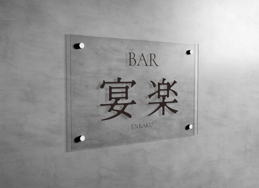
This logo design for a bar centers around two striking Kanji characters, chosen to represent the establishment’s desired atmosphere. The characters themselves evoke a sense of conviviality and relaxed enjoyment, setting the stage for the customer experience. Supported by clean, classic typography for the English text, the overall impression is one of refined elegance, welcoming guests into a space designed for pleasant socializing and unwinding. The design aims to be immediately recognizable while subtly conveying the quality and style of the bar, creating an identity that is both memorable and inviting. It’s crafted to resonate with patrons seeking a comfortable yet sophisticated environment.
Typography that Speaks Volumes
The selection of typefaces is crucial to the logo’s success. The prominent Kanji characters feature a font that balances traditional brushstroke aesthetics with modern clarity, making them impactful yet accessible. This choice anchors the design with a sense of cultural depth. For the designation ‘BAR’ and the Romanized name, a timeless serif font was chosen. This contrasts gently with the Kanji, adding a layer of classic sophistication and ensuring legibility for an international clientele. The careful pairing of these distinct typographic styles creates a harmonious and memorable visual identity, contributing significantly to the logo’s overall appeal and function.
Harmonizing Japanese and Western Aesthetics: A Cultural Bridge
A key aspect of this design is the intentional fusion of Japanese and Western visual language. The dominant Kanji provides a distinct cultural anchor, immediately signaling a connection to Japanese aesthetics, perhaps hinting at the bar’s unique offerings or origins. Simultaneously, the use of the English word ‘BAR’ and the Romanized name ensures broad understanding and accessibility, welcoming guests from various backgrounds. This thoughtful combination results in a logo that feels both culturally rooted and internationally appealing, capable of resonating with a diverse audience seeking a unique and sophisticated drinking and social experience. It acts as a visual bridge between traditions.
Versatility in Application: From Signage to Screens
The logo is designed for versatility across various applications, ensuring consistent branding. As demonstrated in the provided image mockup featuring the logo on a sleek sign against a textured wall, it translates effectively onto physical materials. The clean lines and balanced composition maintain clarity and impact. Beyond signage, the design maintains its integrity whether rendered large or scaled down for use on menus, coasters, websites, or social media profiles. This adaptability ensures the bar’s identity is reinforced consistently at every customer touchpoint, contributing to a cohesive and memorable brand experience adaptable to both print and digital contexts.
AMIX Design Studio has spent the past decade honing its craft in Japan. Through our dedicated label Japanify Works, we create designs that celebrate kanji, the Japanese language, and Japan’s rich culture—covering everything from Kanji logo design to fully bespoke branding. Quotes are always free, so drop us a line any time!
This logo design is a sample.
For logo design requests, please contact us using the contact form.
Contact Us
Also viewed: