Natural Elegance: Skincare Packaging Design
Visual Language Inspired by Nature’s Calendar
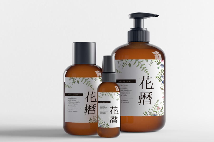
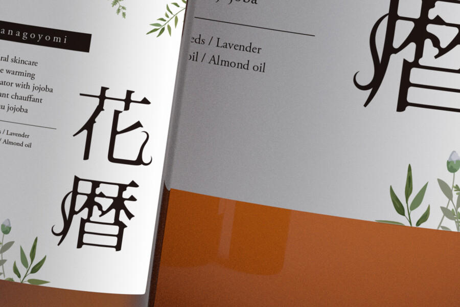
This packaging design aims to evoke a sense of natural serenity and gentle care. Using botanical illustrations that suggest seasonal transitions, the design connects the product to the rhythms of nature. The illustrations are placed thoughtfully, framing the central text elements without overwhelming the label. This balance creates an inviting look, suggesting the product’s natural origins and effectiveness. The amber color of the bottles complements the natural theme, adding a touch of warmth and protecting the contents. The overall composition is clean and uncluttered, focusing attention on the brand’s identity and the product’s essence.
Delicate Illustrations and Typography
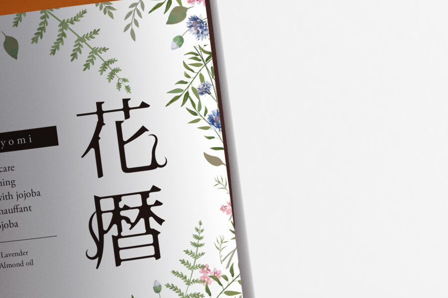
The fine-lined botanical illustrations are key to this design. They depict various leaves and flowers with subtle color accents, wrapping around the label edges. This approach adds an artistic touch while maintaining a clean aesthetic. The typography combines elegant Japanese characters for the product’s name with a clean, modern sans-serif font for the English text and descriptions. This pairing reflects a blend of tradition and modernity, appealing to a broad audience. The vertical orientation of the main Japanese text adds a distinct visual element characteristic of traditional Japanese design, enhancing the overall uniqueness.
Warmth and Simplicity in Materials
The choice of amber-colored bottles serves multiple purposes. Visually, it provides a warm, earthy contrast to the white label and delicate illustrations, reinforcing the natural theme. Functionally, amber often suggests protection from light, hinting at the preservation of natural ingredients within. The smooth texture of the bottles and the simple, functional shapes (pump, spray, standard cap) convey ease of use and reliability. This focus on simple forms and natural colors creates a cohesive and trustworthy appearance for the skincare line, suggesting quality and care in the product itself.
Creating a Gentle Brand Presence
Ultimately, the design elements work together to establish a gentle and sophisticated brand presence. The combination of nature-inspired artwork, balanced typography, and warm materials communicates calmness and efficacy. The design avoids overly bold or clinical aesthetics, instead opting for an approachable and reassuring feel. This visual identity aims to resonate with consumers seeking natural, high-quality skincare products, making the packaging itself an integral part of the product experience. It stands out quietly on the shelf, inviting touch and promising a gentle, natural routine.
Get Japan-Optimized Packaging →
AMIX Design Studio has spent the past decade honing its craft in Japan. Through our dedicated label Japanify Works, we create designs that celebrate kanji, the Japanese language, and Japan’s rich culture—covering everything from Kanji logo design to fully bespoke branding. Quotes are always free, so drop us a line any time!
This package design is a sample.
For package design requests, please contact us using the contact form.
Contact Us
Also viewed: