Crafting Authenticity: Japanese Green Tea Packaging
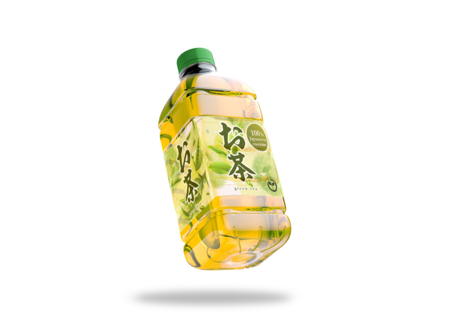
Blending Tradition and Modernity on the Label
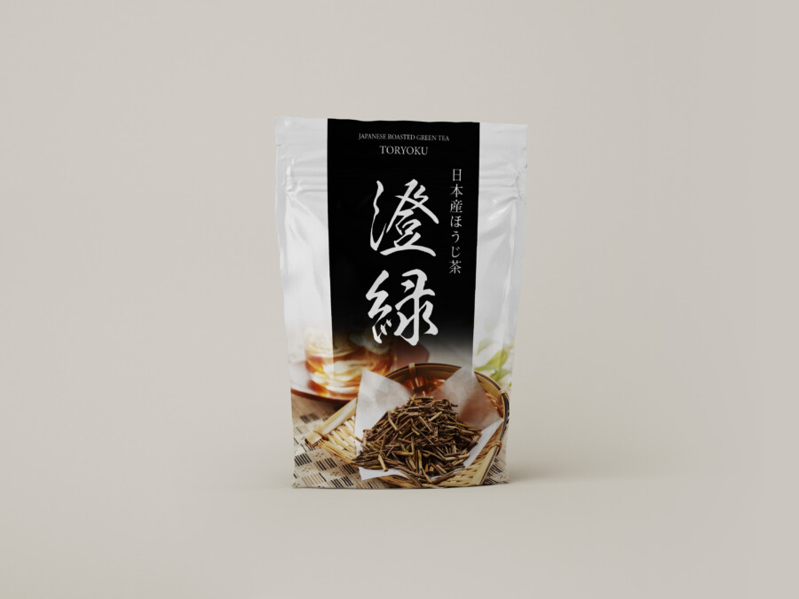
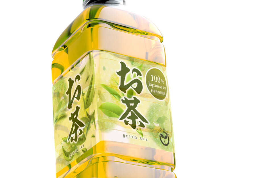
This package design aims to capture the essence of authentic Japanese green tea while appealing to a global audience. The visual approach balances traditional Japanese aesthetics with modern clarity. The goal was to create a design that feels both refreshing and high-quality, immediately conveying the nature of the product inside. The clear bottle allows the natural color of the tea to be part of the overall visual presentation, enhancing the sense of freshness and natural ingredients. The label itself acts as a window into the tea’s origins and quality.
Typography that Speaks Volumes
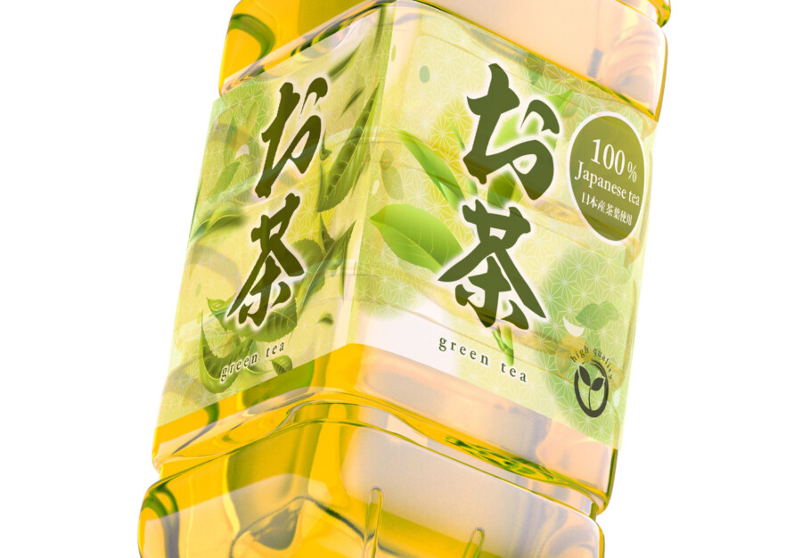
A key element is the interplay between typography styles. Prominent Japanese calligraphy evokes a sense of tradition and artistry, directly referencing the product’s cultural roots. This is carefully balanced with clean, modern English typography that provides essential information like “100% Japanese green tea.” This dual-language approach ensures clarity for international consumers while retaining an authentic Japanese character. The specific style chosen for the brand name aims for distinctiveness and memorability, integrating smoothly with the other visual elements on the label. The careful placement and sizing of text ensure readability and visual hierarchy.
Color and Imagery: Evoking Freshness and Quality
The color palette is central to the design’s appeal. Vibrant shades of green, combined with subtle gold accents, create a feeling of freshness, vitality, and premium quality. Images of fresh tea leaves are integrated into the background, reinforcing the natural origin of the product and adding depth to the label. These visuals work together with the transparent bottle, allowing the tea’s own color to contribute to the fresh aesthetic. The overall effect is clean, natural, and inviting, suggesting a high-quality, authentic tea experience.
Harmonizing Elements for Impact
The final design successfully integrates these elements – calligraphy, modern type, color, and imagery – into a cohesive whole. The layout is designed to be eye-catching on the shelf, distinguishing it from competitors while clearly communicating its identity as a premium Japanese green tea. The balance between traditional motifs and modern design sensibilities makes it accessible and appealing to consumers worldwide who appreciate authenticity and quality. It’s a visual representation of the refreshing and genuine tea experience offered by the product.
Japanese Package Design Service
AMIX Design Studio has spent the past decade honing its craft in Japan. Through our dedicated label Japanify Works, we create designs that celebrate kanji, the Japanese language, and Japan’s rich culture—covering everything from Product packaging in Japanese to fully bespoke branding. Quotes are always free, so drop us a line any time!
This package design is a sample.
For package design requests, please contact us using the contact form.
Contact Us
Also viewed: