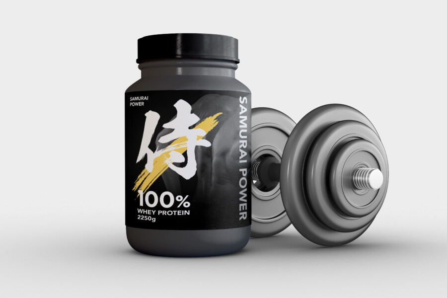
Modern Meets Savory: High-Impact Yakitori Packaging Design
Capturing the Sizzle: Modern Design for Classic Yakitori Flavor
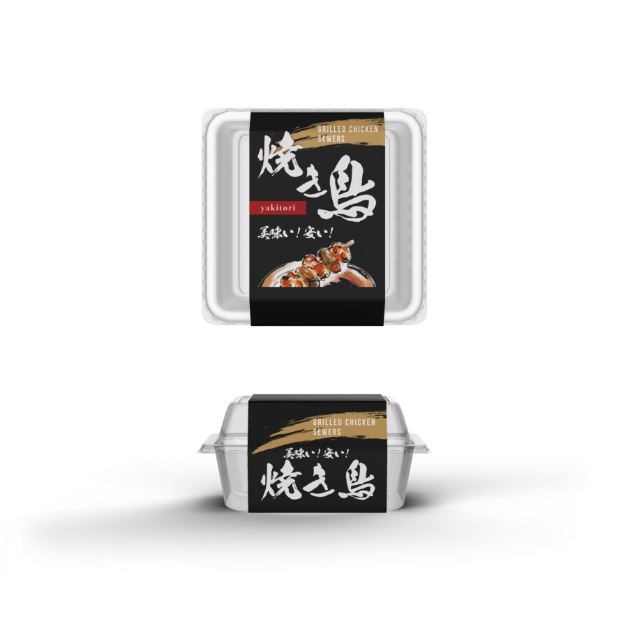
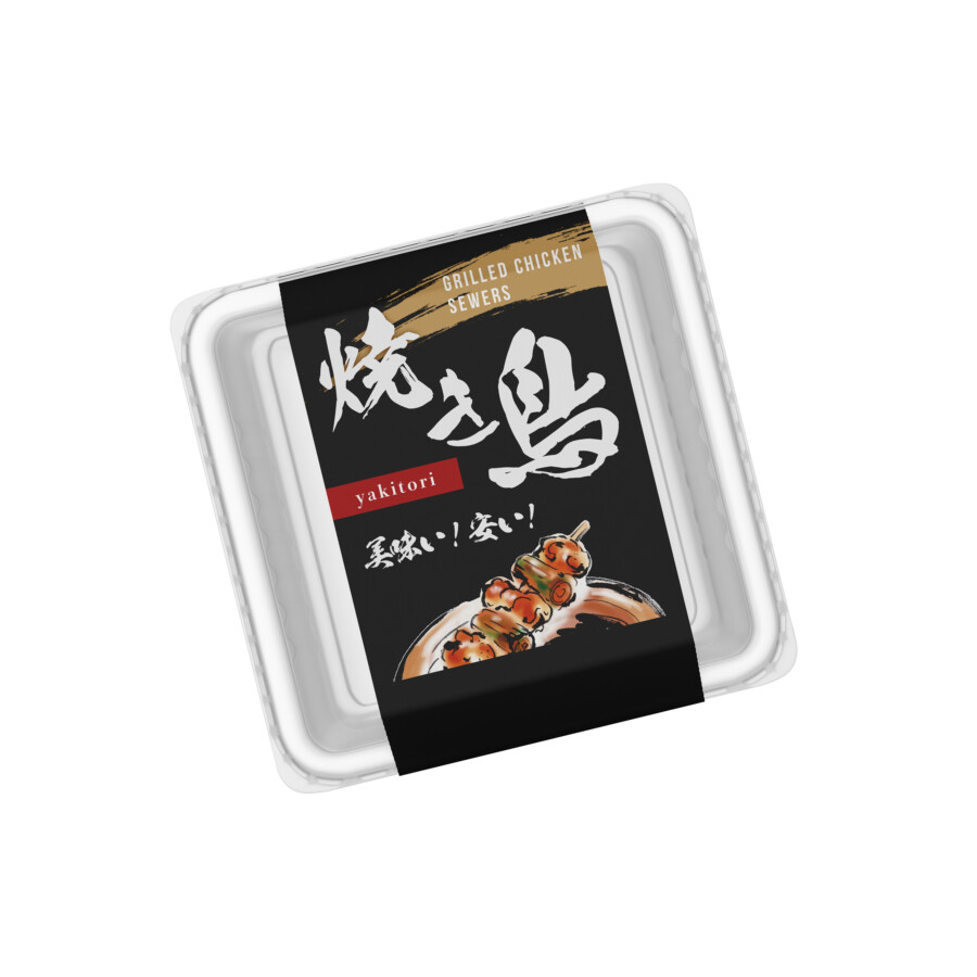
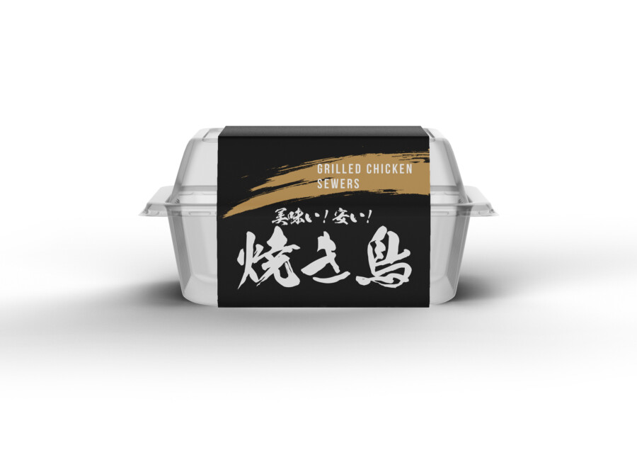
This packaging design was developed for a yakitori (grilled chicken skewers) product, intended to grab attention in a competitive retail environment. The primary goal was to convey both the delicious taste and the convenience of the product. We aimed for a design that felt authentically Japanese yet modern and accessible. The visual direction focused on creating immediate appetite appeal while ensuring the product type was instantly recognizable, balancing traditional elements with clean, contemporary graphics for maximum impact on the shelf.
Bold Typography & Evocative Imagery
A key feature of this design is the dynamic Japanese calligraphy used for the main product name. This evokes a sense of energy, tradition, and handcrafted quality, connecting the product to authentic Japanese culinary experiences. This is balanced with clear, legible sans-serif typefaces for secondary information, ensuring clarity for a wider audience. Central to the design is a high-quality photograph of the yakitori itself, glistening and perfectly grilled. This image is crucial; it bypasses language barriers to directly stimulate the appetite and communicate the deliciousness within.
Strategic Color Palette: Impact and Information
The color palette was carefully chosen for impact and meaning. A deep black background serves as a sophisticated base, allowing the other elements to stand out prominently. It creates a sense of quality and helps the package pop, whether in a brightly lit store refrigerator or online. Accents of vibrant red are used strategically – red is strongly associated with energy, flavor, and Japanese food culture. White text ensures high contrast and readability against the dark background, making essential information easy to grasp quickly.
Clean Layout for Clarity: Balancing Act
The design utilizes a band label format on a clear container. This approach is practical, allowing consumers to see the actual product, which enhances trust and appetite appeal. The layout is deliberately clean and organized. The striking calligraphy, the enticing photograph, and essential text elements are balanced within the band, ensuring no single element overwhelms the others. This structured approach delivers key messages – what the product is, its visual appeal, and key selling points – effectively and almost instantaneously to the busy shopper.
Professional Japan-Ready Packaging
AMIX Design Studio has spent the past decade honing its craft in Japan. Through our dedicated label Japanify Works, we create designs that celebrate kanji, the Japanese language, and Japan’s rich culture—covering everything from Custom Japanese packaging to fully bespoke branding. Quotes are always free, so drop us a line any time!
This package design is a sample.
For package design requests, please contact us using the contact form.
Contact Us
Also viewed: