Bold & Appetizing: Hakata Tonkotsu Ramen Package Design
Visual Impact That Whets the Appetite
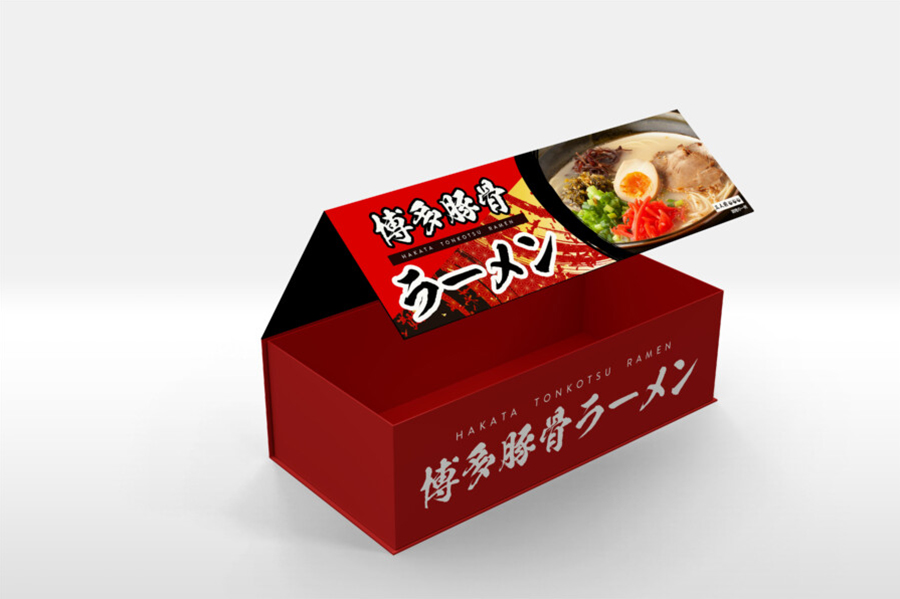
This package design aims to make a strong first impression on the shelf. Utilizing a vibrant red as the primary color immediately catches the eye and evokes a sense of energy and warmth, often associated with delicious food. The bold, dynamic typography chosen for the product name stands out against the background, ensuring high visibility even from a distance. This powerful combination of color and text is designed not just to be seen, but to create an immediate sense of craving. Furthermore, the design strategically incorporates a mouth-watering photograph of the prepared ramen, directly showcasing the product’s appeal and promising a satisfying taste experience. The overall composition balances these strong elements to create a package that is both impactful and informative, inviting consumers to pick it up and learn more.
Dynamic Typography and Color Palette
The choice of typography plays a crucial role in this design. The main characters for the product name are rendered in a thick, impactful brushstroke style, conveying a sense of tradition and authenticity, while also possessing a modern boldness. This contrasts effectively with the cleaner, sans-serif font used for the English text, ensuring readability for a wider audience. The color palette is dominated by a deep, rich red, instantly associated with richness and perhaps a hint of spice. Black is used for contrast, particularly for the main typography, making it pop. A touch of gold or yellow within the ramen photo adds a highlight, enhancing the visual appeal of the noodles and toppings. This carefully considered combination of fonts and colors works together to create a visually stimulating and cohesive brand identity for the product.
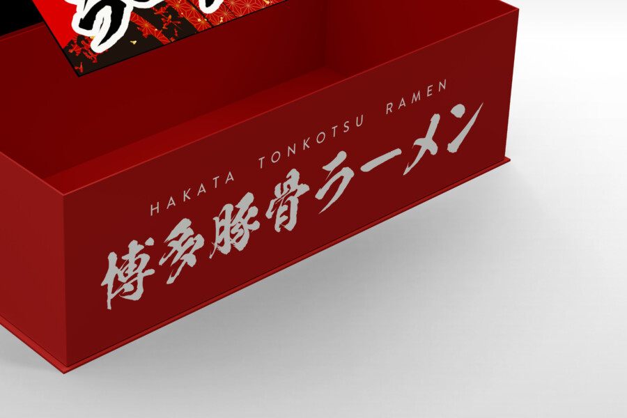
Attention to Detail: Balancing Tradition and Modernity
Looking closer, the design reveals thoughtful details. While the main front panel focuses on immediate impact, the side panels of the box continue the branding elements in a slightly more subdued manner. The product name is repeated in a clean, horizontal layout, ensuring brand recognition from multiple angles. This repetition reinforces the product identity without overwhelming the senses. The design successfully walks the line between honoring the traditional origins of Hakata Tonkotsu ramen, suggested by the Japanese characters and the classic color scheme, and presenting it in a modern, accessible format suitable for today’s competitive market. It’s a design that feels both familiar and fresh, appealing to both connoisseurs and newcomers to this style of ramen.
Showcasing the Product: The Power of Food Photography
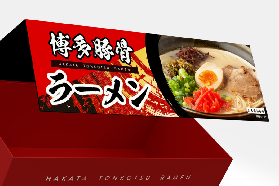
A key element of this packaging is the high-quality photograph featured prominently on the lid flap. This isn’t just any image; it’s a carefully styled shot designed to maximize the ramen’s visual appeal. The steam subtly rising, the perfectly arranged toppings – glistening chashu pork, a soft-boiled egg with a golden yolk, vibrant green onions, and bright red pickled ginger – all contribute to a powerful sense of “シズル” (sizzle), the Japanese term for the mouth-watering quality of food presentation. This image acts as a visual promise of the deliciousness inside, translating the taste experience into a compelling visual cue. Integrating this appetizing photo directly into the bold graphic design creates a strong connection between the packaging and the product itself, significantly boosting its shelf appeal.
Japanese Package Design Service
AMIX Design Studio has spent the past decade honing its craft in Japan. Through our dedicated label Japanify Works, we create designs that celebrate kanji, the Japanese language, and Japan’s rich culture—covering everything from Japan-inspired logo design to fully bespoke branding. Quotes are always free, so drop us a line any time!
This package design is a sample.
For package design requests, please contact us using the contact form.
Contact Us
Also viewed: