Hojicha Packaging Design: Blending Modernity and Tradition
Crafting a Serene Experience: The Visual Language of Roasted Tea
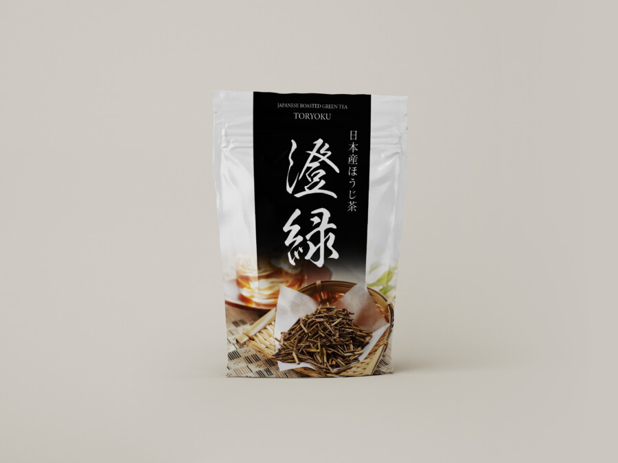
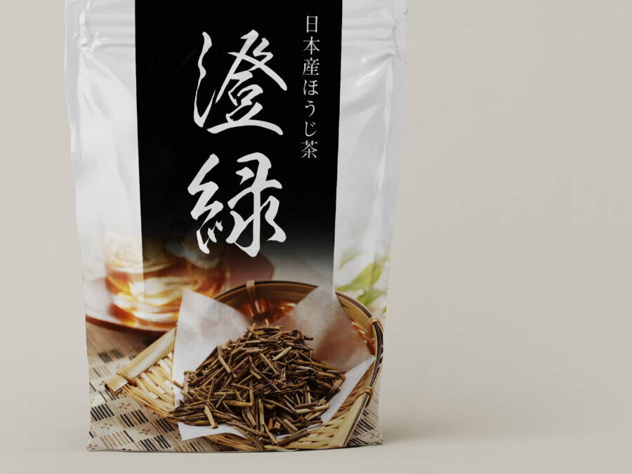
This packaging design aims to create a sophisticated and authentic impression for Japanese roasted green tea (Hojicha). The foundation is a clean, white pouch, suggesting purity and modernity. Against this backdrop, a striking black vertical band runs down the center, immediately drawing the eye and creating a sense of focus and structure. This central element serves as a canvas for the primary product identifier, rendered in expressive Kanji characters, lending an air of Japanese tradition and artistry. The design balances this traditional element with clear, modern typography for the English description (“Japanese Roasted Green Tea”) and the product name, ensuring accessibility for an international audience. The overall first impression is one of elegance, clarity, and premium quality, inviting consumers to discover the unique character of Hojicha.
The Power of the Centerpiece: Typography and Structure
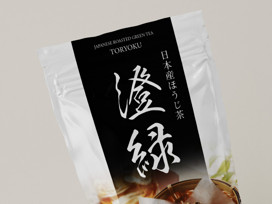
The core of the design lies in its strong central composition. The bold, vertical Kanji characters are not just text; they are a key graphic element that anchors the entire layout. Placed prominently within the black band, they create a powerful visual contrast against the white pouch, making the package stand out. Supporting information, such as the type of tea and its origin (“日本産ほうじ茶”), is positioned thoughtfully to maintain balance and readability. The interplay between the traditional calligraphy style and the clean, sans-serif English font creates a harmonious blend of cultures and aesthetics. This structured approach ensures that essential information is conveyed effectively while establishing a distinct and memorable brand presence.
Evoking Aroma and Warmth Through Imagery
Complementing the minimalist upper section, the lower part of the packaging features carefully selected imagery that adds a crucial sensory dimension. A photograph subtly reveals the texture and rich color of the roasted tea leaves nestled in a traditional woven basket. In the background, a gently steaming cup of tea hints at the comforting warmth and aroma experienced when enjoying the beverage. This visual element grounds the design by offering a tangible glimpse of the product itself. The warm tones of the photograph provide a soft contrast to the monochrome palette above, adding approachability and connecting the consumer to the ritual and pleasure of drinking Hojicha. It appeals directly to the senses, suggesting a high-quality, authentic tea experience.
Refined Simplicity for a Premium Feel
The design employs a minimalist aesthetic to convey sophistication and quality. By keeping the background uncluttered, the focus remains squarely on the essential elements: the impactful typography, the central structural band, and the evocative imagery. The choice of a simple pouch format is practical, while the presumed quality of the material and finish (often matte or textured for premium teas) would enhance the tactile experience. This deliberate simplicity avoids visual noise and speaks to a sense of quiet confidence. It reflects traditional Japanese design principles of elegance and restraint, while also possessing a clean, modern look that resonates with global consumers seeking authentic and high-quality products. The overall effect is one of refined taste and trustworthiness.
Make My Packaging Stand Out in Japan →
AMIX Design Studio has spent the past decade honing its craft in Japan. Through our dedicated label Japanify Works, we create designs that celebrate kanji, the Japanese language, and Japan’s rich culture—covering everything from Kanji logo design to fully bespoke branding. Quotes are always free, so drop us a line any time!
This package design is a sample.
For package design requests, please contact us using the contact form.
Contact Us
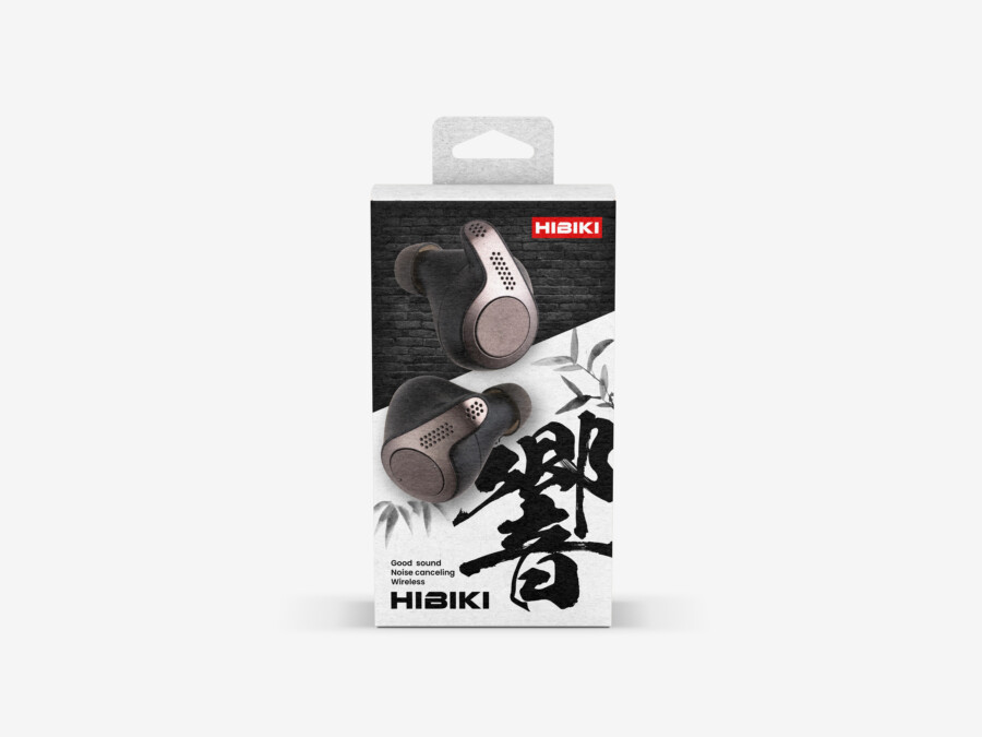
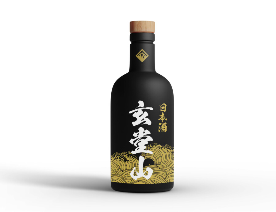
Also viewed: