Dynamic Tapestry Design for a Sumo Tournament Event
Where Tradition Meets Modern Dynamism in Event Promotion
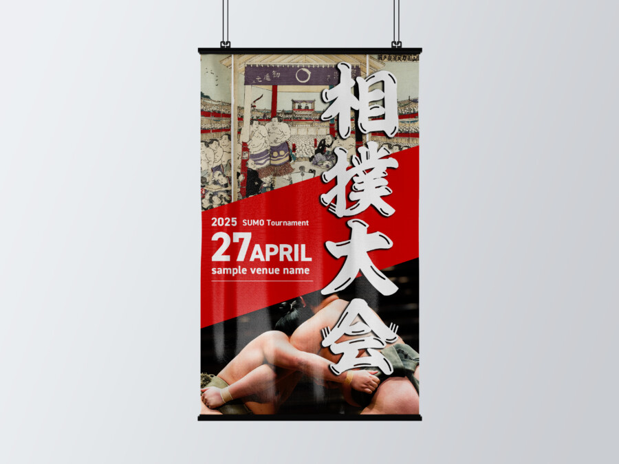
This tapestry design vividly captures the power and cultural significance of a sumo tournament. The striking contrast between the deep red background and the bold, black diagonal slash immediately draws the eye, creating a sense of energy and movement befitting the sport. Central to the design is the event title, rendered in large, impactful Japanese characters. This prominent placement ensures high visibility, even from a distance, effectively announcing the event’s theme. Below the main title, essential details like the date and venue are clearly presented in English, ensuring accessibility for a wider audience. The overall composition is carefully balanced, using strong visual elements to create an exciting and informative piece that sets the stage for the upcoming tournament. It aims to convey both the intensity of the matches and the rich heritage associated with sumo.
Visual Storytelling Through Contrasting Elements
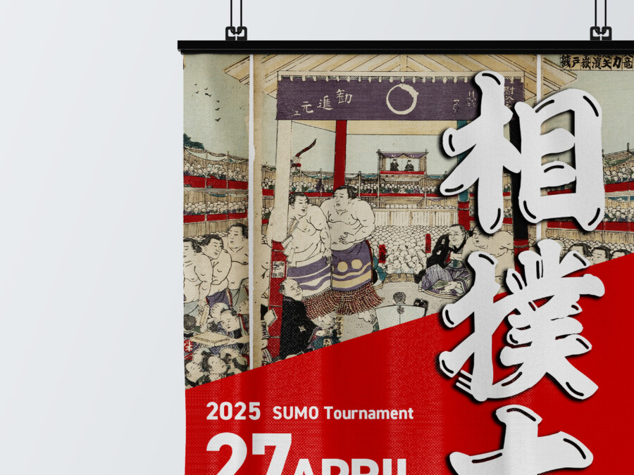
A key feature of this design is the sophisticated blend of traditional Japanese aesthetics with modern photographic elements. Positioned subtly in the upper section is an illustration reminiscent of classic ukiyo-e woodblock prints, depicting a historical sumo scene. This element grounds the event in its deep cultural roots and heritage. Juxtaposed against this is a dynamic photograph of wrestlers locked in combat, capturing the raw power and athleticism of contemporary sumo. This contrast between the historical illustration and the modern photograph creates a compelling visual narrative. It speaks to the enduring legacy of sumo while highlighting its relevance and excitement as a modern spectator sport, offering layers of meaning to the viewer.
Impactful Typography and Layout Choices
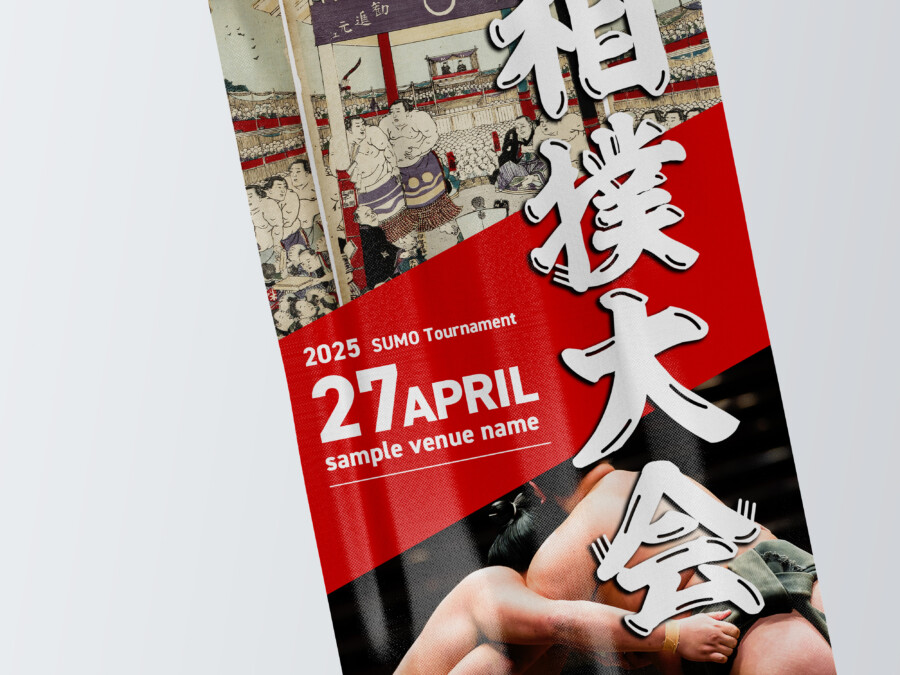
Typography plays a crucial role in this tapestry’s effectiveness. The main event title, presented vertically in large, stylized Japanese script, dominates the visual space. The brushstroke style of the characters adds an artistic flair and reinforces the traditional aspect of the event. Its sheer size ensures it’s the first thing people notice. Supporting information, such as the “2025 SUMO Tournament” tagline, the date “27 APRIL,” and the placeholder venue name, are rendered in a clean, modern sans-serif font. This choice provides clarity and readability, contrasting effectively with the traditional script. The diagonal layout structure further enhances the design’s dynamism, guiding the viewer’s eye through the information hierarchy and adding a contemporary edge to the overall composition.
Conveying the Event’s Atmosphere and Energy
More than just conveying information, this tapestry design works to evoke the unique atmosphere and energy of a live sumo tournament. The dominant red color is often associated with passion, power, and celebration in Japanese culture, immediately setting an energetic tone. The combination of the imposing wrestlers in action and the large, forceful calligraphy communicates the intensity and drama viewers can expect. The subtle inclusion of the traditional print adds a layer of respect and cultural depth. Hung at the event venue, this tapestry would not only inform attendees but also contribute significantly to the overall ambiance, heightening anticipation and excitement for the matches. It serves as a powerful visual ambassador for the event itself.
Native-Checked Japanese Copy Review
AMIX Design Studio has spent the past decade honing its craft in Japan. Through our dedicated label Japanify Works, we create designs that celebrate kanji, the Japanese language, and Japan’s rich culture—covering everything from Japan-inspired packaging to fully bespoke branding. Quotes are always free, so drop us a line any time!
This graphic design is a sample.
For graphic design requests, please contact us using the contact form.
Contact Us
Also viewed: