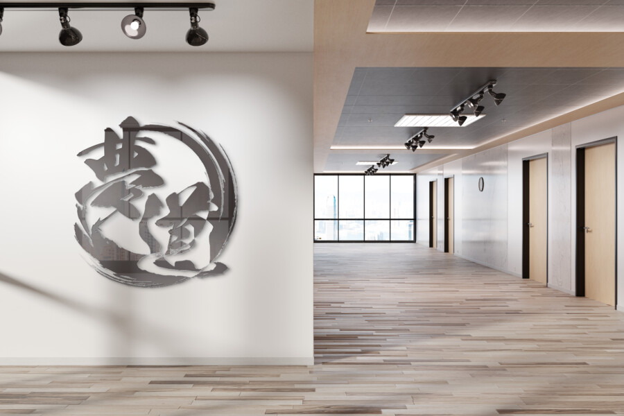
Dynamic Calligraphy Logo for an Unagi Dining Experience
Dynamic Brushwork: Bringing an Eel Restaurant’s Essence to Life
The objective was to create a memorable logo for a restaurant specializing in traditional eel dishes. It needed to convey both the rich heritage associated with this cuisine and the unique quality of the establishment. The design aimed to capture the specific character of eel – its energy and distinct form – while establishing a sophisticated and authentic brand presence. We sought a visual identity that felt both classic and alive, reflecting the premium dining experience offered to patrons. The logo needed to be instantly recognizable and resonate with lovers of traditional Japanese food, ensuring it communicated quality and tradition effectively.
The Eel as the Central Motif: A Symbol of Vitality
Central to the logo is the depiction of the eel itself. Rendered with bold, fluid brushstrokes characteristic of Japanese calligraphy, the eel curves dynamically, forming a near-circle. This movement isn’t just illustrative; it embodies the vitality of the creature and the lively atmosphere of the restaurant. The circular composition evokes traditional Japanese ‘enso’ circles or family crests (‘kamon’), suggesting harmony, completeness, and a deep connection to cultural roots. This visual metaphor links the main ingredient directly to the restaurant’s identity in a powerful, artistic way, making the specialty clear at first glance.
Integrating Typography: Harmony Between Characters and Illustration
The restaurant’s name is presented using both Kanji and Roman letters, thoughtfully integrated within the eel’s circular form. The typography mirrors the brushstroke style of the illustration, ensuring visual coherence and a unified aesthetic. The Kanji characters are prominent, anchoring the design in Japanese tradition, while the Roman letters offer clarity and accessibility, potentially broadening the logo’s appeal to a diverse audience. This dual approach allows for cultural authenticity alongside modern legibility. The placement within the circle creates a contained, balanced composition where text and image work together seamlessly, reinforcing the brand identity.
Monochrome Impact: Versatility and Timelessness
A deliberate choice was made to execute the logo in monochrome (black ink on a white background). This aligns with the aesthetic of traditional sumi-e (ink wash painting) and calligraphy, reinforcing the sense of heritage and artistry that complements the cuisine. Beyond aesthetics, the simplicity of black and white offers significant practical advantages. It ensures the logo remains impactful and legible across various applications – from large-scale signage and intricate menu details to digital platforms and embroidered uniforms. This timeless colour scheme guarantees longevity and adaptability for the brand’s visual identity, ensuring consistency wherever it appears.
AMIX Design Studio has spent the past decade honing its craft in Japan. Through our dedicated label Japanify Works, we create designs that celebrate kanji, the Japanese language, and Japan’s rich culture—covering everything from Custom Japanese packaging to fully bespoke branding. Quotes are always free, so drop us a line any time!
This logo design is a sample.
For logo design requests, please contact us using the contact form.
Contact Us
Also viewed: