Visual Identity for Mindful Relaxation: Spa Logo Case Study
Capturing Serenity: The Essence of a Relaxation Spa Logo
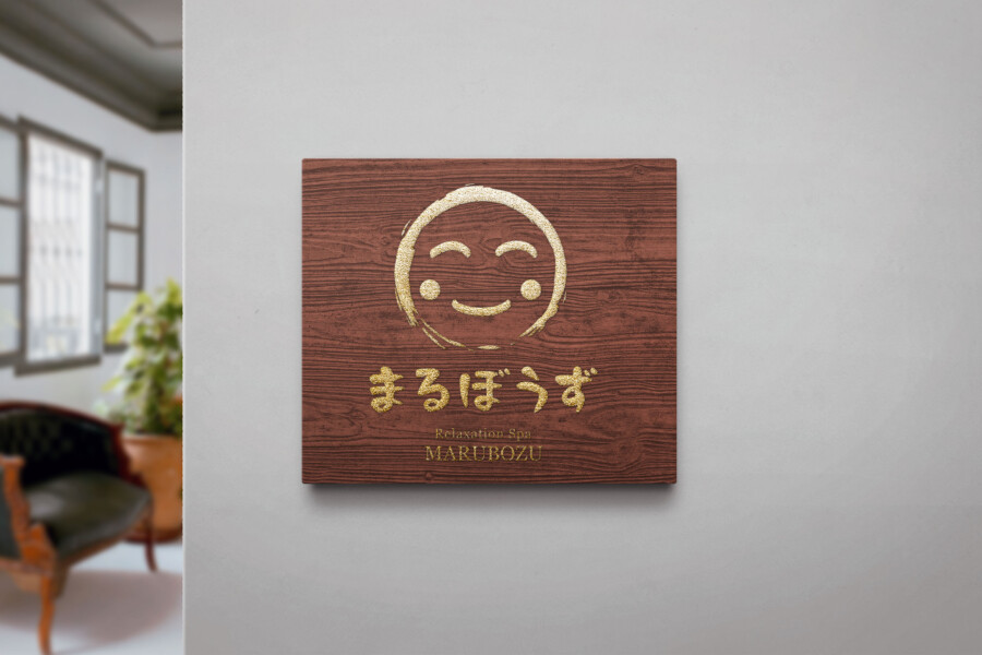
The primary goal for this project was to craft a logo that visually communicates the core values of a relaxation spa: tranquility, rejuvenation, and a deep sense of peace. Spas offer an escape, a moment dedicated to self-care and unwinding, and the logo needed to instantly evoke this atmosphere. We chose the lotus flower as the central symbol. Widely recognized for representing purity, beauty, and rebirth across many cultures, the lotus floating serenely on water perfectly mirrors the calming and restorative experience the spa aims to provide. Its gentle unfolding petals suggest a gradual release of stress and a blossoming of inner calm, setting the tone for the brand’s identity.
Harmonizing Symbols and Typography
Integrating the iconic lotus symbol with the textual elements required careful consideration of balance and flow. The symbol is nestled under a soft arch, creating a visual embrace that enhances the feeling of sanctuary and focus. For the English text identifier, a clean and refined typeface was selected to convey modern elegance and clarity. This choice provides a subtle contrast to the more traditional aesthetic of the Japanese characters below it. Achieving harmony between these different typographic styles – the Roman alphabet and Kanji – was key to reflecting a brand that blends contemporary spa practices with timeless wellness philosophies derived from Eastern traditions. The spacing and alignment were meticulously adjusted to ensure the overall composition felt balanced and aesthetically pleasing.
The Significance of Kanji: Expressing Core Concepts
Beneath the main symbol and English text, specific Kanji characters were incorporated to articulate the spa’s unique philosophy. These characters represent profound concepts: the mindful tranquility of Zen, the essential need for Rest and recuperation, and the holistic engagement of the Five Senses. This textual element serves not just as a name, but as a declaration of the spa’s commitment to a multi-sensory journey towards well-being. The chosen font style for the Kanji possesses a sense of tradition and authenticity, yet remains highly legible. This careful selection reinforces the spa’s dedication to providing an experience that is both deeply rooted and refreshingly restorative, appealing to guests seeking genuine peace and sensory awakening.
Color and Application Considerations
While presented here in a versatile monochrome format, the development of a spa logo often involves exploring color palettes that enhance the desired mood. Calming blues and greens, earthy neutrals, or soft pastels are frequently employed to reinforce tranquility. Alternatively, touches of gold, silver, or deep plum can add an element of luxury and indulgence. The monochrome version itself offers excellent flexibility, ensuring brand consistency across diverse applications – from elegant signage and printed materials like brochures and menus, to digital platforms and potentially even product packaging for spa amenities. The logo’s clean lines and balanced composition ensure it remains clear and impactful, regardless of size or the medium on which it appears.
Professional Japan-Ready Logos
AMIX Design Studio has spent the past decade honing its craft in Japan. Through our dedicated label Japanify Works, we create designs that celebrate kanji, the Japanese language, and Japan’s rich culture—covering everything from Language & culture audit to fully bespoke branding. Quotes are always free, so drop us a line any time!
This logo design is a sample.
For logo design requests, please contact us using the contact form.
Contact Us
Also viewed: