Characteristics of Logo Design Expressing Japanese Culture: A Visual Story Weaving Tradition and Modernity
Walking through Japanese streets, one encounters Kanji logos everywhere. Each of these logos carries a long history and deep cultural background. Kanji is not merely a writing system; each character possesses beautiful formative art and profound meaning, akin to a work of art. This article unravels the history of logo design using Kanji and delves into its cultural background. We’ll explore how Kanji has played various roles from ancient times to the present, what aesthetic value it has held, and how it has been incorporated into logo design.
Native-Checked Japanese Copy Review
The Birth of Kanji and Its Introduction to Japan
The Origin of Kanji: From Oracle Bone Script to Modern Times
The history of Kanji dates back to around 1300 BC during the Yin Dynasty. The oracle bone script, characters inscribed on turtle shells and animal bones, is considered the origin of Kanji. Initially used for divination, these characters eventually developed into a writing system.
Over time, oracle bone script evolved into bronze inscriptions, seal script, clerical script, and regular script. Through this process, Kanji evolved from a mere means of conveying meaning to an artistic work with beautiful formative art.
Introduction to Japan and the Birth of Japanese-made Kanji
Kanji is said to have been introduced to Japan around the 5th century. Initially, Kanji imported from China was used as is, but eventually, unique Japanese readings (on-yomi and kun-yomi) emerged, and Japanese-made Kanji were also created.
Japanese-made Kanji include characters like “峠” (touge, mountain pass), “込” (komu, to insert), and “畑” (hata, field). These characters were created to express concepts rooted in Japanese geography and culture. Thus, even after its introduction to Japan, Kanji continued to develop uniquely while fusing with Japanese culture.
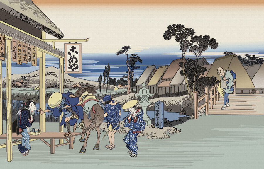
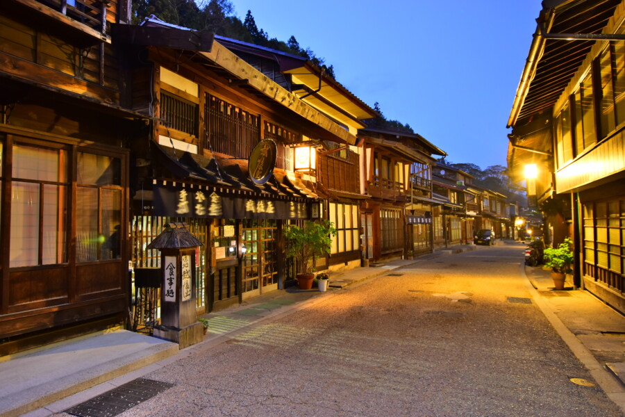
Edo Period: The Use of Kanji as Trademarks
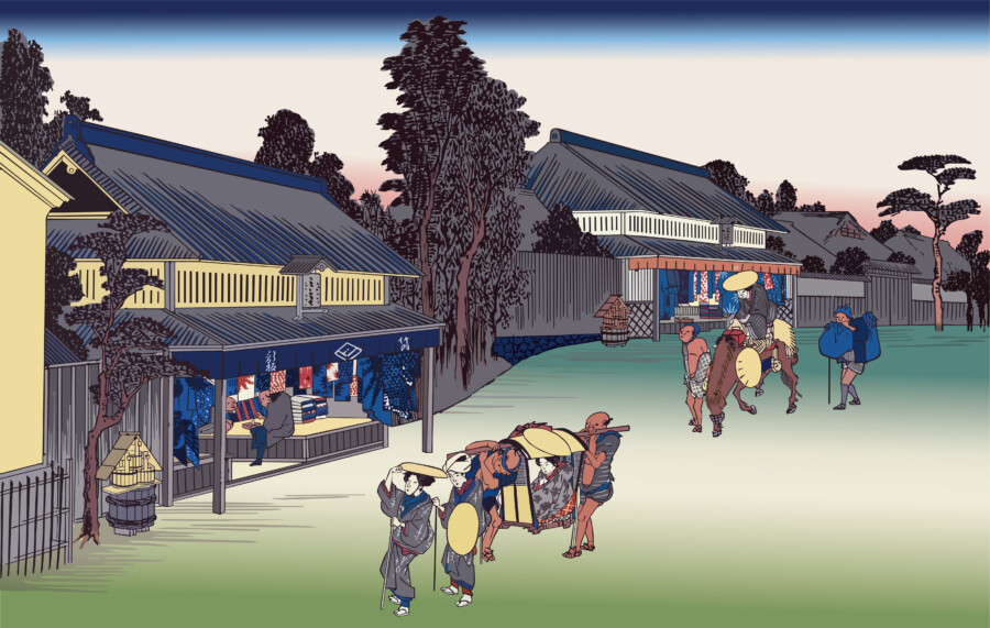
Noren and Signboards: Early Kanji Logos
With the development of commerce in the Edo period, signs to identify shops became necessary. This is where noren (shop curtains) and signboards appeared. These often featured Kanji characters representing the shop’s name or products, functioning as early Kanji logos.
For example, shop names like “鳥忠” (Torichuu, poultry shop) or “魚久” (Uokyu, fish shop) succinctly expressed the characteristics of the store. These Kanji logos played an important role as visual symbols in an era when literacy rates were not high.
Family Crests and Trade Names: Refinement of Kanji Design
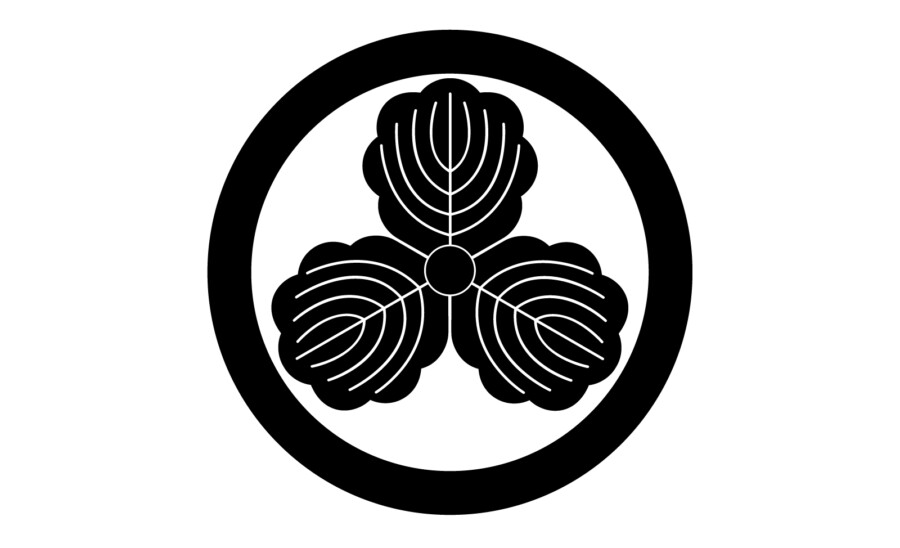
丸に三つ柏” (maru-ni-mitsu-kashiwa)
During the Edo period, many samurai family crests and merchant trade names also used stylized Kanji. For instance, the family crest “丸に三つ柏” (maru-ni-mitsu-kashiwa) is a design based on the Kanji character “柏” (kashiwa, oak).
These family crests and trade names were not just written Kanji but were elevated into beautiful designs by stylizing the characters. This demonstrates the Japanese aesthetic sense towards Kanji and their high design skills.
Meiji Era: The Budding of Modern Logo Design
Western Influence and Fusion of Japanese and Western Designs
With the rapid influx of Western culture in the Meiji era, logo design also saw significant changes. Designs emerged that incorporated traditional Japanese typefaces and the formative beauty of Kanji while being influenced by Western typography.
For example, the logo of “Kikkoman,” founded in the Meiji era, is a stylized version of the Kanji “萬” (man, ten thousand). This is a good example of expressing traditional Japanese Kanji using Western graphic design techniques.
The Spread of Letterpress Printing and New Kanji Designs
The Meiji era saw the spread of letterpress printing technology, allowing mass reproduction of previously handwritten characters as type. This led to diversity in Kanji designs used in newspapers, magazines, and advertisements.
Particularly, newspaper mastheads and magazine cover titles became important elements expressing the identity of the media, leading to the creation of many unique Kanji designs.
From Post-War to Present: Diversification and Evolution of Kanji Logos
Kanji Logos as Corporate Identity
With the rapid growth of the Japanese economy after World War II, corporate branding became increasingly important. Many corporate logos using Kanji were created during this period.
For instance, the “MUJI” (無印良品) logo uses simple Sans-serif Kanji, with its minimal design perfectly expressing the brand concept. The “Yoshinoya” (吉野家) logo uses strong brush-stroke style Kanji, evoking images of traditional Japanese food culture.
Kanji Logo Design in the Digital Age
Today, with the development of computer graphics, the possibilities for Kanji design have greatly expanded. Innovative Kanji logos are continually emerging, such as those that abstract parts of Kanji or add movement.
Moreover, logo designs intended for use in digital media such as web design and smartphone apps are increasing. As designs that are easily recognizable on small screens yet impressive are required, the formative beauty of Kanji is demonstrating new value.
The Future of Kanji Logos: Fusion of Tradition and Innovation

Kanji Logos in the Age of Globalization
In recent years, as international interest in Japanese culture has increased, Kanji logos have become an important element in expressing “Japaneseness.” For Japanese companies expanding overseas, Kanji logos are an effective tool for simultaneously conveying their corporate identity and Japanese image.
On the other hand, there is a challenge to create logo designs that have universal appeal while utilizing the formative beauty of Kanji, as they need to be understandable to people in non-Japanese speaking regions.
Kanji Logo Design in the AI Era
With the development of AI, significant changes are about to occur in the field of logo design. While automatic generation of Kanji logos by AI is becoming technically possible, the challenge lies in how much cultural background and aesthetic sense can be reflected.
In the future, we can expect the creation of new Kanji logos that combine traditional aesthetics and innovative design by fusing AI technology with human sensibility.
Conclusion
Tracing the history of Kanji logo design clearly reveals the transitions in Japanese culture and aesthetics. From ancient times to the present, Kanji has evolved beyond its function as mere characters to become a work of art with beautiful formative beauty and deep meaning.
In the future, Kanji logo design will likely continue to develop while preserving Japanese traditions and incorporating new technologies and sensibilities. In this process, we can’t help but expect the infinite possibilities of Kanji to expand further.
Kanji logo design is an important medium for conveying Japanese culture and aesthetics to the world. Designers and companies need to understand its deep history and cultural background and challenge themselves to create Kanji logos suitable for the new era.
Kanji & Cultural Accuracy Check