Designing for a Japanese Audience vs. a Western Audience: Key Differences to Know
Design is never a one-size-fits-all solution. It’s rooted in culture, language, social norms, and countless other subtle influences. Even seemingly universal design principles can manifest differently depending on the target audience’s background. When comparing Japanese and Western audiences, these differences can feel especially pronounced—ranging from aesthetic choices and color symbolism to layout structure and user expectations. Whether you’re a UX designer, a marketer, or simply curious about cultural contrasts, understanding these key differences can help you create more meaningful and resonant experiences.
Professional Japan-Ready Packaging
Cultural and Social Context
The Importance of Collectivism vs. Individualism
A foundational cultural difference between Japan and many Western countries (such as the United States and parts of Europe) lies in the emphasis on collectivism versus individualism. Japanese culture places a high value on harmony, group consensus, and respect for social hierarchies. Western cultures, in contrast, often champion individual rights, personal freedom, and self-expression.
From a design perspective, this contrast might show up in how prominently products or services highlight a user’s personal achievements versus their role in a community. For instance, a Japanese website for a sports team might emphasize teamwork and shared goals, whereas a Western counterpart could highlight star players or individual success stories. Recognizing these cultural preferences allows designers to better tailor messaging to resonate with target users.
Formality and Politeness
Japanese communication leans toward formalities and politeness, a nuance that extends to both written and visual language. Websites and apps designed for Japanese audiences typically employ polite language, often using honorific forms to maintain respect for the reader. On the other hand, many Western websites adopt a more direct, casual tone to engage the user. Keeping this difference in mind is crucial when choosing everything from typography to the phrasing of calls to action.
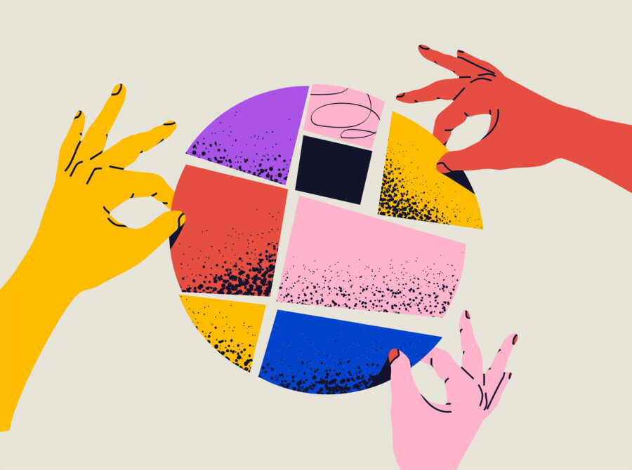
Visual Aesthetics and Composition
Minimalist vs. Maximalist Approaches
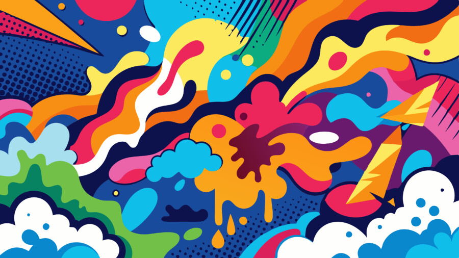
While minimalism is celebrated globally, the specific execution can differ. Japanese minimalism (often associated with Zen principles) is about restraint, negative space, and subtle elegance that quietly emphasizes the product or message. At the same time, Japanese design can also get quite vibrant and dense, especially in certain advertising contexts—like flyers or pop-culture event announcements—where designers cram as much information as possible into a limited space.
In the West, minimalism typically aims for simplicity in both content and visuals, resulting in straightforward layouts with a strong, clear focal point. When designing for Japanese audiences, it’s important to consider that it’s not always about less content; sometimes it’s about carefully layering multiple pieces of information in a harmonious way.
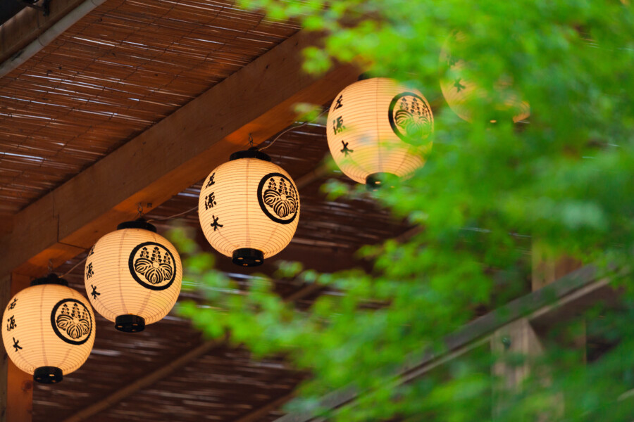
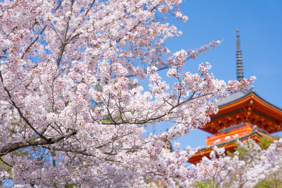
Symbolism and Imagery
Designers must also be aware of how imagery is perceived differently. In Japan, subtlety is often valued. For example, seasonal motifs—such as cherry blossoms (sakura) in spring or maple leaves (momiji) in autumn—have deep cultural significance. These elements can be used to evoke emotion or symbolize a time of year, subtly appealing to a sense of nostalgia or connection to nature.
In Western contexts, using seasonal imagery can feel more decorative and less symbolic. While it may still resonate with users—such as snowflakes during the winter holidays—there’s often less of a direct, collective emotional response to such imagery. Designers who integrate symbolic imagery thoughtfully can create stronger emotional ties with their audience.
Color Perceptions and Meanings
-
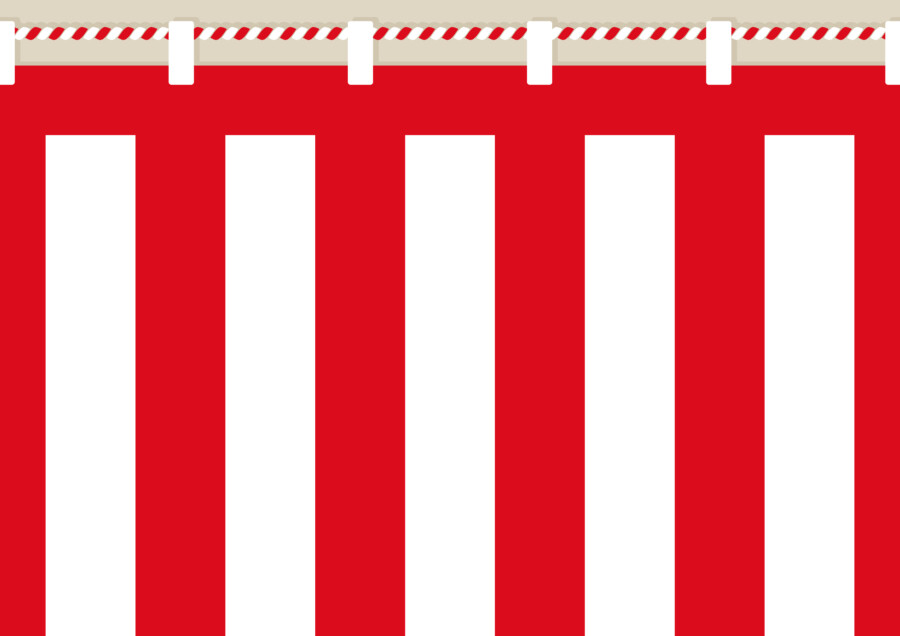
- Celebratory Curtain
-
- Funeral Curtain
Red, White, and Everything in Between
In both Japan and many Western cultures, red often signifies passion and excitement. However, in Japan, red also has historical links to good fortune (for instance, the iconic torii gates at Shinto shrines). White—commonly associated with purity in Western cultures—is also tied to cleanliness in Japan, but it can carry meanings of mourning or death in certain traditional contexts. This duality can influence how audiences perceive white-based designs in Japan.
Additionally, gold and silver often evoke premium, high-quality images in both Japan and Western markets, yet the subtlety or boldness of how these colors are employed can differ significantly. In Japanese design, a refined use of gold might be preferred to convey elegance without overpowering the layout. In a Western context, bold and metallic gold might be used to emphasize luxury more directly.
Balancing Bold and Subtle Palettes
While vibrant colors certainly appear in Japanese designs, the context of use often dictates the choice. For instance, bright pop-art-inspired colors are popular in youth-oriented campaigns or manga/anime-related websites, whereas traditional or formal brands might lean toward muted, earthy tones. Western designs may toggle between a broad spectrum of colors depending on brand identity, but often emphasize color psychology—red for urgency, blue for trust, green for sustainability, and so forth. Finding the right balance involves not only brand identity but also cultural context.
Typography and Language Considerations
The Complexity of Japanese Characters
Designing typography for a Japanese audience means accommodating Kanji, Hiragana, and Katakana. These three writing systems—often used interchangeably in a single sentence—demand a careful typographic approach. Overly decorative fonts can quickly become illegible. At the same time, the right font choice can add a distinctly Japanese flair that enhances brand authenticity.
By contrast, Western typography tends to focus on legibility of the Latin alphabet. Designers often look at whether a typeface is serif or sans-serif, how it pairs with another font, and its overall tone—modern, classic, friendly, etc. When localizing for a Japanese audience, it’s essential to pick a Japanese typeface that aligns with the brand’s voice but remains highly readable across different screen sizes and platforms.
Line Spacing and Hierarchy
Japanese text can appear dense due to the complexity of characters. Adequate line spacing (leading) and thoughtful hierarchy help users scan and understand the content. In Western languages, the use of bold or italic styles is common for emphasis, whereas in Japanese text, the emphasis might be shown through larger font size, different color, or even the use of special markers alongside the text. Understanding these typographic nuances helps avoid clutter and confusion.
Layout, Navigation, and User Experience
Reading Patterns and Layout Preferences
Western audiences typically read from left to right, top to bottom. This left-to-right orientation informs a common layout pattern called the “F-pattern” or “Z-pattern.” By contrast, Japanese texts can be read horizontally (left to right) or vertically (top to bottom), though most modern web design uses the horizontal approach for digital platforms. Even so, a more vertical organization—particularly in print media—remains prevalent in Japan.
Understanding how your audience expects to navigate the content is key. Some Japanese websites favor dense, information-packed homepages that require scrolling. They often assume users will scan a lot of data before clicking through. Western websites, on the other hand, frequently use cleaner, more minimalist homepages, providing high-level overviews with quick access to deeper sections.
Navigation Labels and Icons
Another noticeable difference is in the approach to labeling. Japanese users might appreciate more detailed labels or explanations on navigation buttons, reflecting a cultural preference for clarity and avoiding ambiguity. Western designs often lean toward minimal or icon-driven labels, relying on a more intuitive sense of user exploration. It’s important to strike the right balance: too much text can overwhelm Western audiences, while too little can confuse Japanese audiences, especially if iconography alone isn’t immediately clear.
Content Preferences and Approach
Informational Depth vs. Conciseness
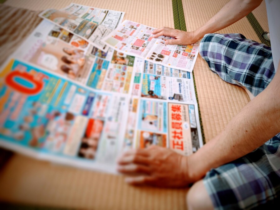
Many Japanese users expect thorough, detailed explanations in product descriptions, user manuals, and even marketing materials. A sense of trust can be built by showing that the company or brand has carefully considered the user’s questions and needs. In Western contexts, audiences may prefer concise, direct messaging that quickly outlines the main benefits. To avoid friction, Japanese websites often include FAQ sections, step-by-step guides, and multiple images, whereas Western sites might deliver a more streamlined, bullet-point overview.
Trust-Building Tactics
Building trust in Japan can be a nuanced process. Elements such as customer testimonials, official stamps of approval (e.g., government or industry associations), and explicit privacy notices are commonly featured. In Western design, social proof often comes in the form of star ratings, short testimonials, or influencer endorsements. By aligning your trust-building elements with audience expectations, you’ll increase the likelihood of conversions and user engagement.
Striking the Right Balance

Localization and Adaptation
One pitfall for many global brands is rolling out a uniform design without localizing content. While brand consistency is essential, there is a difference between cohesive branding and ignoring local tastes. For example, using the same color palette and imagery for both Japanese and Western markets might undermine cultural connections. Instead, adapt layouts, imagery, and content hierarchy to respect local cultural norms, while ensuring brand recognition remains intact.
Testing and Iteration
Ultimately, design is an iterative process. Conducting user tests in both Japan and Western regions can shed light on user preferences, highlight pain points, and guide designers toward successful adjustments. A/B testing, surveys, and analytics are invaluable for revealing how different audiences interact with the same design elements. By gathering data and iterating, you can continually refine the user experience.
Conclusion
Design transcends mere aesthetics—it encapsulates cultural values, communication styles, and user expectations. While there are certain universal principles (like clarity, accessibility, and user-centric thinking), the way these principles manifest can differ markedly between Japanese and Western audiences. By understanding cultural nuances—whether it’s the formality of language, the density of information on a webpage, or the symbolic weight of certain colors—designers can build more authentic and engaging experiences.
If you’re creating a product or service that bridges these worlds, start by researching your audience’s preferences, test your prototypes, and don’t be afraid to adapt. Taking the time to align your designs with cultural nuances isn’t about pandering; it’s about respecting the people you’re creating for and delivering value in a way that resonates with them. In the end, thoughtful cultural sensitivity in design fosters trust, loyalty, and genuine connection—goals that transcend any border.
Ensure Your Japanese Is Spot-On →