The Beauty of Imperfection: How Wabi-Sabi Enhances Brand Design
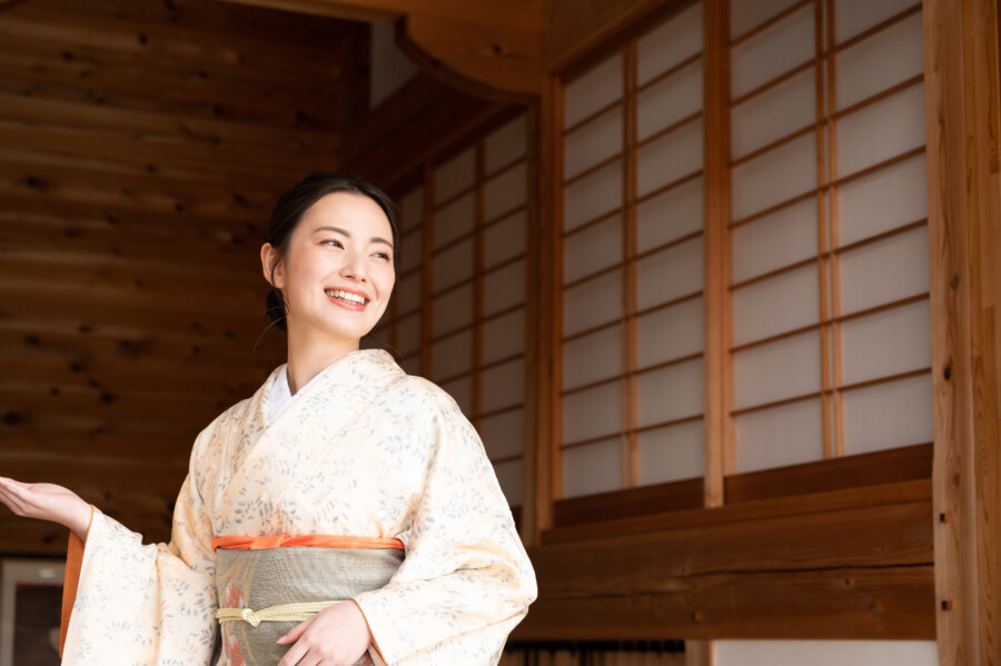
The notion of “Wabi-Sabi” is deeply rooted in Japanese culture, celebrating simplicity, impermanence, and imperfection as sources of subtle beauty. While this philosophy is centuries old, its essence remains remarkably relevant—especially within modern design. As brands increasingly seek to convey authenticity and emotional resonance, designers are turning to Wabi-Sabi principles to infuse their work with warmth, depth, and a sense of genuine individuality. In this article, we’ll explore the fundamental ideas of Wabi-Sabi, discuss why embracing imperfection can foster more authentic branding, and provide concrete examples of how to incorporate these concepts into contemporary design.
Kanji-Inspired Package Artwork
What Is Wabi-Sabi?
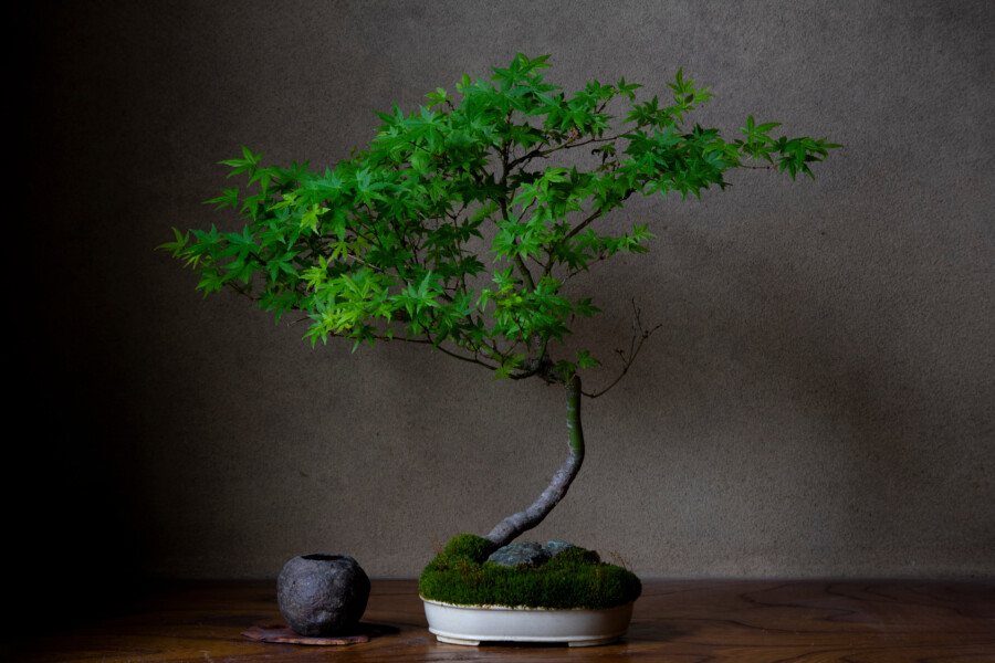
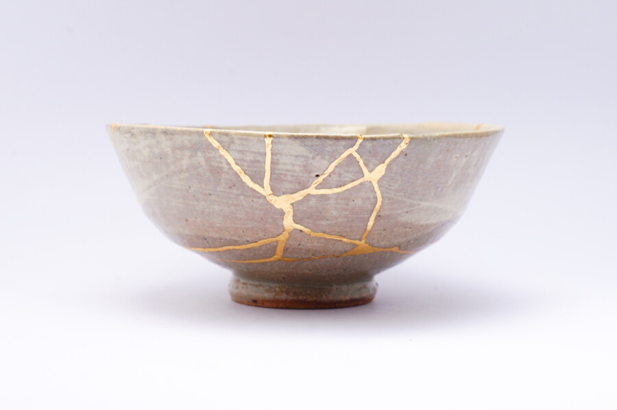
Wabi-Sabi can be a bit tricky to define, especially from a Western perspective. At its core, Wabi-Sabi is a worldview that values imperfection, impermanence, and the natural cycles of growth and decay. Instead of discarding items that have cracks or patina, Wabi-Sabi sees beauty in those flaws. It’s an aesthetic that acknowledges the character that arises from time-worn textures, uneven edges, and simple, uncomplicated forms.
In traditional Japanese tea ceremonies, for instance, slightly misshapen tea bowls are prized for their subtle irregularities. These objects possess a quiet elegance that’s rooted in authenticity. In the context of branding and modern design, this mindset translates into appreciating designs that aren’t over-polished or artificially perfect. The “realness” of a product, a logo, or a brand story can often be far more compelling than a perfectly glossy exterior.
The Rise of Imperfection in Modern Design
Modern consumers are inundated with products and services claiming to be “the best,” “the newest,” or “the most innovative.” In an overly saturated market, many people have grown skeptical of slick advertising and hyper-polished brand images. There’s a pushback against the “too perfect” aesthetic that has long dominated commercial design, leading designers and brands to explore rawer, more honest expressions.
This shift is not just about standing out; it’s also about building trust. When a brand embraces its flaws and humanizes its image, consumers feel an emotional connection. Imperfection, in a sense, has become a new form of transparency. People are increasingly drawn to brands that show their behind-the-scenes process, highlight handmade elements, or openly discuss their challenges. Wabi-Sabi’s emphasis on sincerity and humility aligns perfectly with these emerging consumer values.
Why Imperfection Is an Asset for Branding
Authenticity
Wabi-Sabi encourages brand storytelling that honors the real journey—complete with ups and downs, scrapes and bruises. Brands that adopt this mindset can communicate a more nuanced story, forging genuine bonds with their audience.
Emotional Connection
Imperfections often evoke empathy or curiosity. Think of a hand-thrown ceramic mug with small indentations from the potter’s fingertips. Those indentations remind us of the human touch, creating a sense of warmth. In a similar way, a design that isn’t flawlessly symmetrical or perfectly aligned can feel more approachable.
Sustainability and Longevity
By valuing flaws and minor damage, we reduce waste and promote the idea that items have a longer life cycle. This ethos can extend to branding strategies—rather than chasing disposable trends, a brand can invest in timeless design elements that endure and evolve gracefully over time.
Incorporating Wabi-Sabi in Visual Identity
Adapting Wabi-Sabi principles to branding doesn’t mean everything has to look “old” or “broken.” Rather, it’s about thoughtfully selecting and implementing design choices that convey authenticity, natural beauty, and a sense of calm. Below are some practical ways to bring Wabi-Sabi into your brand’s visual identity:
Subtle Color Palettes
Wabi-Sabi palettes typically include earth tones and muted hues—think soft grays, warm browns, sage greens, and gentle whites. These understated colors evoke a sense of tranquility and timelessness. If your brand traditionally uses vibrant colors, you could consider incorporating a few muted accents for balance or adopting a more subdued secondary palette to complement bolder tones.
Organic Textures
Texture plays a major role in Wabi-Sabi design. Incorporate materials that reveal natural grains, such as paper with visible fibers or website backgrounds that mimic raw, tactile surfaces. Even subtle grain effects in digital content can hint at a handmade quality, adding depth and richness to a design that might otherwise appear flat.
Imperfect Typography
Instead of using purely geometric, razor-sharp fonts, explore typefaces with slight irregularities or hand-drawn elements. For example, a logo or tagline that features variations in line weight or spacing can subtly communicate a human touch. The goal is to avoid looking sloppy; the imperfections should be deliberate, reflecting authenticity rather than carelessness.
Minimalist Layouts
Wabi-Sabi isn’t about clutter or chaos. It’s about paring down to the essentials while respecting the natural flow of a design. Consider using ample whitespace and thoughtful placement of text and images so that each design element can “breathe.” This approach not only aligns with the minimalist side of Wabi-Sabi but also makes your content more legible and engaging.
Real-World Examples
MUJI
Although not exclusively Wabi-Sabi, MUJI’s branding incorporates many harmonious elements: muted color schemes, minimalist packaging, and natural materials. Their approach highlights functionality and simplicity, echoing Wabi-Sabi ideals.
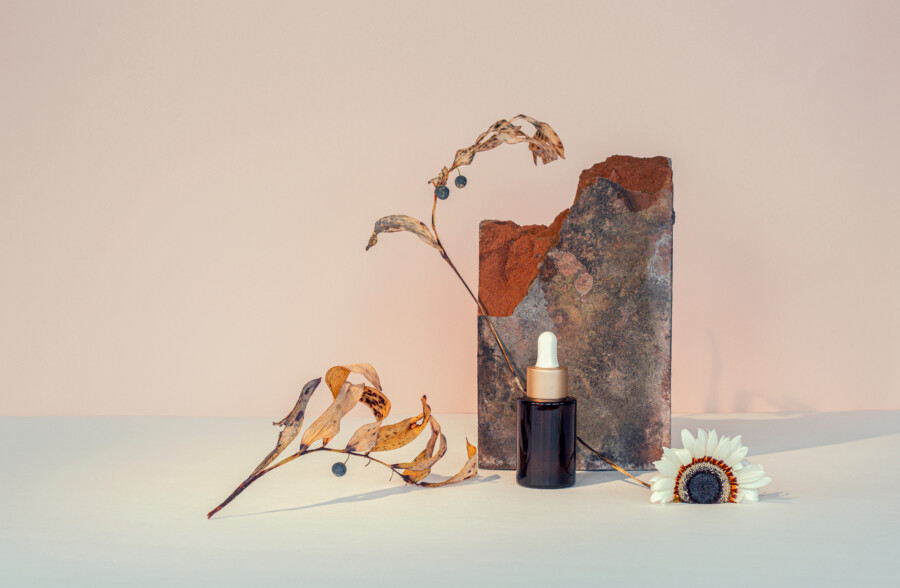
Aesop
The skincare brand Aesop uses understated packaging and earthy tones, focusing on product quality rather than flashy advertising. While their visual identity is polished, there’s an inherent calmness and authenticity in their choice of brown glass bottles and monochrome labels.
Kinfolk
This lifestyle publication often features photography emphasizing natural light, subtle textures, and imperfect table settings. By capturing the essence of real-life moments instead of hyper-curated vignettes, the magazine aligns closely with Wabi-Sabi’s embrace of imperfection.
Balancing Minimalism and Imperfection
Wabi-Sabi can be seen as a cousin to minimalism, but the two aren’t identical. Minimalism focuses on stripping away excess, aiming for a clean, functional aesthetic. Wabi-Sabi, on the other hand, adds a layer of emotional depth through imperfections and a celebration of natural processes. When blending the two, it’s important to maintain a delicate balance. Too much minimalism can feel sterile; too much rustic imperfection can turn into disorder. Finding harmony is the key—leave enough negative space for the imperfect elements to stand out, but don’t go overboard with chaotic textures or mismatched shapes.
Practical Tips for Designers
Start with a Story
Before you dive into mood boards, clarify your brand’s origin and goals. Identify which parts of your story could be authentically communicated through subtle imperfections.
Experiment with Materials
If you’re designing packaging, consider kraft paper, recycled cardboard, or textured labels. For digital designs, create mock-ups that incorporate hand-sketched icons or gently distressed backgrounds.
Refine, Then Distress
An effective Wabi-Sabi design isn’t simply messy. Typically, it undergoes multiple refinement stages before selectively adding “imperfections” that feel intentional and meaningful.
Stay True to Your Audience
While Wabi-Sabi may be appealing, it’s not for every brand. Analyze your target audience’s preferences and expectations. A high-tech startup aiming for a crisp, futuristic image might only borrow certain Wabi-Sabi elements—like subtle texturing or subdued color choices—instead of going full-on rustic.
Conclusion
Wabi-Sabi’s philosophy offers a refreshing counterpoint to the polished perfection so common in modern design. By welcoming imperfection and emphasizing authenticity, designers and brands can build deeper emotional connections with consumers. Whether it’s through earthy color palettes, organic textures, or the honest storytelling behind a product’s journey, incorporating Wabi-Sabi elements can enrich a brand’s visual identity. In a digital world flooded with seemingly flawless images, the genuine beauty of imperfection stands out—and might just be what helps your brand resonate more profoundly with its audience.
Embracing Wabi-Sabi doesn’t mean rejecting technology or modernity. Rather, it encourages a more nuanced, human-centric approach to design—one that values simplicity, impermanence, and the delicate interplay of form and function. For brands eager to create meaningful, long-lasting impressions, allowing a bit of roughness, irregularity, and realness into the mix could be the key to truly authentic branding.