Avoiding Font Faux Pas: Common Mistakes with Japanese Text in Design
When designing with Japanese text, there’s far more to consider than just selecting a font that “looks cool.” From spacing issues to unexpected character alignment, Japanese typography has its own set of rules and complexities that can catch even experienced designers off guard. By understanding these challenges and taking a more intentional approach to your typographic choices, you can avoid the most common pitfalls and create designs that are both beautiful and easy to read.
In this article, we’ll explore the unique aspects of Japanese typography, the common mistakes designers make, and practical strategies to make sure your design shines. Whether you’re creating digital interfaces or printed materials, this guide will help you navigate the fascinating world of Japanese fonts with confidence.
The Unique Nature of Japanese Typography
Character Variety and Complexity
Unlike English, which uses 26 letters in the alphabet (plus uppercase variants), Japanese relies on three main script systems: Hiragana, Katakana, and Kanji. Kanji alone includes thousands of characters, each with a unique structure and meaning. Because of this complexity, Japanese typography requires fonts that can handle a wide range of characters while maintaining consistent visual harmony.
Vertical vs. Horizontal Text
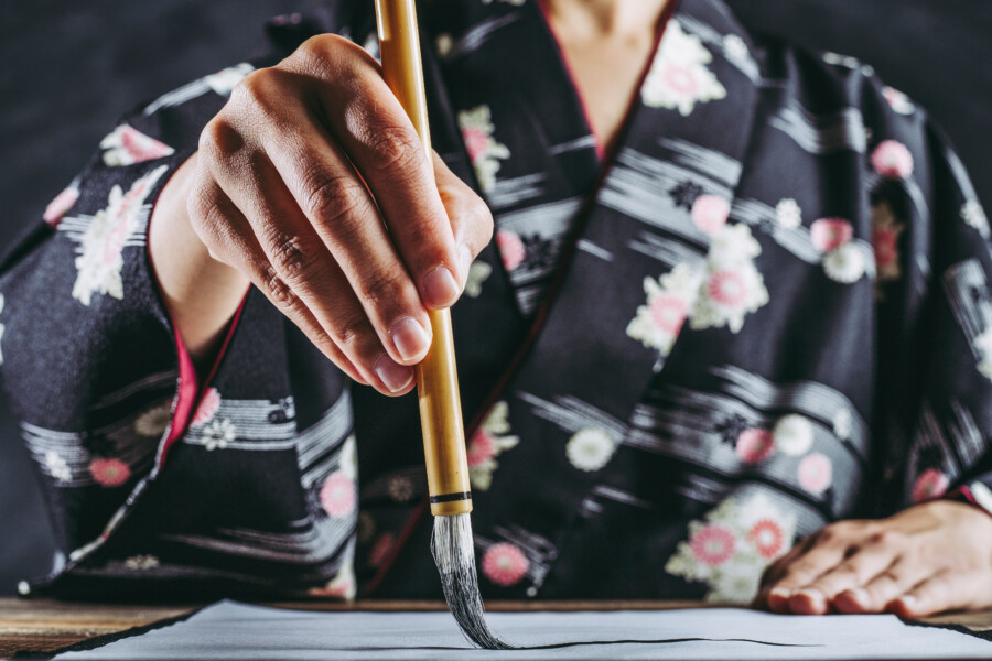
Another consideration is that Japanese can be written vertically (tategaki) or horizontally (yokogaki). While horizontal text is standard in digital media and many contemporary contexts, some books, newspapers, and magazines still incorporate vertical text. This duality can impact layout choices and even font design, since certain typefaces or spacing rules may work better in vertical text than others. If your design needs to accommodate both orientations, it’s crucial to pick fonts (and a layout structure) that adapt gracefully to either format.
Full-Width vs. Half-Width Characters
Japanese also uses both full-width and half-width versions of certain characters. For instance, numbers and punctuation marks can exist in two forms, and mixing them incorrectly can create odd spacing or disrupt the flow of text. Designers need to pay close attention to which versions of characters are used and how they interact with the surrounding text. Failure to manage these details often leads to layout inconsistencies and a less polished final product.
Common Font Faux Pas

Mixing Incompatible Typefaces
One of the biggest mistakes designers make is mixing fonts that clash in style or character design. For example, pairing a highly decorative Japanese font with a minimalist Latin font can disrupt the visual flow, making the text feel disjointed. The key is to ensure the weights, proportions, and overall aesthetic are harmonious, even when using separate typefaces for Japanese and English text. Keep in mind that some Japanese fonts have built-in Latin characters designed to blend seamlessly, which can be a huge advantage if you need bilingual text.
Overlooking Readability
In an effort to stand out, designers sometimes choose overly stylized fonts that are difficult to read. While these fonts might look striking in a headline, using them for longer text blocks can be a recipe for eyestrain—especially when dealing with detailed kanji characters. The more complex the text, the more important it is to choose a font that prioritizes legibility. Think about the size of the text, the spacing, and how the font might appear across different devices or printed formats.
Using Latin Spacing Rules for Japanese Text
Western typography often uses spacing rules that don’t translate perfectly to Japanese. In English, for instance, it’s common to add an extra space after punctuation. But in Japanese, spacing is typically more uniform, and certain punctuation marks have dedicated full-width versions that incorporate their own spacing. Applying Western spacing habits to Japanese text can create awkward gaps or crowding, so it’s vital to understand the specific spacing conventions before finalizing your layout.
Ignoring Character Alignment
Another subtle error is misalignment of characters, especially when mixing Japanese and English. For instance, half-width English characters might not align neatly with full-width Japanese characters, creating a staggered effect that’s distracting to the reader. Pay attention to baseline alignment and letter spacing, adjusting as needed to ensure a clean, consistent look. Many design tools allow for custom baseline adjustments, so take advantage of these features to fine-tune your typography.
Neglecting Font Licensing and Encoding
When sourcing Japanese fonts, it’s important to verify that they include the full range of characters you need. Some free or low-cost fonts might not have the complete set of kanji, which could lead to missing glyphs or forced substitutions. Also, be sure you understand the font’s licensing terms—especially if you’re working on commercial projects. And don’t forget encoding: ensure that your chosen fonts support standard character encodings like Unicode, so your text displays correctly in all contexts.
Balancing Aesthetics and Legibility
Consider the Purpose of Your Design
The ideal balance between aesthetics and legibility often depends on your project’s purpose. For instance, a high-end fashion brand might want a more elegant, stylized font to match its brand identity, while a newspaper or blog might prioritize clarity for long-form reading. Identify your design goals before picking your fonts. If you’re aiming for a more decorative feel, reserve that style for headings and use a cleaner, more traditional font for body copy.
Be Mindful of Context and Medium
Designing for print sometimes allows for finer typographic details, like subtle serif flourishes or delicate stroke weights. However, digital environments can vary drastically in screen resolution and color settings, so fine details might be lost or distorted. Additionally, if your text is viewed on mobile devices, small characters and thin strokes can become nearly illegible. Always test your designs in real-world scenarios (e.g., printing a sample, checking different screen sizes) to confirm that your font choices hold up under various conditions.
Striking the Right Visual Hierarchy
When Japanese text is mixed with English, creating a coherent visual hierarchy can be tricky. You may need to use different weights or sizes to ensure both languages remain balanced. Headings might be bolded in both Japanese and English, while subheadings are rendered in a slightly lighter weight. Using color contrast can also help direct attention and keep different sections of text visually distinct, all while maintaining a cohesive overall look.
Recommended Practices for Better Japanese Typography
Use Fonts Designed for Multi-Language Support
If your design includes both Japanese and Western text, choose fonts that are explicitly designed to handle multiple writing systems. These typefaces typically contain well-crafted versions of both Latin characters and Japanese glyphs, ensuring consistent line spacing, stroke thickness, and overall style. Doing so can spare you the headache of manually adjusting two separate fonts to achieve a uniform look.
Leverage Proper Typesetting Tools
Many professional design tools—such as Adobe InDesign, Illustrator, and Photoshop—offer specialized settings for Asian typography. These include automatic kerning for Japanese characters, ruby text support, and vertical layout options. Familiarize yourself with these features so you can take full advantage of what the software offers. By doing so, you’ll not only save time but also avoid errors that can arise from manual workarounds.
Pay Attention to Line and Character Spacing
Appropriate line and character spacing can make or break your design’s readability. For Japanese, line spacing might need to be slightly more generous than for English text, especially if you’re using smaller font sizes or more complex kanji. Similarly, pay attention to how punctuation marks and half-width characters fit into your lines. Adjust spacing to ensure the text flows smoothly without awkward breaks or collisions.
Test Across Different Platforms
Typography can appear quite differently on various devices and operating systems. Before finalizing your design, test it on Windows, macOS, iOS, and Android (if relevant). Check how characters scale in responsive layouts, whether any glyphs are missing or incorrectly rendered, and how the text appears under different color profiles. These tests will give you valuable insights into how your design might need to be tweaked for broader accessibility.
Don’t Underestimate the Power of Feedback
If possible, consult native Japanese speakers or fellow designers experienced in Japanese typography. A fresh pair of eyes can quickly spot issues you might have overlooked—such as incorrect punctuation usage or unnatural line breaks. Collect this feedback early and often in your design process, so you can refine your approach without having to make major revisions at the last minute.
Conclusion
Japanese typography is a world unto itself, filled with intricacies that can be both fascinating and intimidating. From balancing multiple scripts to mastering spacing and alignment, the path to visually pleasing and readable Japanese text is paved with potential pitfalls. But by understanding the nuances and applying best practices, you can avoid the most common font faux pas and produce designs that resonate with your audience.
Remember: the goal is to serve your readers or users by presenting text in a clear, appealing way. Whether you’re designing a website, a brochure, or a digital product interface, taking the time to carefully choose and refine your fonts will pay off in the final result. Stay mindful of the details—like mixing typefaces, managing spacing, and respecting cultural conventions—and you’ll be well on your way to creating polished, professional designs that make a lasting impression.
Professional Japanese Design Audit