Color vs Monochrome: When to Go Bold or Stay Subtle with Your Logo
I often see brands grappling with foundational decisions that shape their entire identity. One of the most visually impactful, and often debated, choices is the color palette – or lack thereof – for a logo. Should you burst onto the scene with vibrant hues, or opt for the timeless elegance of monochrome?
It’s more than just aesthetics; it’s strategy. Your logo is the visual cornerstone of your brand, the first impression, the tiny symbol that carries immense weight. Choosing between color and monochrome significantly influences perception, memorability, and versatility. So, let’s dive deep into the nuances of each approach and explore when to embrace the bold and when to master the subtle.
The Irresistible Pull of Color: Emotion, Energy, and Recognition

Sampajano-Anizza – stock.adobe.com
Color isn’t just decoration; it’s a powerful psychological tool. Our brains are hardwired to react to different colors in specific ways. Think about it:
- Emotional Connection: Reds can evoke passion and urgency (Coca-Cola, Netflix), blues instill trust and stability (Facebook, IBM, many financial institutions), greens suggest nature, health, or growth (Whole Foods, Starbucks), and yellows radiate optimism and warmth (McDonald’s, IKEA). Using color strategically allows you to tap into these primal emotional responses and align them with your brand’s intended feeling.
- Standing Out: In a crowded marketplace, a distinctive color palette can make your logo instantly recognizable. Think of the Google logo – its playful mix of primary colors reflects innovation and accessibility. Or the vibrant orange of Fanta, screaming fun and energy. Color helps differentiate you from competitors who might be playing it safer.
- Memorability: Our visual memory often latches onto color. A unique color combination can make your logo stick in people’s minds more effectively than a purely black-and-white design, especially if the design itself isn’t exceptionally unique.
- Conveying Personality: Is your brand playful, energetic, and modern? Or perhaps organic, serene, and trustworthy? Color is a shortcut to expressing this personality. Bright, saturated colors often suit younger, dynamic brands, while more muted or specific palettes might appeal to different demographics or industries.
When is Color the Right Choice?
- Your brand personality is energetic, youthful, or approachable.
- You operate in a market where differentiation through color is key.
- You want to evoke specific emotions strongly tied to your product or service (e.g., warmth for a coffee shop, excitement for an entertainment brand).
- Your target audience responds well to visual stimulation and vibrant design.
- Your primary applications allow for consistent, high-quality color reproduction (digital platforms are great for this).
The Timeless Elegance of Monochrome: Sophistication, Versatility, and Clarity
Robert – stock.adobe.com
While color shouts, monochrome often whispers – with authority. A black-and-white (or grayscale) logo carries its own distinct advantages:
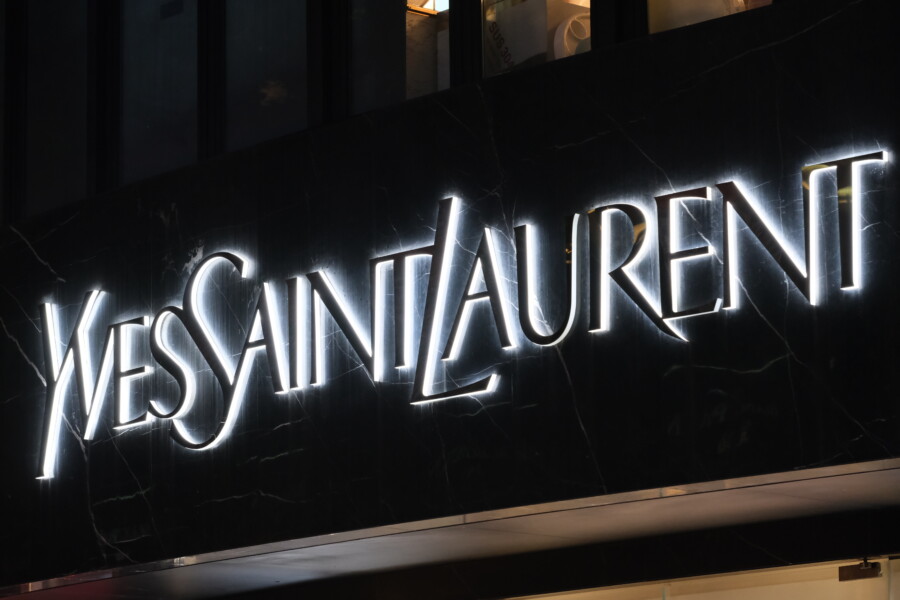
- Sophistication and Luxury: Think of high-fashion brands like Chanel, Prada, or Yves Saint Laurent. Their often monochrome logos exude exclusivity, timelessness, and sophistication. Simplicity in color often translates to perceived high value.
- Versatility Supreme: This is arguably monochrome’s biggest strength. A black-and-white logo works everywhere. It looks sharp on any background color, reproduces cleanly in all print formats (even low-cost ones), scales down beautifully to tiny sizes (like favicons or app icons), and translates effortlessly to physical products like engravings or embossings. You never have to worry about color clashes or printing inconsistencies.
- Clarity and Form: Stripping away color forces focus onto the shape, form, and concept of the logo itself. A strong monochrome logo relies on its fundamental design structure, which can communicate strength and confidence. Think of the Nike swoosh – instantly recognizable and powerful even without color.
- Timelessness: Color trends come and go, but black and white are eternal. A monochrome logo is less likely to feel dated over time compared to one relying heavily on trendy color palettes.
- Seriousness and Authority: For industries like law, finance, or high-end consulting, a monochrome logo can convey professionalism, trustworthiness, and gravitas.
When is Monochrome the Right Choice?
- Your brand aims for sophistication, luxury, or timeless appeal.
- Versatility across a vast range of applications (print, web, merchandise, various backgrounds) is paramount.
- You want the core shape and concept of your logo to be the primary focus.
- Your industry values tradition, authority, or minimalist aesthetics.
- You need a logo that will remain relevant and chic for decades to come.
- Budget constraints for printing or merchandise production are a significant factor.
Finding the Balance: The Best of Both Worlds?
It’s crucial to understand that this isn’t always an either/or decision. Many successful brands utilize both:
- Designing for Monochrome First: A widely accepted best practice in logo design is to ensure your logo works powerfully in black and white first. If the logo’s structure, balance, and concept aren’t strong without color, adding hues won’t fix fundamental flaws. It must be recognizable and effective in its simplest form.
- Having Variations: Most brands need logo variations for different contexts. This typically includes:
-
- Primary Color Logo: The main, full-color version.
- Monochrome Versions: Essential black-only and white-only (reverse) versions for use on varied backgrounds or specific print methods.
- Simplified/Optimized Versions: Sometimes, color palettes are simplified for specific uses.
Think of Apple. While their products embrace color, the Apple logo itself is most often seen in monochrome (black, white, or gray), ensuring maximum versatility and reinforcing its iconic shape.
Key Factors in Your Decision: A Strategic Checklist

Choosing between color and monochrome requires careful consideration of your unique brand context. Ask yourself:
- What is our Core Brand Personality? (Playful or Serious? Modern or Classic? Loud or Understated?)
- Who is our Target Audience? (What aesthetics resonate with them? What are their expectations?)
- What is the Industry Norm? (Do you want to conform or disrupt? What are competitors doing?)
- Where Will the Logo Be Used Most Often? (Digital screens? Print materials? Tiny app icons? Large signage? Embroidered uniforms?) -> This is critical for versatility.
- What Core Message Must the Logo Convey Instantly? (Trust? Innovation? Fun? Luxury?)
- What is our Long-Term Vision? (Will this choice feel relevant in 5, 10, 20 years?)
Conclusion: Choose with Purpose
The decision between a colorful or monochrome logo is far more than a simple aesthetic preference. It’s a strategic choice that impacts how your brand is perceived, remembered, and applied across countless touchpoints.
A vibrant, colorful logo can inject energy, emotion, and memorability, helping you stand out in a busy world. A sophisticated monochrome logo offers timelessness, unmatched versatility, and a sense of authority or luxury.
Often, the most robust solution involves designing a logo that is fundamentally strong in black and white but also has a carefully considered color version for primary use. The key is intentionality. Understand the strengths and weaknesses of each approach, weigh them against your brand strategy, target audience, and application needs, and choose the path that best communicates who you are and where you want to go.
Don’t just pick colors you like; choose the palette (or lack thereof) that works for your brand’s future.