Points to consider when creating a poster design for a restaurant
When designing a poster design for a restaurant, the color scheme and typeface design will vary depending on the type of restaurant.
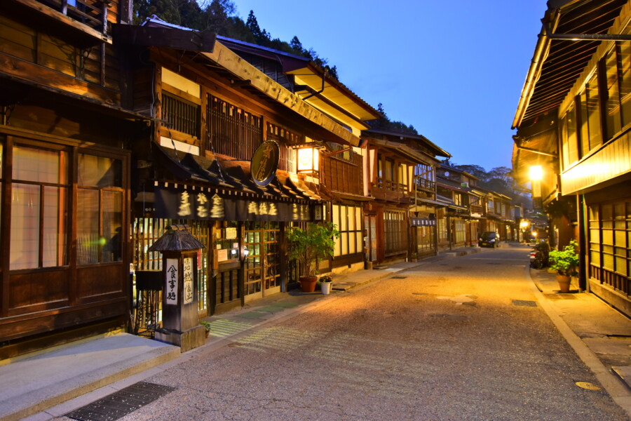
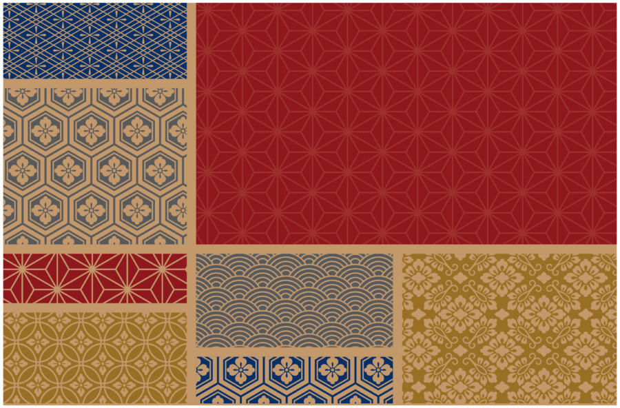
Authentic Japanese Branding Marks
Match the color scheme of the poster to the type of restaurant
For a relaxed café, three colors, such as black or dark brown to evoke the feel of coffee and wood, dark green, and clean white, will fit the atmosphere.
For a family-friendly restaurant, warm colors such as red, yellow, and orange are good choices. This creates the image of a fun space where everyone can enjoy conversation while eating together.
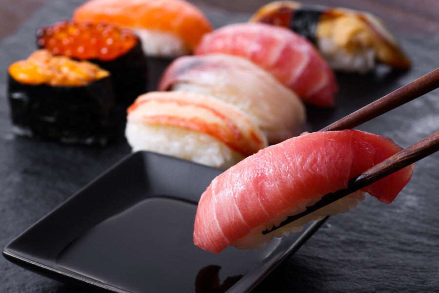
Sushi restaurants can use beautiful blue and white colors that remind one of the ocean, and black colors to create the image of Japanese food. For Japanese food, colors that evoke traditional Japanese colors such as red, green, and black would be appropriate for the atmosphere.
Choose a typeface that matches the type of restaurant
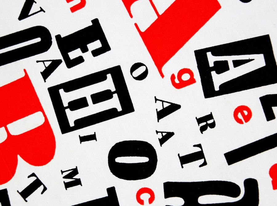
What typeface to use is also important because it is related to the branding of the restaurant. A rounded, bold typeface evokes a fun image of a children’s or family oriented restaurant.
Modern sans-serif typefaces are more casual and friendly.
Traditional serif typefaces have an image of luxury and elegance, and may be suitable for restaurants with stylish tastes that women may prefer.
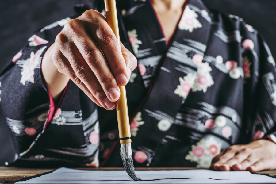
Brush strokes are likely to have a strong image of Japanese food.
By changing the size of the typeface or combining other typefaces, you can create a poster with a strong sense of crispness. Changing the size of the letters in the area you want to emphasize will make the poster very easy to read and create a cohesive look.
In addition, you can emphasize the seasonality of your campaign posters by subtly adding illustrations such as autumn leaves for fall or snowflakes or snowmen for winter.
In addition to text, illustrations and photos of limited-edition menu items can be added to the design to make the poster more effective and easier to understand. A map of the restaurant and detailed information can also be included at the bottom of the poster to make it easier to understand and attract customers to the restaurant.
Consider the overall layout and organization of the poster design as well
When designing a poster for a restaurant, it is important to consider not only the color scheme and typeface, but also the overall layout and composition of the design.
The layout should be easy to read and navigate, with the most important information, such as the restaurant name and location, prominently displayed. Use contrasting colors for the text and background to ensure legibility, and consider using hierarchy to prioritize important information.
The composition of the design can also be important in creating an effective poster. Consider using a focal point or central image to draw the viewer’s attention and create a cohesive design. Balance the text and graphics throughout the poster to create an overall pleasing design.
In addition to the visual elements, it is also important to consider the message and tone of the poster. The poster should communicate the restaurant’s unique selling point and convey a clear message to the viewer. Use persuasive language and a call-to-action to encourage viewers to visit the restaurant.
Finally, consider the context in which the poster will be displayed. Will it be hung in the restaurant or in a public space? Will it be displayed on social media or in print? Each of these contexts may require different design considerations and can impact the overall effectiveness of the poster.