Kanji as Art – Designing Logos that Double as Visual Poetry
When we talk about typography in design, most people instinctively think of alphabet-based scripts like Latin or perhaps the gracefully flowing curves of Arabic calligraphy. But one of the most captivating scripts to explore, especially in branding and logo design, is Kanji, the logographic characters used in written Japanese. More than just letters, Kanji are steeped in history and cultural significance. Each character can be an art form in itself, evoking visual poetry that resonates with aesthetics and meaning simultaneously. In this blog post, we’ll delve into how Kanji can serve as a powerful artistic tool in logo design—and how these characters can become symbols that communicate brand identity while functioning as genuine works of art.
Get Your Japanese Design Reviewed →
The Cultural and Historical Appeal of Kanji
Kanji were originally derived from Chinese characters and adapted over centuries in Japan, evolving into the script we recognize today. Each character isn’t merely a sound; it often represents a concept or idea and can even have multiple readings depending on context. This inherent complexity contributes to their mystique. For designers, the cultural weight and visual symmetry of Kanji make them stand out. Incorporating Kanji into a logo can instantly convey a sense of tradition, craftsmanship, and respect for history.
Interestingly, Kanji are also a bridge between cultures. Many brands seeking to communicate an exotic or global sensibility use Kanji to evoke images of the Far East. But beyond global appeal, these characters offer an authenticity that goes deeper than mere novelty. When used thoughtfully, Kanji can reflect the essence of a brand’s identity—sometimes even more effectively than a standard alphabetic approach.
Why Kanji Can Function as “Visual Poetry”

A Kanji character is not just a “letter” but a picture bearing semantic layers. Its strokes can be bold or delicate, reminiscent of brush calligraphy that has centuries of tradition behind it. Here are some reasons why Kanji can be considered a form of visual poetry:
- Layered Meanings
Many Kanji have multiple connotations. For example, the character “心” (kokoro) means “heart” or “mind,” encompassing emotion, spirit, and essence. In a single character, you can capture diverse aspects of a brand’s philosophy or attitude. This conceptual density makes logos both visually enticing and intellectually compelling. - Expressive Brush Strokes
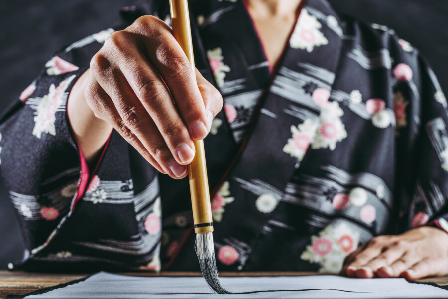
Traditional Kanji calligraphy is performed with a brush, giving each stroke a certain personality. Even in digital form, the brush-like qualities remain, exuding elegance or boldness based on the thickness and balance of lines. This inherent dynamism adds an artistic layer to the design that can evoke a range of emotions. - Aesthetically Balanced Forms
Many Kanji are designed in a way that creates a visually pleasing shape, whether it be symmetrical or intentionally asymmetrical. The geometric balance of strokes can resemble a piece of abstract art. When integrated into a logo, the character stands as a self-sufficient visual entity, yet it can also combine beautifully with other design elements.
Approaches to Incorporating Kanji into Logo Design
Designing a Kanji-based logo isn’t as simple as picking a character and slapping it onto a brand name. It requires cultural sensitivity, careful aesthetic consideration, and a deep understanding of the character’s meaning. Below are some approaches to get it right:
Consult Native Speakers and Calligraphy Experts
Because many Kanji have multiple pronunciations and nuanced meanings, it’s essential to consult fluent Japanese speakers or calligraphy experts to ensure your chosen character aligns with your brand message. Even similar-looking characters can differ significantly in meaning, and a small stroke can entirely change the character’s sense.
Combine Kanji with Complementary Typography
A Kanji-based logo can stand alone, but you can also pair it with a simpler typeface—whether that’s a Latin font or another script. The key is to choose a secondary font that doesn’t clash with the Kanji’s aesthetic. A minimalist sans-serif or a refined serif can provide a nice contrast, ensuring that the Kanji remains the focal point.
Experiment with Contemporary and Traditional Elements
One of the joys of Kanji-based design is merging old and new. For instance, you might keep the traditional calligraphic form of the character but pair it with modern geometric shapes or colors. Alternatively, you can stylize the Kanji into a more contemporary shape while preserving its recognizable form. Striking this balance can make a logo feel timeless yet fresh.
Maintain Readability and Scalability
When applying Kanji to a logo, readability matters. Overly stylizing a character might render it unrecognizable, losing the benefit of its original cultural and semantic value. Additionally, test the logo at different sizes. Fine details in the strokes can disappear in smaller formats, so be sure the essence of the character remains intact when scaled down.
Real-World Case Studies

To see Kanji logos in action, here are a couple of examples that beautifully fuse meaning, aesthetics, and brand identity.
- Sushi Restaurants
Many upscale sushi restaurants have taken to using a single Kanji character—like “鮨” (sushi) in stylized brush form—as their main logo. This character alone immediately communicates authenticity, tradition, and culinary mastery. The elegance of each stroke can remind patrons of the precision required in sushi preparation, thus forging a direct visual connection with the dining experience. - Modern Fashion Labels
Some contemporary fashion brands have turned to Kanji to evoke exclusivity or a unique cultural statement. For instance, a clothing brand might use “風” (kaze, wind) to symbolize freedom and movement in its apparel. By integrating the character into sleek garment labels and minimalist packaging, the brand can embody a concept that feels both global and rooted in cultural identity. - Tech Startups Emphasizing Innovation
While tech might not be the first industry you’d associate with traditional calligraphy, certain startups have chosen Kanji to reflect core values like “新” (shin, meaning new or renewal) to highlight innovation. Pairing the character with modern typefaces and futuristic design elements creates a logo that is both ancient and cutting-edge—standing out in a crowded market.
Practical Tips for Designers
If you’re considering Kanji for your next logo project, here are a few practical tips to keep in mind:
- Research Thoroughly: Understand the cultural background of the chosen Kanji. Make sure its common usage, connotations, and associations fit the brand message.
- Seek Feedback: Show the design to Japanese speakers, especially those familiar with calligraphy. Their insight can prevent unintentional misrepresentation or awkwardness.
- Simplicity Wins: Resist the urge to over-decorate. Kanji can already be quite elaborate. Balancing additional elements sparingly often results in a cleaner, more powerful design.
- Respect the Tradition: Acknowledge that Kanji has a rich cultural heritage. Using it simply for “exotic appeal” can come off as insincere or exploitative. Aim for an authentic connection to the brand’s story and values.
- Refine and Adapt: Don’t be afraid to iterate. Small changes in stroke thickness or spacing can dramatically alter the feel of a Kanji-based logo.
Conclusion: Logos as Living Works of Art
Designing a logo with Kanji isn’t merely about choosing a character with a particular meaning. It’s about crafting a harmonious balance of cultural authenticity, visual poetry, and brand identity. When integrated with thoughtfulness and respect for tradition, a Kanji-based logo can communicate deep layers of meaning, standing as a piece of visual poetry that engages the viewer on multiple levels.
By merging modern design principles with centuries of calligraphic heritage, you can create logos that transcend language barriers and time periods. Whether you’re branding a boutique, a restaurant, or a tech startup, consider exploring Kanji as an avenue for artistic expression. Done well, it will not only make your brand stand out but also whisper a profound story, one that resonates long after the first glance.