Difference in appearance and design impression between hiragana and katakana
The Japanese language has two types of characters: hiragana and katakana. Hiragana is the basic character of the Japanese language, while katakana is mainly used for foreign words and proper nouns. Although hiragana and katakana look similar, they have slightly different characteristics. This article describes the differences in appearance and design impression between hiragana and katakana.
Shape differences between hiragana and katakana
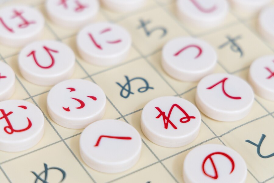
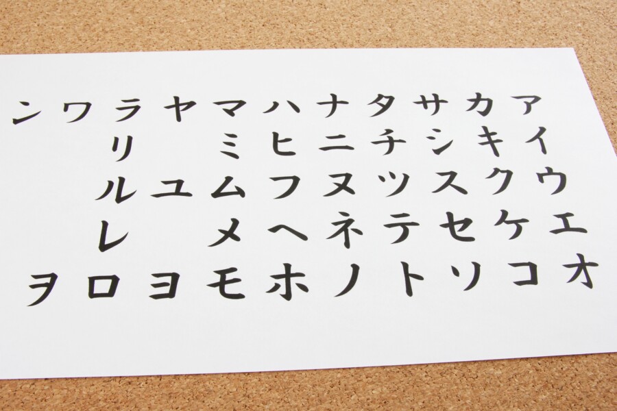
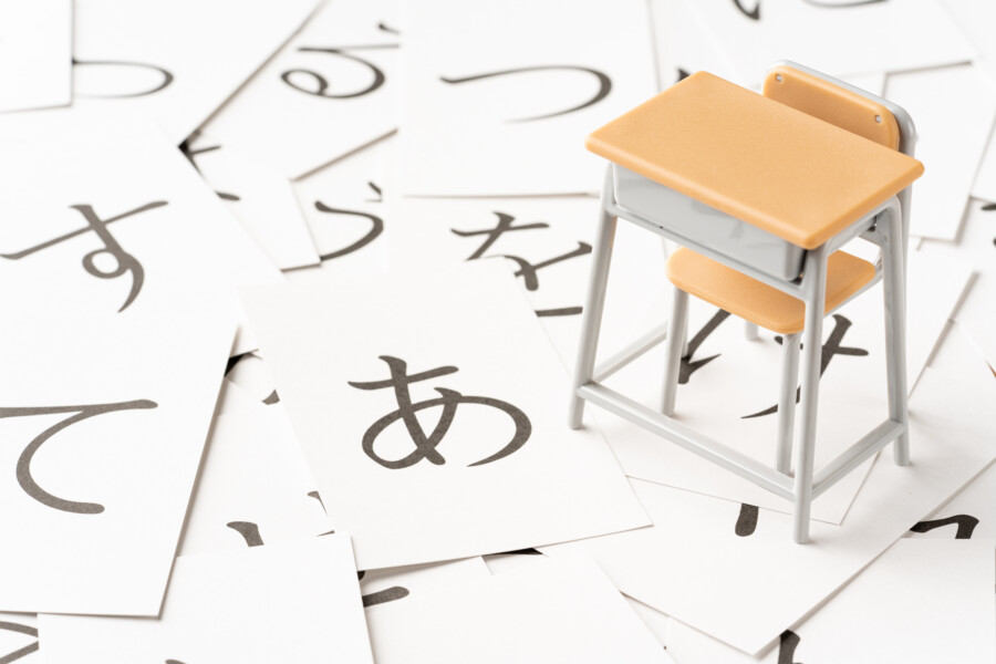
Hiragana and katakana have distinctive differences in shape. Hiragana has a rounded, curved shape, while katakana has a straight shape. Katakana has an angular shape, giving it a strong and dynamic impression. Hiragana, on the other hand, gives an elegant and soft impression.
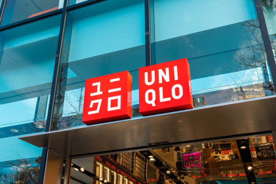
yu_photo – stock.adobe.com
The UNIQLO logo is available in English and Japanese versions, but the Japanese version is made in katakana. The katakana’s linear features give it a light, modern look.
Different impressions with different font choices
- Hiragana
- Katakana
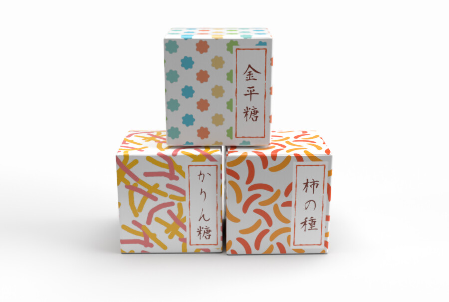
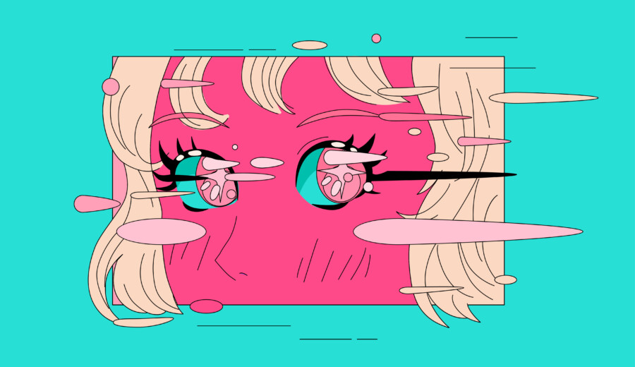
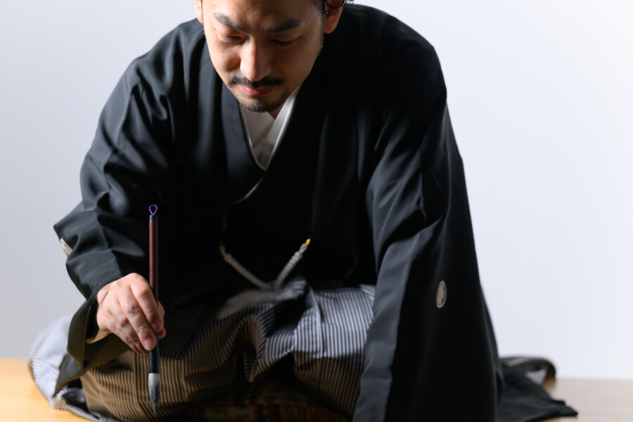
Hiragana and katakana have slightly different characteristics in terms of design impression. Hiragana has many fonts that express grace and softness. Depending on the typeface, hiragana can express femininity and cuteness. Katakana, on the other hand, has many fonts that express dynamism and strength. Depending on the typeface, it can express masculinity and sportiness.
Hiragana and katakana have subtly different characteristics and therefore have different design impressions. Different writing styles, font choices, and the use of different characters can create different impressions. It is important to skillfully use hiragana and katakana in accordance with the impression you wish to express.


