Evoking Tranquility: A Japanese-Inspired Candle Label Design
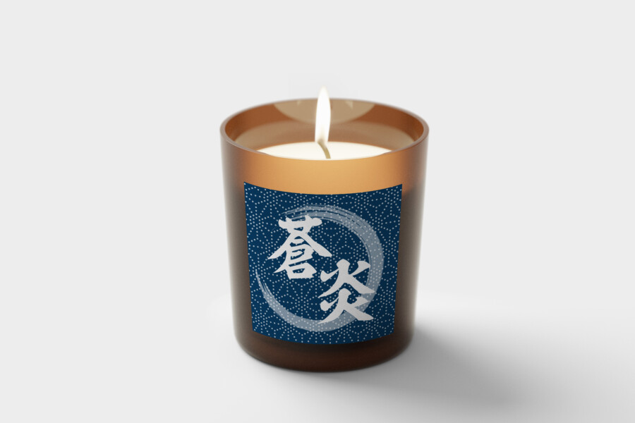
Where Calm Blue Meets Flickering Flame
This candle label design seeks to create a moment of peace in everyday life. The deep indigo blue base color evokes a sense of profound serenity and the vastness of the night sky or the deep sea. Against this calming backdrop, carefully placed elements draw the eye, hinting at the gentle light and warmth the candle provides. The overall impression is one of quiet sophistication, blending traditional Japanese aesthetics with a modern sensibility. It’s a design that doesn’t shout but rather invites contemplation, aiming to harmonize with the space it occupies and enhance the user’s time for relaxation. We focused on creating a visual experience that complements the candle’s purpose: to soothe and provide comfort. The balance between the rich color and the contrasting elements is key to achieving this tranquil yet engaging atmosphere, making the product feel special and considered.
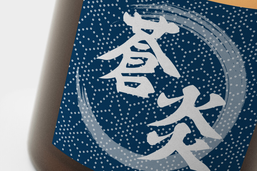
The Art of Kanji: Strength in Typography
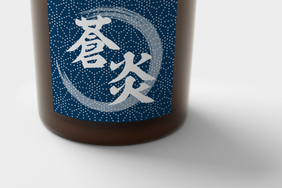
Central to the label’s design is a prominent Kanji character, rendered in a powerful, bold brushstroke style reminiscent of samurai strength and decisiveness. This single character, suggesting concepts like “blue” or “depth,” acts as the primary focal point. Below it, a complementary character, perhaps hinting at “flame” or “light,” adds another layer of meaning. The choice of typography is crucial; it’s not just text but a form of art that carries inherent symbolism and visual energy. The strong, energetic strokes convey a sense of dynamism and presence, contrasting beautifully with the stillness suggested by the background color. This character becomes more than just identification; it’s an emblem representing the candle’s essence – the fusion of profound calm (blue) and focused energy (flame). It aims to resonate with those who appreciate the potent beauty found in Japanese calligraphy and its ability to communicate complex ideas with impactful elegance.
Indigo Depths: Abstract Patterns and Textures
The background isn’t merely a solid color; it features a subtle, abstract pattern resembling stippling or swirling energy within a circular motif. This pattern, rendered in white against the indigo, adds texture and visual interest without overwhelming the central typographic element. It creates a sense of depth and contained dynamism, perhaps evoking a starry sky or gentle eddies in water. The circular frame contains this energy, providing a sense of wholeness and focus. This textural element enhances the tactile quality of the label, even visually, suggesting a connection to traditional crafts without referencing a specific pattern. It’s a detail that rewards closer inspection, adding a layer of refined complexity to the design and enriching the narrative of powerful tranquility.
Designing Ambiance: Visuals that Enhance Experience
Ultimately, this label design is about crafting an atmosphere. The combination of the deep indigo, the forceful Kanji, and the subtle background pattern works together to create a visual identity that enhances the experience of lighting the candle. It’s designed to integrate seamlessly into a peaceful interior setting, perhaps accompanying moments of meditation, quiet reading, or simply unwinding after a long day. The visual cues – serenity, focused energy, refined craftsmanship – all contribute to the product’s perceived value and its role in creating a desired mood. The design aims to be more than just packaging; it’s a visual prelude to the calming sensory experience the candle itself offers, turning a simple object into a small piece of functional art that promotes well-being.
Japanese Language & Culture Supervision
AMIX Design Studio has spent the past decade honing its craft in Japan. Through our dedicated label Japanify Works, we create designs that celebrate kanji, the Japanese language, and Japan’s rich culture—covering everything from Japanese text review to fully bespoke branding. Quotes are always free, so drop us a line any time!
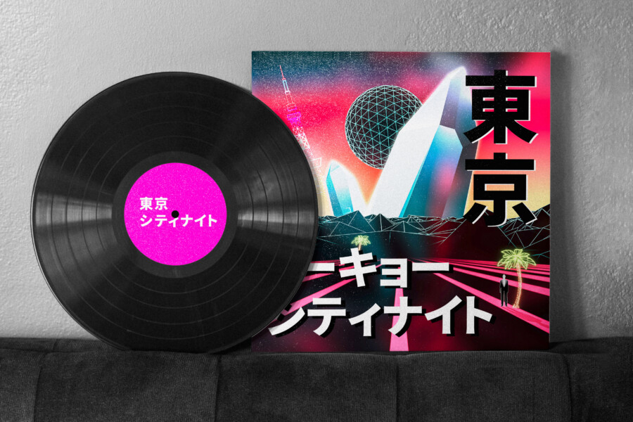
This graphic design is a sample.
For graphic design requests, please contact us using the contact form.
Contact Us
Also viewed: