Crafting Identity: A Modern Traditional Udon Logo
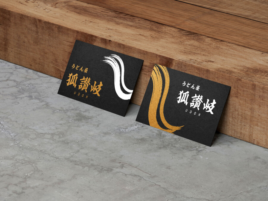
Brushstrokes of Tradition, Lines of Modernity
This logo is designed for an establishment specializing in udon noodles, aiming to create a memorable and appealing brand identity. The design carefully balances the weight of tradition with a clean, modern sensibility. Central to the logo are the prominent Kanji characters, rendered in a bold, brushstroke-like style. This element immediately evokes a sense of authenticity and Japanese heritage, suggesting deep roots and culinary expertise. The dynamic strokes convey energy and craftsmanship, hinting at the care put into the food itself. This central motif is designed to be instantly recognizable, serving as the core visual anchor for the brand and communicating a strong sense of place and tradition to potential customers. It’s a visual statement that speaks to quality and cultural depth.
The Power Within the Kanji
The main Kanji characters are the heart of this logo’s identity. Their powerful, somewhat calligraphic appearance gives the brand a distinct personality. While appearing traditional, the specific rendering avoids overly complex or archaic forms, ensuring legibility. These characters carry significant cultural weight, connecting the establishment to the rich history of Japanese cuisine, particularly the specific regional noodle style implied. The visual strength of this element ensures it stands out, whether on signage, menus, or packaging. It’s designed not just to be seen, but to be felt – conveying reliability, expertise, and a connection to authentic culinary traditions that resonate with those seeking a genuine experience.
Clarity and Approachability: Supporting Typography
Complementing the central Kanji characters are supporting text elements in both Japanese Hiragana and English alphabet. These are rendered in a much simpler, cleaner sans-serif style. This contrast is intentional. While the Kanji provides tradition and visual impact, the supporting text ensures clarity and broad accessibility. The Hiragana element offers a softer, more approachable feel for the domestic audience, clearly stating the nature of the business (“Udon Shop”). The English text further enhances understanding for international visitors, making the establishment feel welcoming and easy to identify. This combination ensures the logo communicates effectively across different audiences, balancing cultural authenticity with modern practicality.
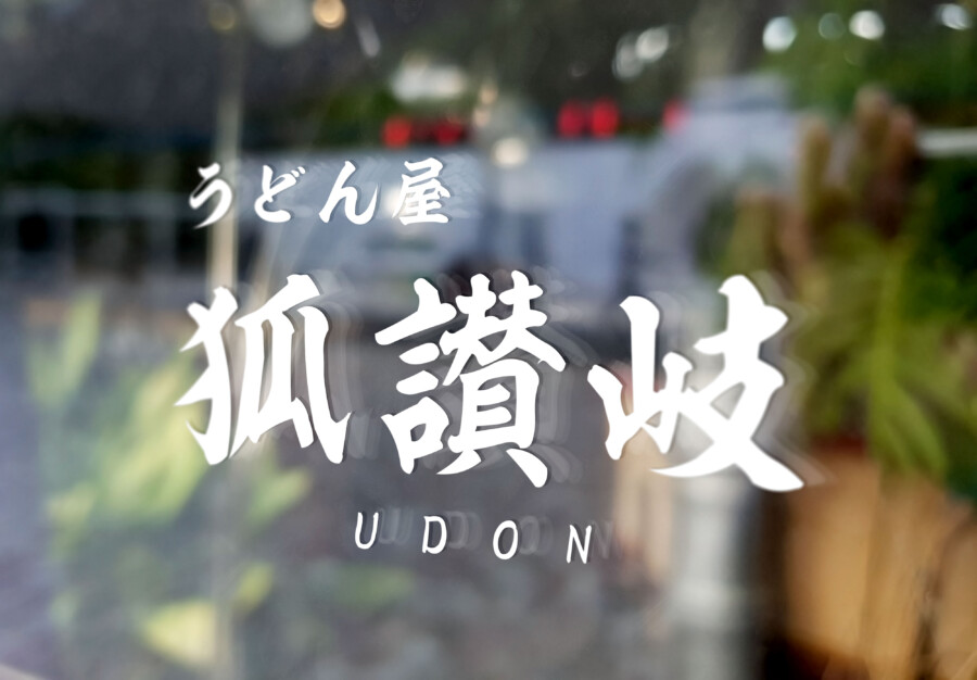
Versatility in Application: A Striking Visual Signature
A key strength of this logo design is its adaptability. It functions powerfully in its primary color and also in reverse – appearing crisp and clear in white against a darker background, as demonstrated in the provided image on a window. This versatility ensures the brand identity remains consistent and impactful across various applications, from illuminated signage and window decals to printed materials like menus and business cards, or digital platforms. The clean separation of elements and the strong core motif allow it to be scaled effectively without losing its integrity or recognizability, providing a robust and enduring visual signature for the udon establishment.
This logo design is a sample.
For logo design requests, please contact us using the contact form.
Contact Us
Also viewed: