Elegant Logo Design for a Japanese Bento Delivery Brand
Weaving Tradition and Modernity in Food Service Branding
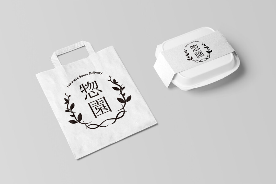
This logo was designed for a Japanese bento (boxed meal) delivery service. The aim was to create a visual identity that feels both authentic and contemporary, reflecting the quality of the meals offered. The design centers around the brand name, rendered in distinctive Japanese characters, evoking a sense of tradition and careful preparation. These characters are framed by a delicate, wreath-like illustration of leaves and vines. This motif adds an element of naturalness and artistry, suggesting fresh ingredients and attention to detail. The overall impression is one of sophisticated simplicity, suitable for a service that values both heritage and modern convenience. The balance achieved between the strong calligraphic characters and the gentle botanical elements creates a memorable and appealing mark for the brand.
Harmony in Typography and Symbolism
The core of the logo lies in the two Kanji characters representing the brand name. Their design possesses a classic feel, yet they are presented cleanly, avoiding excessive complexity. Surrounding these characters is the botanical motif, carefully drawn to integrate seamlessly with the typography. It doesn’t overpower the characters but rather enhances them, creating a unified symbol. This interplay suggests harmony – perhaps the harmony of flavors within the bento, or the balance between traditional recipes and modern dietary needs. The motif resembles a laurel wreath, subtly hinting at quality and excellence, without being overly ostentatious. It’s a design that communicates trustworthiness and a commitment to providing satisfying meals, presented with a touch of elegance that elevates the brand perception.
Strategic Simplicity: The Power of Monochrome
The choice of a monochrome color palette – black ink on a white background – is a deliberate strategic decision. This simplicity ensures maximum clarity and versatility across various applications, as seen on the packaging mockups like the paper bag and the bento box band. The high contrast makes the logo instantly recognizable and legible, even from a distance or at smaller sizes. Furthermore, the minimalist black-and-white approach conveys a sense of sophistication, cleanliness, and understated quality. It avoids trends and ensures longevity for the brand’s visual identity. This color scheme allows the structural beauty of the logo’s elements – the Kanji and the botanical illustration – to stand out without distraction, reinforcing the brand’s focus on essential quality.
Brand Impression: Beyond the Visuals
Ultimately, this logo serves as the cornerstone of the brand’s identity, aiming to leave a lasting positive impression. The design choices – the blend of traditional characters and natural motifs, the elegant composition, and the clean monochrome execution – all work together to communicate key brand values. It suggests a service that is reliable, offers high-quality, thoughtfully prepared meals, and respects both culinary heritage and contemporary aesthetics. The logo appears approachable yet refined, suitable for customers seeking convenient, delicious, and trustworthy meal solutions. It functions not just as an identifier, but as a visual promise of the quality and care that goes into every bento box delivered.
AMIX Design Studio has spent the past decade honing its craft in Japan. Through our dedicated label Japanify Works, we create designs that celebrate kanji, the Japanese language, and Japan’s rich culture—covering everything from Japanese package design to fully bespoke branding. Quotes are always free, so drop us a line any time!
This logo design is a sample.
For logo design requests, please contact us using the contact form.
Contact Us
Also viewed: