Visual Identity Design for a Modern Japanese Izakaya
Capturing Essence: Blending Tradition and Modernity in an Izakaya Logo
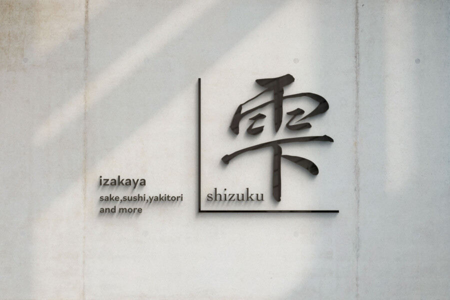
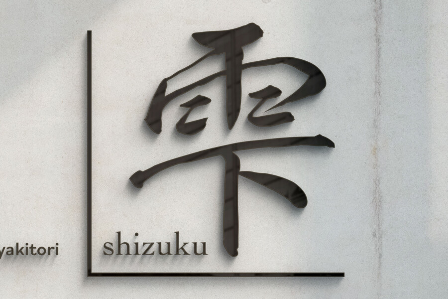
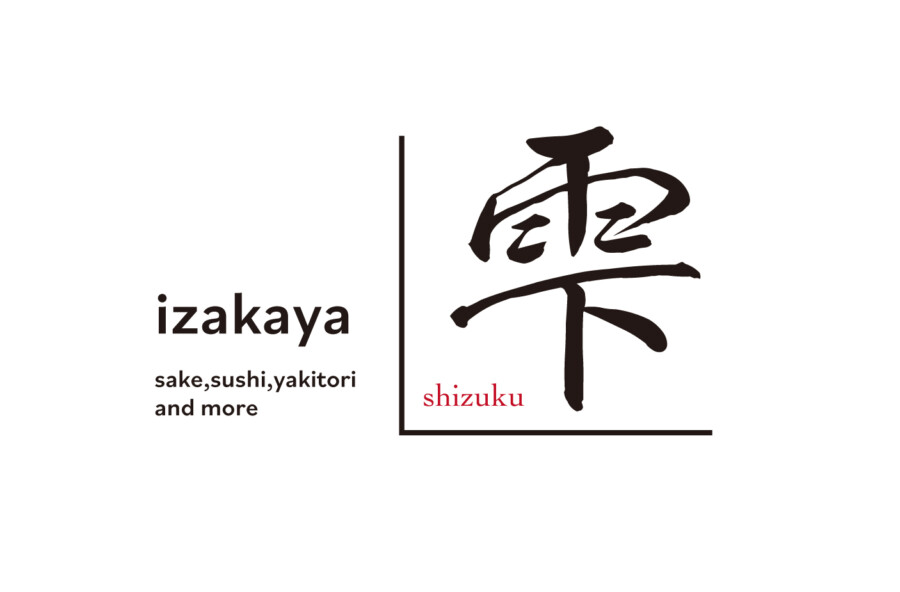
Creating a logo for an Izakaya, a Japanese-style pub, involves capturing a unique atmosphere – one that’s welcoming, perhaps a bit lively, yet respects tradition. The core of this design centers around a single Kanji character, “雫,” meaning “drop” or “droplet.” This character was chosen for its evocative nature, suggesting the freshness of ingredients, the clarity of sake, or perhaps a single, precious moment of enjoyment. The character itself is rendered in a dynamic, brushstroke style, grounding the design in Japanese calligraphy and artistry. This traditional element is intentionally juxtaposed with clean, modern lines that frame it, creating a visual dialogue between the old and the new. This balance aims to reflect an establishment that honours its roots while offering a contemporary dining experience, appealing to a diverse clientele seeking authentic Japanese hospitality. The simplicity ensures memorability, while the chosen Kanji adds a layer of meaning.
Balancing Act: Integrating Kanji and Roman Typography
A key aspect of this logo is the careful integration of different typographic elements. Alongside the prominent Kanji, the word “izakaya” is presented in a clean, legible sans-serif font. This choice provides a modern counterpoint to the calligraphic Kanji, enhancing readability and accessibility, especially for an international audience. The placement creates a visual hierarchy: the striking Kanji captures initial attention, while the adjacent text clearly defines the nature of the business. Below “izakaya,” a smaller line lists key offerings like sake, sushi, and yakitori, setting clear expectations. The subtle inclusion of the establishment’s name, romanized below the Kanji in a contrasting red, adds a specific identity marker without overpowering the main elements. The limited colour palette – primarily black and white with a touch of red – is drawn from traditional Japanese aesthetics, lending sophistication and highlighting key information effectively.
Communicating the Offering: Beyond the Visual Symbol
While the Kanji “雫” provides a beautiful and symbolic core, a logo must also communicate clearly. Explicitly stating “izakaya” ensures immediate understanding of the type of establishment. Complementing this, the descriptive text listing typical Izakaya fare – “sake, sushi, yakitori and more” – plays a crucial role. It fleshes out the visual symbol, giving potential customers a concrete idea of what to expect inside. This combination of evocative imagery (the Kanji) and straightforward information (the text) works together to build a comprehensive picture. It aims to attract both patrons familiar with Izakaya culture, who might appreciate the calligraphic touch, and newcomers drawn by the clear description of offerings and the clean, inviting design. The logo functions as a visual promise of the experience within.
Versatility and Application: Ensuring Brand Consistency
A successful logo must function effectively across various mediums. This design’s strength lies in its simplicity and balanced composition, ensuring versatility. Whether enlarged for signage, scaled down for menus or coasters, or used digitally on a website or social media, the core elements remain clear and recognizable. The strong contrast and clean lines reproduce well in different formats and sizes. Furthermore, the distinct separation between the Kanji symbol and the text allows for flexible application; the Kanji mark could potentially be used independently as a brand icon where appropriate, further extending the visual identity system. Ultimately, the design provides a consistent and adaptable brand marker, effectively conveying the intended image: a welcoming Izakaya that blends Japanese tradition with modern sensibilities.
This logo design is a sample.
For logo design requests, please contact us using the contact form.
Contact Us


