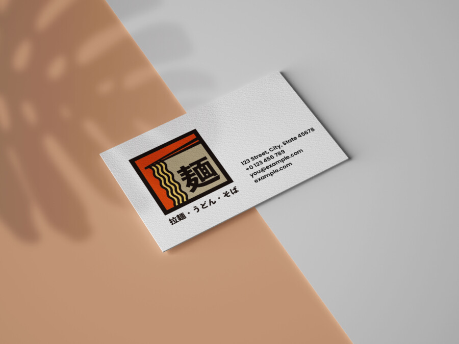
Dynamic Brushwork: Crafting a Logo for a Logistics Leader
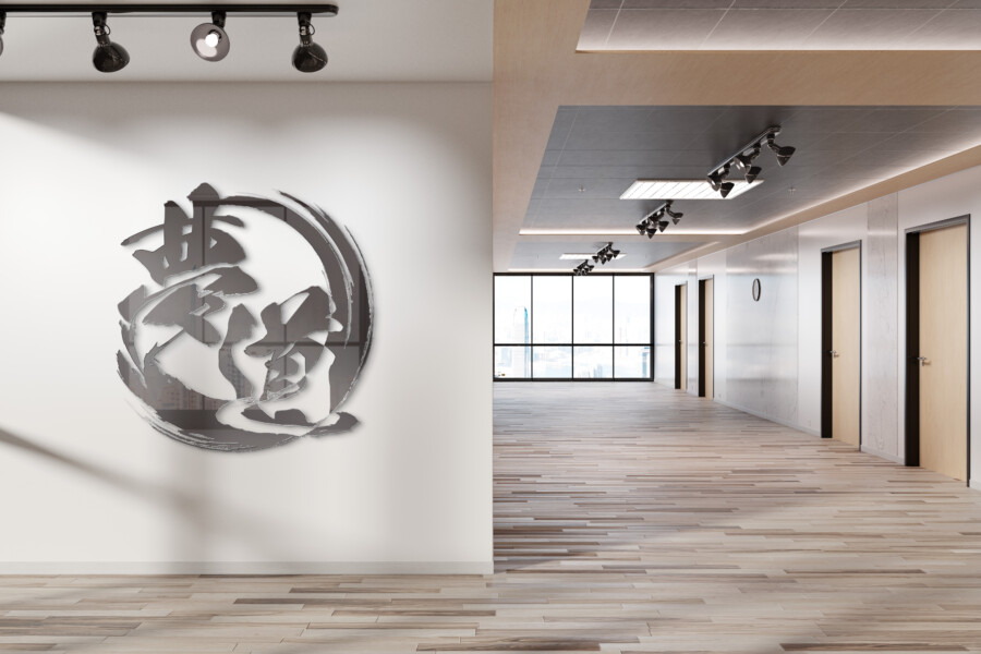
Beyond Characters: Weaving Motion and Reliability into a Visual Identity
This logo utilizes the powerful and fluid artistry of East Asian calligraphy to forge a unique brand identity. The design centers around symbolic characters rendered with bold, energetic brushstrokes, contained within a dynamic circular form. This approach immediately conveys a sense of movement and forward momentum, essential qualities for a company operating in the fast-paced logistics sector. The thickness and flow of the lines suggest strength and dependability, assuring clients of the company’s capability to handle shipments with care and precision. It’s a visual representation of controlled power, reflecting the organized yet adaptable nature required to navigate complex transportation networks efficiently and reliably day in and day out. The deliberate imperfections inherent in calligraphy, such as subtle ink splatters and variations in stroke width, add a layer of authenticity and human touch, differentiating the brand from more sterile, purely digital designs.
The Essence Captured in Ink
The core strength of this logo lies in its masterful use of brushwork. Each stroke appears intentional, contributing to an overall feeling of balance and contained energy. The sweeping curve that partially encircles the central characters evokes a sense of global reach and continuous movement, like goods constantly circulating. The way the ink seems to flow and pool mirrors the dynamic nature of logistics – the constant movement, the hubs of activity, and the smooth transitions between different stages of transport. This isn’t just about depicting characters; it’s about capturing the very essence of the company’s operations – speed, fluidity, and unwavering focus. The calligraphic style lends an air of established expertise and trustworthiness, suggesting a company rooted in strong principles while embracing dynamic action.
Impact Through Simplicity: The Power of Monochrome
Opting for a purely monochrome palette significantly enhances the logo’s impact. The stark contrast between the black ink and the implied white space creates a visually arresting image that is both timeless and modern. This simplicity ensures versatility across various applications, from large-scale vehicle branding to small digital icons, without losing its integrity or recognizability. Black ink, particularly in the context of calligraphy, carries connotations of authority, sophistication, and unwavering resolve. It strips away distractions, focusing attention entirely on the form and energy of the brushstrokes. This deliberate lack of color speaks to a confidence in the core message and a focus on essential services, projecting an image of efficiency and seriousness appropriate for the logistics industry.
Bridging Tradition and Modernity
While deeply rooted in traditional calligraphic art, the logo avoids feeling dated. The energetic composition and the slightly abstract quality of the strokes give it a contemporary edge. It successfully bridges the gap between a respected art form and the demands of modern branding. This fusion suggests a company that values its heritage and experience but is also forward-thinking and adaptable to the evolving demands of the global market. The design feels enduring, capable of representing the company for years to come without appearing tied to a specific trend. It speaks to a foundational stability combined with the dynamism needed to thrive in today’s world, offering a compelling narrative of tradition powering innovation within the logistics sphere.
Get a Culturally Accurate Logo →
AMIX Design Studio has spent the past decade honing its craft in Japan. Through our dedicated label Japanify Works, we create designs that celebrate kanji, the Japanese language, and Japan’s rich culture—covering everything from Japan-inspired packaging to fully bespoke branding. Quotes are always free, so drop us a line any time!
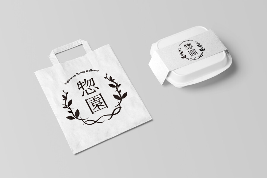
This logo design is a sample.
For logo design requests, please contact us using the contact form.
Contact Us
Also viewed: