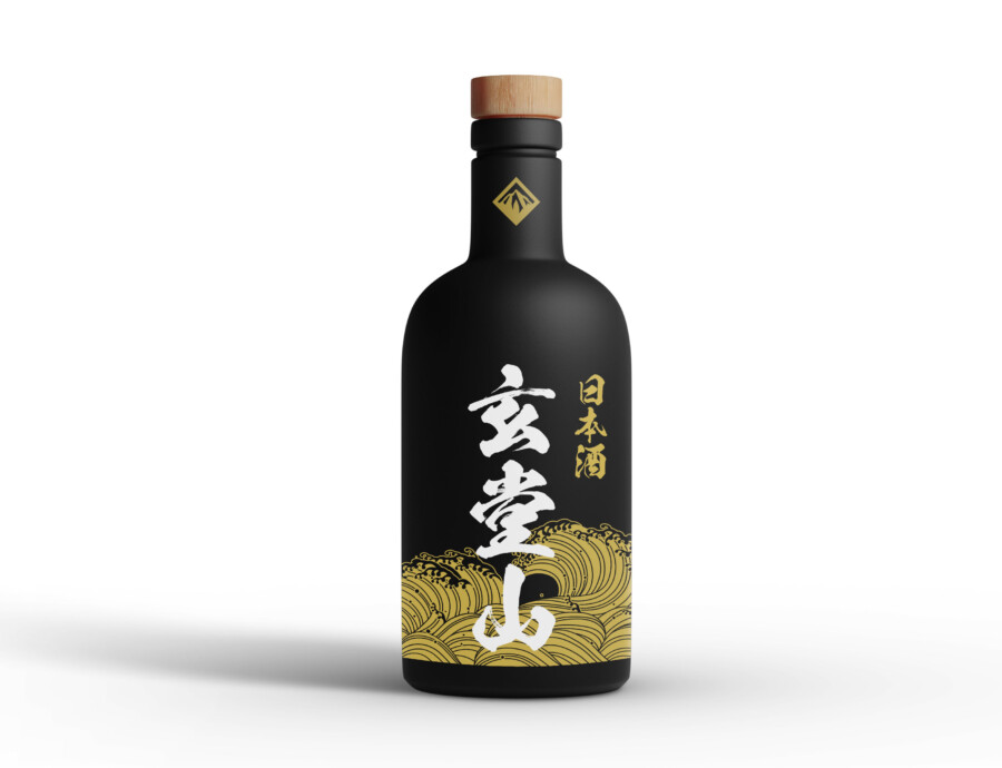
Strength Meets Tradition: Protein Packaging Design
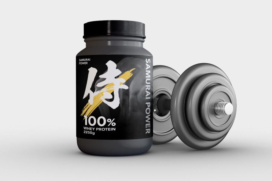
Embodying the Samurai Spirit: Design for Modern Fitness
This packaging design aims to capture attention on crowded shelves while conveying the product’s core identity: power and quality derived from a disciplined approach, much like the ancient samurai warriors. The design needed to feel modern and energetic, appealing to fitness enthusiasts, yet also hint at a deeper philosophy of strength and dedication. We chose a bold, dark base color for the container, creating a strong foundation that speaks to seriousness and intensity. Against this backdrop, the key visual elements stand out sharply, ensuring immediate impact and brand recognition even from a distance. The overall impression is one of focused power and reliability, aligning perfectly with the expectations of consumers seeking effective fitness supplements. It’s designed not just to hold the product, but to represent the user’s commitment to their own strength journey.
The Power of ‘Samurai’: Iconic Kanji Graphic
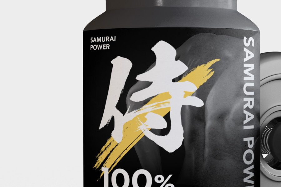
Central to the design is the powerful calligraphy of the kanji character for “Samurai” (侍). This isn’t just a decorative element; it’s the conceptual heart of the brand identity visible on the package. The brushstroke style evokes a sense of dynamism, discipline, and honed skill – qualities associated with the samurai warrior, and highly relevant to the target audience dedicated to physical training. Rendered prominently in white with a striking gold accent that suggests a swift, powerful movement, the kanji becomes an instantly recognizable symbol. It differentiates the product by infusing it with a sense of heritage and inner strength, moving beyond typical fitness visuals to create a more profound connection with the consumer looking for that extra edge.
Strategic Typography: Balancing Information and Impact
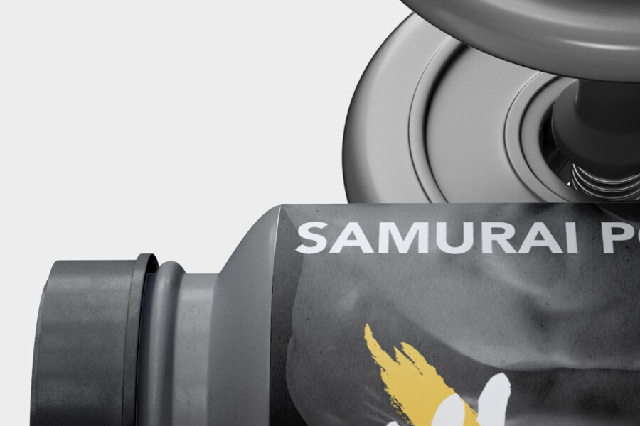
While the “Samurai” kanji provides the primary visual hook, the typography for the product name and key information is carefully considered to complement it. The English brand name is set vertically in a clean, modern sans-serif font, creating a visual contrast with the expressive kanji while maintaining a strong, stable presence. This vertical orientation adds a unique touch and guides the eye. Essential details like “100% WHEY PROTEIN” and the quantity are presented clearly and legibly in white, ensuring easy readability against the dark background. The hierarchy is clear: the impactful graphic draws you in, and the supporting text delivers necessary information efficiently, without cluttering the powerful core message.
Sophisticated Strength: The Black, White, and Gold Palette
The color palette is deliberately minimalist yet impactful. The deep black or charcoal grey of the container provides a sophisticated and premium feel, suggesting high quality and potency. White is used for maximum contrast, ensuring the crucial elements – the kanji and essential text – are highly visible and communicate clarity and purity. The strategic use of gold is key; it’s not overwhelming but adds a touch of energy, premium quality, and perhaps even echoes the ornamentation found on samurai armor. This combination of black, white, and gold creates a visually striking package that feels both powerful and refined, appealing to a discerning consumer who values both performance and aesthetics in their fitness products.
Get Japan-Optimized Packaging →
AMIX Design Studio has spent the past decade honing its craft in Japan. Through our dedicated label Japanify Works, we create designs that celebrate kanji, the Japanese language, and Japan’s rich culture—covering everything from Kanji packaging design to fully bespoke branding. Quotes are always free, so drop us a line any time!
This package design is a sample.
For package design requests, please contact us using the contact form.
Contact Us
Also viewed: