Striking Gold on Matte Black: A Modern Take on Sake Packaging
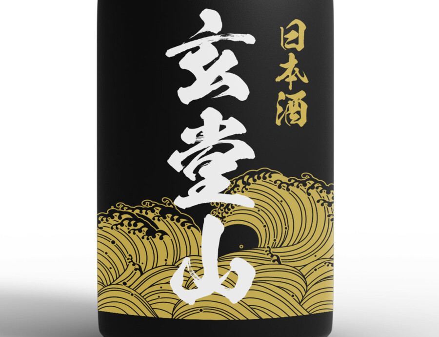
Where Minimalist Elegance Meets Japanese Tradition
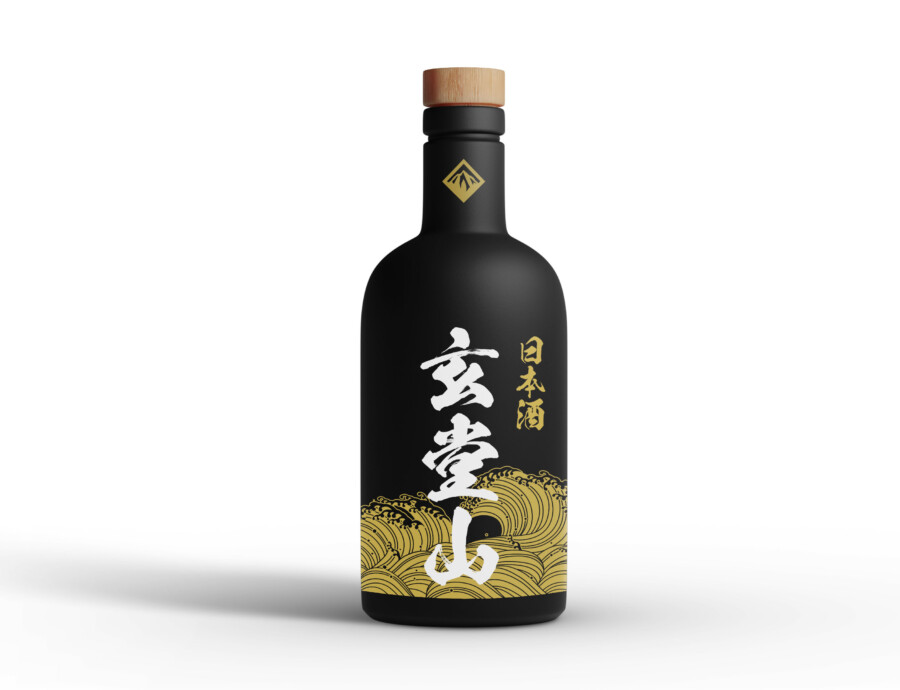
This packaging design presents a sophisticated visual identity for a Japanese alcoholic beverage. The core appeal lies in its high contrast and carefully selected elements, creating an immediate impression of quality and refinement. A deep matte black finish covers the bottle, providing a contemporary and luxurious canvas. Against this dark background, accents of gold are used exclusively, ensuring every detail stands out with striking clarity. This minimalist approach, focusing on just two main colors, exudes confidence and allows the form of the bottle and the graphic elements to take center stage. The overall feeling is one of balanced harmony – a modern aesthetic sensibility respectfully interwoven with traditional Japanese motifs, designed to capture attention on the shelf while conveying a sense of premium value. It’s a visual statement that speaks to both heritage and contemporary tastes.
Bold Strokes: Calligraphy as the Visual Anchor
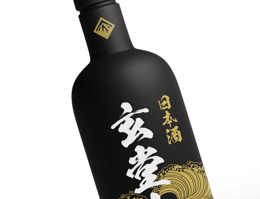
Central to the design is the prominent use of Japanese calligraphy, rendered vertically in a vibrant gold. The characters, which represent the product’s designation, possess dynamic and fluid strokes, suggesting artistry and a handcrafted quality. This element serves as the primary focal point, instantly communicating the product’s cultural origin and identity. Positioned beside it, smaller characters specifying the beverage type (“Japanese Sake”) provide essential information in a complementary style. The calligraphy isn’t just text; it’s a core graphic element that anchors the entire composition, lending it an authentic and distinguished character. Its placement and scale are carefully considered to balance with the other elements, ensuring it draws the eye without overwhelming the overall design aesthetic.
Golden Waves: A Nod to Nature and Artistry
Adding a layer of visual richness and symbolic depth, a stylized wave pattern adorns the lower portion of the bottle. Executed in the same striking gold as the calligraphy, these waves evoke traditional Japanese art, perhaps reminiscent of ukiyo-e prints or patterns found on classic kimonos. The undulating lines create a sense of movement and fluidity, contrasting beautifully with the static, solid form of the bottle. This motif connects the product to natural imagery – water, purity, flow – which resonates well with the beverage category. It’s more than mere decoration; it’s a subtle narrative element that adds texture and cultural context, enhancing the perceived craftsmanship and hinting at the quality contained within the sleek, modern vessel.
Tactile Finishing Touches: Completing the Premium Feel
Beyond the main graphic elements, subtle details contribute significantly to the packaging’s premium appeal. The choice of a matte finish for the bottle offers not just a visual elegance but also a distinct tactile experience, feeling smooth and sophisticated to the touch. This contrasts effectively with the sheen of the gold elements. At the top, the bottle is sealed with a cap that appears to be made of natural wood or a high-quality wood-effect material, adding a touch of organic warmth and texture that complements the cool black and gold. A small, geometric emblem in gold near the bottleneck provides a final, refined detail, acting almost like a seal of quality. These carefully chosen finishes work together to create a holistic sensory experience, reinforcing the product’s high-end positioning.
Professional Japan-Ready Packaging
This package design is a sample.
For package design requests, please contact us using the contact form.
Contact Us


