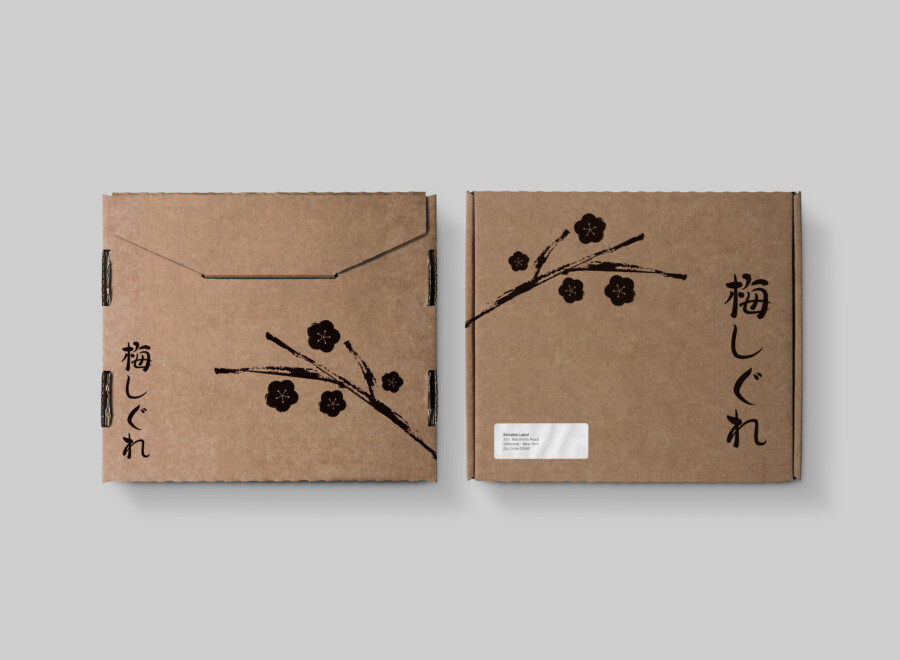
Ume Shigure Packaging: A Study in Minimalist Japanese Aesthetics
Evoking Nature’s Poetry: The Design Language of Wabi-Sabi
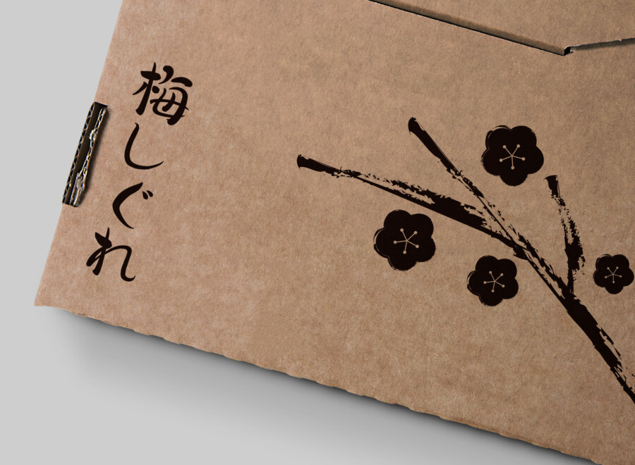
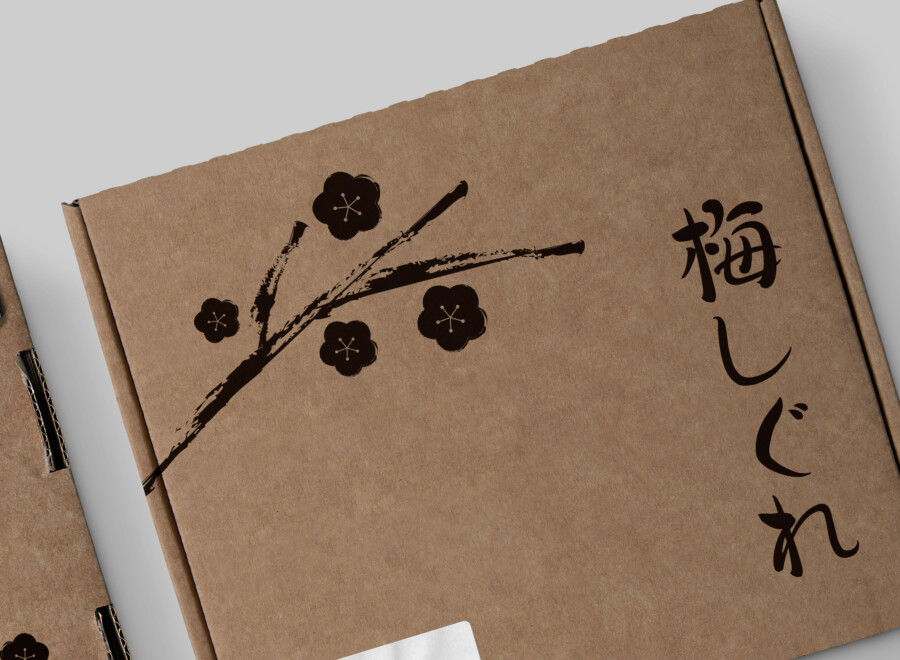
This packaging design embraces the natural texture of the cardboard material, creating a sense of warmth and simplicity. The graphic elements are intentionally kept minimal, featuring a delicate illustration of a plum branch and blossoms rendered in black ink. This approach evokes a sense of wabi-sabi – the Japanese aesthetic centered on the acceptance of transience and imperfection. The unbleached, earthy tone of the cardboard serves as a canvas, allowing the stark black illustration to stand out, yet remain harmonious with the overall natural feel. The design aims to convey a feeling of quietude and the subtle beauty found in nature, particularly the brief yet beautiful moment of plum blossoms emerging in the late winter or early spring. It’s a visual representation of tranquility and understated elegance.
Delicate Ink Strokes: The Plum Blossom Illustration
The core graphic element is the illustration of the plum blossom branch. Rendered in a style reminiscent of traditional Japanese ink painting (sumi-e), the artwork possesses a simple yet profound elegance. The lines depicting the branch are fluid and dynamic, stretching across the package surface, while the blossoms are rendered with a soft, almost stamped texture. The deliberate placement of the branches and blossoms across the different panels of the two box types creates a subtle visual narrative and rhythm. Using only black ink enhances the contrast against the brown cardboard, emphasizing the forms and creating a sophisticated, modern interpretation of a classic motif. It’s not just a decoration, but an integral part of the packaging’s identity, suggesting artistry and care.
Typography as Atmosphere: Integrating Text with Texture
The typography plays a crucial role in complementing the minimalist aesthetic. The product name, written vertically in Japanese characters on one box design and horizontally integrated with the address label space on the other, uses a clean and somewhat traditional-feeling font. The choice of vertical text alignment connects with traditional Japanese writing formats, adding an authentic cultural nuance. Its placement is carefully considered to maintain the balance and negative space within the design. The black color of the text mirrors the ink of the illustration, creating visual coherence. The typography doesn’t shout for attention; instead, it integrates seamlessly with the cardboard texture and illustration, contributing to the overall serene and refined atmosphere of the packaging.
Material Matters: Embracing the Warmth of Cardboard
The choice of corrugated cardboard as the primary material is fundamental to the design’s success. Its inherent texture provides a tactile quality that enhances the user experience, inviting touch and conveying a sense of naturalness and earthiness. Beyond aesthetics, this material choice might also suggest environmental consciousness. The visible structure of the cardboard on the edges adds subtle detail. The existence of two slightly different box structures (one appearing more like a wrap-around sleeve, the other a standard box) offers versatility while maintaining a consistent visual identity through the shared graphics and material. The material isn’t just a container; it’s an active participant in the design, contributing significantly to the overall wabi-sabi feel and telling a story of simplicity and authenticity.
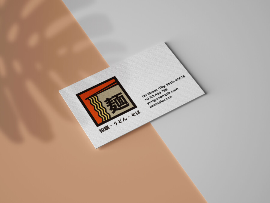
AMIX Design Studio has spent the past decade honing its craft in Japan. Through our dedicated label Japanify Works, we create designs that celebrate kanji, the Japanese language, and Japan’s rich culture—covering everything from Japanese logo design to fully bespoke branding. Quotes are always free, so drop us a line any time!
This package design is a sample.
For package design requests, please contact us using the contact form.
Contact Us
Also viewed: